E-session
It's been a long while since I've posted, but I decided it was time to seek c&c from those that know much more than I. This is my second e-session, so any help you can offer is much appreciated.
1.
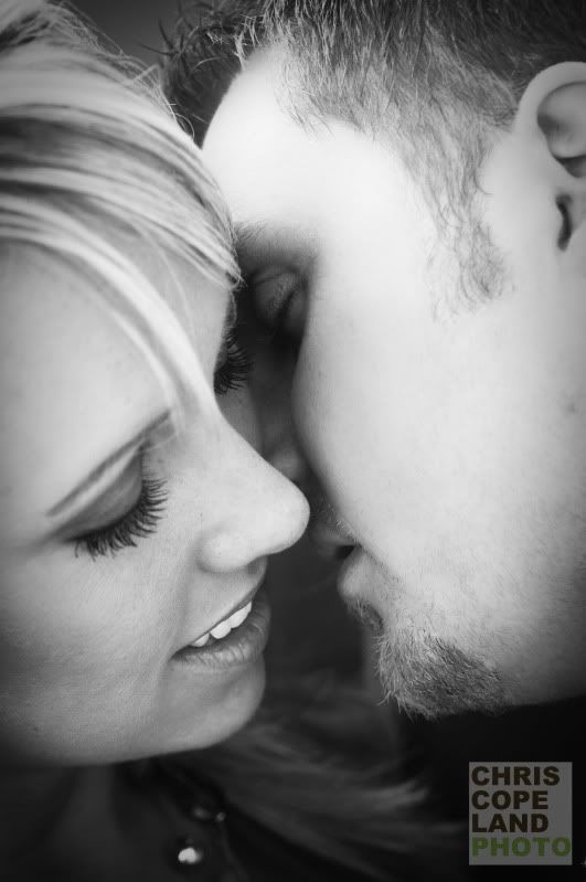
2.
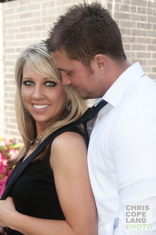
3.
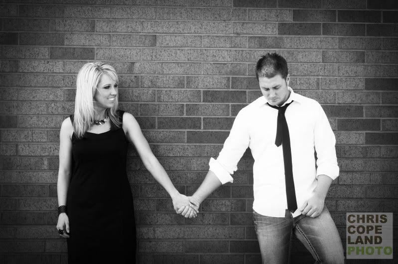
4.
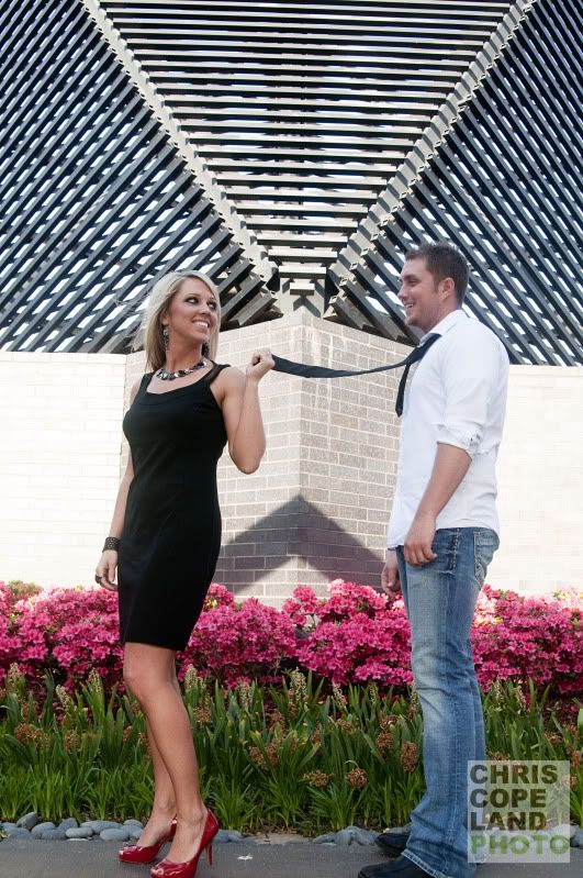
5.
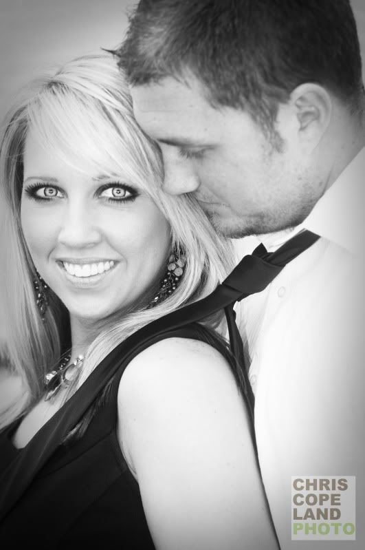
6.
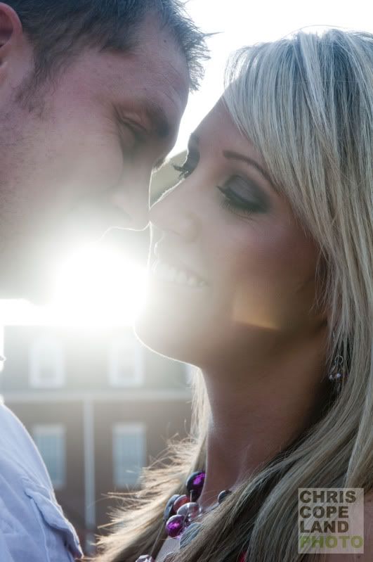
1.

2.

3.

4.

5.

6.

0
Comments
A great capture of emotion!
Hi! I'm Wally: website | blog | facebook | IG | scotchNsniff
Nikon addict. D610, Tok 11-16, Sig 24-35, Nik 24-70/70-200vr
Spread the love! Go comment on something!
www.chriscopelandphotography.com
www.facebook.com/chriscopelandphotofanpage
#1. Her teeth distract from the rest of the photo - they really draw your eyes down to them and away from the connection between the couple.
#2 Dark eye makeup + ultra bright eyes look a bit scary to me. Watch her hand and elbow. The pink flowers in the background are distract and the composition is a bit too centered. I assume #5 is a recrop of this?
#3 I think this would look stronger without the heavy vignette. Also watch out when shooting straight into brick walls - you can easily tell if you are not level or not shooting straight on.
#4 They are not into this pose at all - they look awkward. I love the modern architecture at the top of the frame, but it doesn't match the bottom of the frame. I would get down low, put them in the top of the frame with a long lens and fire away. Great location.
#5 Similar to 32 , but I like this much better
#6 Needs more contrast and warmth. Also watch the grooms ear - I would crop it out altogether.