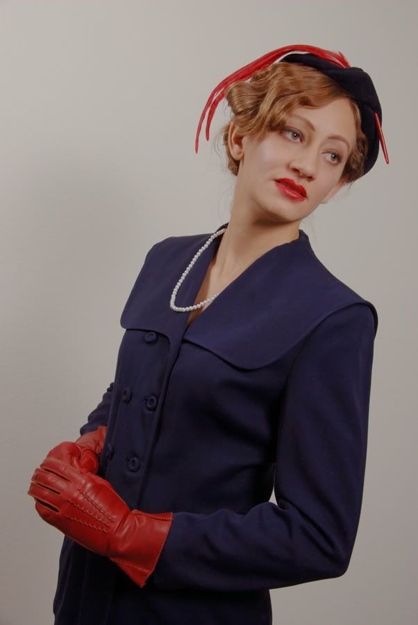
Vintage Vogue style Fashion Photography.
Conde Nast's Vogue has been publishing color photos since at least as early as 1943. That's why this mid to late forties outfit is being shown in color.
My lovely friend and I traded work this past weekend. . . . Actually, we had too much fun to call it work. She sat for a couple of portrait assignments I needed to do and I, in turn, photographed her in some of her vintage clothes - some of them original, such as this outfit; gloves, hat and all, but not the pearls - so that she can show them to friends on the Internet. Of the 100 images we shot, this one is my favorite . . . so far.
Comments always welcome. What'dya think?
Lee
__________________
My SmugMug Gallery
My Facebook
"If you've found a magic that does something for you, honey, stick to it. Never change it." - Mae West, to Edith Head.
"Every guy has to have one weakness - and it might as well be a good one." - Shell Scott: Dance With the Dead by Richard S. Prather
0
Comments
 good choice of the outfit and the "do"
 nice pose
 necklace is skewed off, you gotta watch for this tiny details, your model can't see herself - unless you put a large mirror right next to her
 light is, uhm, bland, definitely not the 40-s..50-s style (did you consider bw?)
- :cry her face expression would ruin everything else even if it was perfect
HTHHer expression kills the shot. It's her mouth ... I see more of a down-turn in the corners of her mouth than I do anything even resembling a smile. A slight up-turn at the corners of her mouth would make all the difference in the world.
Lighting .... You have light fall-off left to right and the light is not flat so much as it lack any punch - almost like the shot is under-exposed by about a stop.
Clean up the stray hairs, get the hair out of her right eye, pay attention to the small details (see Nik's post), and fix the above two items and you have a winner image.
My Photos
Thoughts on photographing a wedding, How to post a picture, AF Microadjustments?, Light Scoop
Equipment List - Check my profile
Actually, I think you may be able to fix the mouth a bit: to me, it's actually the lipstick application which makes the mouth look so weird - it looks like she didn't use a brush (or liner) when she applied, so it's fuzzy around the edge and it actually goes against the polished look of the suit-gloves-and-hat styling, especially since makeup in that period was NOT soft at all eg http://unique-vintage.com/images/makeup-54.gif. Have you tried playing around both with cleaning up the edges of the lipstick and then liquifying a hint of a smile?
Just a thought....
Great idea for a shoot!
NAPP Member | Canon Shooter
Weddings/Portraits and anything else that catches my eye.
www.daveswartz.com
Model Mayhem site http://www.modelmayhem.com/686552
I know what you mean, but the eyes don't bother me in this particular context because that look/pose was so common in pattern books of the period (Vogue as in sewing rather than Vogue as in fashion magazine).. Since the model is a vintage clothing enthusiast, I'll guess this is the sort of thing she may have had in mind:
http://www.craftycrafty.tv/patterncheap.jpg
Actually, thinking this through and thinking how often pattern shots have the eyes looking away and often do NOT engage with the viewer, I wonder if that's so that the eye is thrown back onto the clothes instead of the person wearing them?
LSV (sorry, I can neer remember the orthography and capitals your handle without looking, so forgive me for taking the easy way out!!): can you bump up the curves and contrast in this and play with some post to see what it looks like with a bit of tweaking? I'd be curious. And to see others from the shoot - it's such a neat idea!!!! Please post some more
I have no problem with the eyes direction, but with the eyes expression
Thank you, everyone, for your compliments and critiques; I've read each post several times and found valuable education with every word. I'll do my best to respond to each of you in (relative) order.
Nikolai:
For the outfit, I thank you on her behalf. For the "do", I thank you on behalf of her Gracie Allen-esque friend, Ashley. (You shoulda seen all the bobby pins she put back there! Sheesh!)
Ditto.
Fifteen years ago, I was very good at watching for those "tiny details." That'll come back to me, but I should have asked if she had a different string of small pearls, all the same. This one was stiff and kept jumping back into her collar. You saw her other strings in the single-light and silhouette assignments: Too big and too long, each.
Agreed. Black and white was the idea behind this shoot, but I wanted to show the colors of this outfit. I just haven't done a conversion, yet.
Agreed.
piercingperceptions:
I agree on all counts. And the Magic 8 Ball sees more shoots with her in my future. Not to mention shoots with some of the several dozen other friends we have who are into vintage. (Two more are already scheduled!)
Scott_Quier:
Thank you.
Agreed.
The left-to-right fall-off is partially due to the fact that I have only two lights at this time, and one was on her. I should have been more careful with the one on the wall, as I had it working double-duty as a hair light. I've done this before with good results, but this time I must have either angled it badly or plced it too far to the side. . . . Possibly both. On the other hand, you'll notice that there is also light drop-off from top to bottom. THAT was intentional.
I do intend to re-shoot. Fortunately, we're becoming close friends and she is very willing to do some more. (Also see above.)
divamum:
Once again, you've come through with great resources for me to follow: The pictures you supplied are wonderful and informative! And I hadn't even thought about Vogue patterns! Thank you!
Take Two: Thank you again, and you may be right about where the viewers' eye is intended to go. I know that when I look at images of people I'm generally drawn first to the eyes, unless the subject is looking away, and for this image my intent was to showcase the outfit. But still, Nikolai and the others are right about her expression just not working, thus detracting from the overall image.
Oh, and, don't worry about the orthography (apparently, you're another person who enjoys using sesquipedalian words!
Swartzy:
Me too.
Call me dense, but could you please define "WP/BP" for me? I'm unfamiliar with the acronym.
Of the 100 images we shot, this is one of nineteen of her in this outfit, and was taken at the end of the shoot - in fact, it was the third shot from the last. For reasons unknown, I didn't ask her to smile for any of these final shots. Then again, by this time we were all getting tired, Juliette was getting hungry, and one annoying idiot who was only physically present kept TURNING OFF THE AIR CONDITIONING! :bash (At one point I told the otiose cretin that he was about to be outstanding. . . . Out standing in the HALL!)
He will NOT be allowed at any future shoots!
__________________
My SmugMug Gallery
My Facebook
"If you've found a magic that does something for you, honey, stick to it. Never change it." - Mae West, to Edith Head.
"Every guy has to have one weakness - and it might as well be a good one." - Shell Scott: Dance With the Dead by Richard S. Prather
Las Cruces Photographer / Las Cruces Wedding Photographer
Other site
I agree, Josh! That does look much better. Thank you.
__________________
My SmugMug Gallery
My Facebook
"If you've found a magic that does something for you, honey, stick to it. Never change it." - Mae West, to Edith Head.
"Every guy has to have one weakness - and it might as well be a good one." - Shell Scott: Dance With the Dead by Richard S. Prather
www.cameraone.biz