Options
Stoned
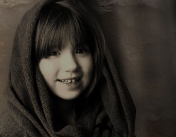
Ok, now that I have some of yalls (can you tell I'm a southern boy?:D)attention, could you PLEASE comment/critique/criticize....did I leave out any other "C"s? It's an older photo that I have did some "Harry Potter-ing" on w/ a stone texture. It's a minimalist effort @ best in addition to being my maiden voyage into these types of waters. You don't have to be gentle, just be honest. PSE7 was the culprit and I can only go up from here. So beat it down, build me up, whichever helps. Thanks so much. :thumb
P.S. I had just got my 50mm 1.4 and was practiting w/ that @ the time. So for discussions sake, let's say the subject matter itself is "ok" from a techincal standpoint (I know it's not - focus issues) I'm looking more for an overall "I think this works" "I think it sucks"......
P.S. I had just got my 50mm 1.4 and was practiting w/ that @ the time. So for discussions sake, let's say the subject matter itself is "ok" from a techincal standpoint (I know it's not - focus issues) I'm looking more for an overall "I think this works" "I think it sucks"......
0
Comments
1) The overall image appears out of focus and not very sharp. If you adjust this and really focus on bringing those eyes into focus it would do a lot.
2) The lighting, while I think is getting you closer to where you want to be, the overall affect has flattened the image.
Play around with it, apply some selective layers and see what you get.
www.brogen.com
Member: PPA , PPANE, PPAM & NAPP
1) out of focus
2) overall the exposure is low
3) lighitng on back drop in uneven
4) hair in eyes
5) you should cut off more of the head or keep it all..the tiny clip is not working
14-24 24-70 70-200mm (vr2)
85 and 50 1.4
45 PC and sb910 x2
http://www.danielkimphotography.com
1. yep, I mentioned that initially....just wanting the "Idea" examined
2. It was too bright when first processed, now maybe a touch too dark.
3. It's a hallway and a doorway to the top-right of her head (again, looking for opinions on the textured effect)
4. Compositional Issues (what about the effect?)
5. See #4
Let's say for arguement sake, I post a picture of a black square. The critiques all relate to the fact that it's not blue and would maybe even look better if green. However, my concern was that I really wanted to know if it was "square"? I swear I'm not trying to be a horse's rear....just trying to get some input on a new procedure for myself. I want to master this, to the best of my ability anyway, and the above image is a single step in that direction. However, I now realize that a better image to begin with would probably lend itself to better/more comments and suggestions.
Thanks for what I have heard so far! It all helps.
oh..you are saying the backdrop is a textured effect from post processsing? I thought it was a "live" backdrop. I am a bit unclear what you mean by "idea". Is the texture the idea? It just appears to me a photo that has been processed as monotone.
14-24 24-70 70-200mm (vr2)
85 and 50 1.4
45 PC and sb910 x2
http://www.danielkimphotography.com
Bingo!
okay wrt to the texture..it doesn't look like stone heh. Not even close. It looks like mottled dry wall or mottled fabric.
14-24 24-70 70-200mm (vr2)
85 and 50 1.4
45 PC and sb910 x2
http://www.danielkimphotography.com
The background looks fine to me. It doesn't distract from the subject. The overall photo has a vintage look to it.
On the other hand, the background doesn't add to the photo except to provide negative space. I don't notice the texture.
Did the "stone" background replace something distracting? If yes, that was a good call. You might want to share the original as suggested by lords8n so people can get a better idea of what you are striving for.
Overall, the photo looks too dark on my screen. Although the dark complements the softness of the focus, I think the picture would be a lot more appealing if her face were a bit brighter. I'd leave the shawl and background as is.
Just my thoughts.
Virginia
"A photograph is a secret about a secret. The more it tells you, the less you know." Diane Arbus
Email
Thank you very much for the constructive criticism! Here's the original...and then the one with the added "stone" texture.
WHOAH!! DARKENED it is! But WRT the texture EFFECT....is it semi-in a round about way-sort of...on track?
If you had not said that the background was PP and texture added, I would have not even noticed that. It is just too subtle.
Comments and constructive criticism always welcome.
www.mikejulianaphotography.com
Facebook
The reason I wanted to see the original was because I thought my eye was seeing something weird and I wanted to know what it was. I was seeing the right side wall as if it were some streaming light rather than form curvature. But it didn't make sense because as close as she appears to be to the wall her shadow should cast right at that spot.
At a glance, in the original, I would place the background on the right side somewhere between four and eight feet behind her. On the modified version the same area looks to be right up against her, mere inches away. Which is why the shadow looks off.
Seriously, you might see about scaling the texture down a bit and throwing a little Gaussian Blur on it to set it back out of the fall of her shadow.
The original is just fabulous.
But I do understand this was simply a proof of concept.
Very nice!