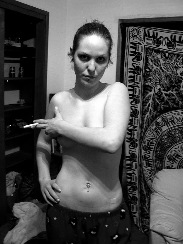
Justin, the background is too busy. It distracts from the subject of the shot. Perhaps you could do some Photoshop work and take care of that.
If the look you were going for is "trashy", you did good. If, however, you were looking for an elegant artistic nude then you failed.
The cigarette, band-aid on her belly, and the mess on the floor all point to "trashy".
thank you
I appreciate the comments. I guess I was going for a trashy,grunge look. I am usually a landscape photographer and she was my first "model" I have taken other model shots recently which are 10x's better than this and are in the people section.
I appreciate the comments. I guess I was going for a trashy,grunge look. I am usually a landscape photographer and she was my first "model" I have taken other model shots recently which are 10x's better than this and are in the people section.
I don't think there is anything wrong with this whatsoever... Compositionally... Yes it's busy and off-putting in some ways, but my first impressions are the artistic aspects of it. I think there's a mood here... A grunge, as the author speaks of; something almost Pulp Fiction-like. If the image was razor sharp and perhaps B&W converted a bit better for better gradients, I think this could work...
As soon as I saw the expression, then the band-aid, then the cigarette, I thought you actually had something there. The only thing detracting for me (initial impression) is the actual picture quality.
I agree with CDub above me. I see the grundge. I think what is at odds for me is her expression. Maybe if she smirked instead, or had a harder facial expression, it would add to the band aid and the cigarette.
Anyway, do try to do another bw conversion and see if that helps (Maybe lighten just a little around her eyes and burn a bit of the bright highlight on her torso. I think it will help if we can see her eyes better so we can connect with her.)

Comments
What exactly are you going for?
Cig is I dunno. "trashy" IMHO
The pajama bottoms are, how do I say, not so elegant?
And the Rug?
Did you see that this was a nude appreciation forum and decided to take your point in shoot and see you get?
Sorry if this is harsh, But you said you wanted CC. =P
If the look you were going for is "trashy", you did good. If, however, you were looking for an elegant artistic nude then you failed.
The cigarette, band-aid on her belly, and the mess on the floor all point to "trashy".
I appreciate the comments. I guess I was going for a trashy,grunge look. I am usually a landscape photographer and she was my first "model" I have taken other model shots recently which are 10x's better than this and are in the people section.
Glass: >Sigma 17-35mm,f2.8-4 DG >Tamron 28-75mm,f2.8 >Canon 100mm 2.8 Macro >Canon 70-200mm,f2.8L IS >Canon 200mm,f2.8L
Flash: >550EX >Sigma EF-500 DG Super >studio strobes
Sites: Jim Mitte Photography - Livingston Sports Photos - Brighton Football Photos
I don't think there is anything wrong with this whatsoever... Compositionally... Yes it's busy and off-putting in some ways, but my first impressions are the artistic aspects of it. I think there's a mood here... A grunge, as the author speaks of; something almost Pulp Fiction-like. If the image was razor sharp and perhaps B&W converted a bit better for better gradients, I think this could work...
As soon as I saw the expression, then the band-aid, then the cigarette, I thought you actually had something there. The only thing detracting for me (initial impression) is the actual picture quality.
(shoot first, then ask questions)
www.cdub.ca | www.cdubphoto.smugmug.com | Twitter | Canon 5DII + Canon 24-105 f/4 L, Canon 580EX II, Gitzo GT1541 + Acratech GV2L
Anyway, do try to do another bw conversion and see if that helps (Maybe lighten just a little around her eyes and burn a bit of the bright highlight on her torso. I think it will help if we can see her eyes better so we can connect with her.)
Hope this helps. Good luck!
Kris
Houston Portrait Photographer
Children's Illustrator