Options
Dull lighting, can this be improved
 double_b
Registered Users Posts: 83 Big grins
double_b
Registered Users Posts: 83 Big grins
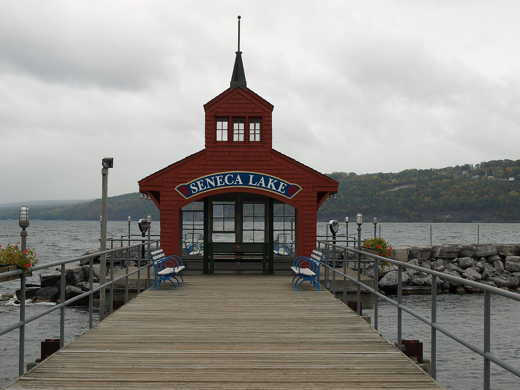
The attached picture is from our 15th anniversery trip to Seneca Lake NY. The day was as you can see very gray and at some points rainy. Anyhow I did take a few pics and I would like to see if this one can be improved a little bit.
Therein lies the problem, and the best I can explain it is this, I can do basic adjustments in Elements(what I have), and can convert to B&W but haven't been happy with that part yet. So the problem is since I don't really know WHAT can be done, I am not sure how to improve my technique. Does that make sense?
I see a lot of pics that are great but I rarely see the "before" shot so I have a problem reverse engineering it. So I am asking if some folks would liek to take this pic and convert to B&W and punch it up a little if possible. I would liek to matte and frame it, 5x7 min but would like to 8x10 if it's worthy. haha
I can e-mail full size if you'd like
Then I can get a better idea of what's possible in the future with some of the pics I have that I feel are dull.
0
Comments
-Convert to black and white
-Darken the sky
-Darken the wood in the foreground
-Lighten the building
-Add a curves adjustment layer to up the contrast a little
That will really draw the reader in. Also, if you wanted, cloning out the Seneca Lake on the blue banner wouldn't be a bad idea.
Save $5 on a new Smugmug Membership
Host your website for just $3.45/mo with JustHost - Rated best web host of 2010
See my profile for a gear list & more
http://nikonic1.smugmug.com/
Where I struggle yet is darkening(or lightening) specific areas. I have Elements so I don't have curves, just levels. I used selection tool to grab the sky and put it on a seperate layer but how do I darken it seperately?
Just curious why clone out the name? Draws to the eye too much?
http://dynamicsportsimages.com/
Does your version of elements have a shadows/highlights adjustment? If so I'd try using the shadow tool to add a little fill light to the image to brighten the wooden structures.
I actually like shooting when the sky is overcast, as there is less worrying about highlight blowouts. (Lucky I live in Rochester, eh?) However, for this image I think the comparatively bright sky may have fooled your camera's meter. Next time you might want to try spot metering on the building and see if that gets you closer to what you want. Alternately, depending on how close you were, you could try using your camera's flash with a relatively low shutter speed to evenly light this scene.
FWIW, I'm really appreciating how easily Lightroom makes basic adjustments to photos, including curves, exposures, tones, etc., as well as straightening (cropping....). For its cost, it is really a worthwhile investment is time savings.
Canon 50D, 30D and Digital Rebel (plus some old friends - FTB and AE1)
Long-time amateur.....wishing for more time to play
Autocross and Track junkie
tonyp.smugmug.com
- Boost the exposure a tad.
- Give it a good dose of fill light.
- Tweak the blacks a bit to reduce the haze
- Boost the brightness some, but not enough to lose too much detail in the sky.
- Boost the clarity and vibrance to taste.
I think you'll be surprised what about a minute's work can do.
Richard,
Thanks, I didn't realize I could open JPG in ACR...but I can!! That seemed to give me a little more flexibility than just the Levels adjustment layer(no Curves or Shadow/Highlight in Elements, but going thru ACR yes!!). I shoot RAW and like the flexibility that gives me obviousy and now I know I have some of those same options for JPEG.
A note....I took this shot about 4 moths after buying my first camera(E510) which was over a year ago. I have learned quite a bit over that time so this isn't the best shot I know, but it is one I wanted to see if I could improve on in PP.
Here is my attempt at following Richards steps and it definitely made it better. One additional thing I did was to select the sky with the quick selection tool and applied a levels adjustment to that(figured out how to do that since my original post sorry) because I just couldn't pull any detail out of the sky without affecting the overall pic too much. I like the look of the sky but you can definitely see the edges of the selection. Next thing I'll learn is how to minimize that.
But this defintely gives me more to work with. Thanks a lot for all the answers!
http://dynamicsportsimages.com/
The only thing I might suggest to improve is to look at cloning out the large square post on the left side. Probably easier said than done, but it is distracting to my eye.
Canon 50D, 30D and Digital Rebel (plus some old friends - FTB and AE1)
Long-time amateur.....wishing for more time to play
Autocross and Track junkie
tonyp.smugmug.com
http://www.realphotoman.com/
Work in progress
http://www.realphotoman.net/ Zenfolio 10% off Referral Code: 1KH-5HX-5HU
WOW!! That's pretty impressive!! Nice job. How did you do it?
http://dynamicsportsimages.com/
Look at the photo. What's the first thing that jumps off? "Seneca Lake". It's near center and its one of the brightest things in the frame.
What I think depends on the situation and the viewer is whether that's bad or not. If Seneca Lake was going to use this for a promotion, this might make sense. Or if the text for whatever reason was important to telling the story of the image. But for this image, I would say that it doesn't really contribute anything, but it does capture the viewer's eye.
Save $5 on a new Smugmug Membership
Host your website for just $3.45/mo with JustHost - Rated best web host of 2010
See my profile for a gear list & more
Brian, it is usually best to make the edits to the colour image, before going to black and white. The colour information in the file can be used to make easier selective edits and additionally, results are often smoother when the edits are applied to colour (three channels) - than when applied to a single channel (black and white, even in RGB all the info is the same R=G=B).
I know that you now know about using the Adobe Raw converter for non-raw camera files...however there are other options for Elements!
The curves found in the Adobe raw converter do not work the same way as in Photoshop or other common image editors. The raw curves adjust tone and saturation at the same time, while attempting to lock the hue. Regular Photoshop curves can affect the "single" RGB composite/master channel or the separate R, G or B channels - and the edits can also be altered by Photoshop layer blending modes such as luminosity.
Depending on your version of Elements, there is a free add-on toolset that will give you more tools, including curves and channel mixer!
Author Richard Lynch has produced various books titled "Hidden Power of Photoshop Elements" - it also came with a CD with various free add-on tools. The site appears to be down at the moment, however you may find the tools on other sites via Google.
http://www.earthboundlight.com/phototips/photoshop-elements-curves.html
As Elements accepts standard third party Photoshop plug-ins, you may even find a free or pay plug for curves or other features:
http://free.pages.at/easyfilter/curves.html
http://www.curvemeister.com/
Regards,
Stephen Marsh
http://members.ozemail.com.au/~binaryfx/
http://prepression.blogspot.com/
http://members.ozemail.com.au/~binaryfx/
http://prepression.blogspot.com/
Mark, I agree and thanks for pointing out this basic but very important point!
I have many years experience in post processing due to my prepress background...however I am a newb when it comes to serious photography.
I am learning from trial and error (mostly error) that metering is so important, as often my shots are less than ideal due to the sky being brighter than the subject. I have been shooting raw and bracketed exposures to help with this issue, however they only go so far and the correct metering would often be a better solution.
The great thing about raw is that one can often pull out more detail from the highlights with negative exposure and or highlight recovery features of various raw converters. One can then make two different renderings of the raw data and merge them together.
Sincerely,
Stephen Marsh
http://members.ozemail.com.au/~binaryfx/
http://prepression.blogspot.com/
http://members.ozemail.com.au/~binaryfx/
http://prepression.blogspot.com/
There are a few ways to help with this, the first being a very good selection!
Rather than using a selection tool, the best masks or selections are generally created from existing channel content using the pixels in the image.
Over and above selection methods, often blending modes can help a great deal. For example:
1) Starting with a raw image, render the image for the building with appropriate exposure and other settings - forget about the sky blowing out.
2) Render a second image with negative exposure to bring out the sky details.
3) Layer the sky image over the building image in PS or PSE.
4) Change the upper sky image layer to say DARKEN blend mode.
You may or may not need a layer mask or selection at this point depending on variables.
5) The selection or layer mask may not have to be very accurate if you are using a blending mode such as darken.
The idea being that layer or channel blends are often more natural than a selection or mask. This can create a better
blend/transition into the landscape.
Stephen Marsh
http://members.ozemail.com.au/~binaryfx/
http://prepression.blogspot.com/
http://members.ozemail.com.au/~binaryfx/
http://prepression.blogspot.com/
I use CS3 and I don't know if Elements has all the same tools, but here's what I did:
1. Levels: Moved the right slider ever so slightly so it fell right under the right side of the graph.
2. Shadows/Highlights: Moved the Shadows slider to about 20 to bring details out of the shadows. Moved the Highlights slider to about 20 to reduce what I perceive as glare and to bring details out as well.
3. Exposure: Bumped the exposure ever so slightly.
4. Applied LAB Curves and Sharpening which makes the colors and contrast pop when applied judiciously. Here's the tutorial for that. I just created an action for that and it works pretty well most of the time.
5. Reduced the Highlights slightly to reduce the glare sometimes produced by the LAB Curves.
That's it for the color version.
I really suck at B&W conversions but here's my attempt. I'm sure others can do much better.
Let me know how you like it.
www.socalimages.com
Artistically & Creatively Challenged
http://www.realphotoman.com/
Work in progress
http://www.realphotoman.net/ Zenfolio 10% off Referral Code: 1KH-5HX-5HU
Your processing of this image is OK, but the copy you posted is sharpened about 3 times more than it needs to be. Maybe that's just the display copy, but there's artifacts all over the place.
Save $5 on a new Smugmug Membership
Host your website for just $3.45/mo with JustHost - Rated best web host of 2010
See my profile for a gear list & more
www.socalimages.com
Artistically & Creatively Challenged
Is this better?
PS: I don't mean to hijack the OP's thread ... just trying to answer his question on how to he might improve the shot.
www.socalimages.com
Artistically & Creatively Challenged
I really like the B&W version. I might suggest working on the sky a bit as that would really add to the picture.
That's true. But as the poster above said, he did sharpen it more. Without additional sharpening it looks much better.
Save $5 on a new Smugmug Membership
Host your website for just $3.45/mo with JustHost - Rated best web host of 2010
See my profile for a gear list & more
* Shadows/Highlights
* Simple curves tweaks
* Some vibrance and saturation
* Some sharpening
www.socalimages.com
Artistically & Creatively Challenged