Options
New here my first share CC welcome!
At this point I am a mom with a camera but I have always dreamed of doing more with it!
That stated here is what I got of my 8.5yr old today.
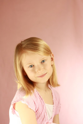
SOOC ISO 800 f3.2 tv 1/1250
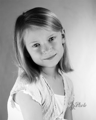
Here is my B&W I did in PSE9.0
If you have any advice on the best place to learn please let me know as the nearest school that offers any courses is over an hour away. I have self taught just by reading forums online. I have a bunch of friends that really want me to jump into business but I don't feel ready.
That stated here is what I got of my 8.5yr old today.
SOOC ISO 800 f3.2 tv 1/1250
Here is my B&W I did in PSE9.0
If you have any advice on the best place to learn please let me know as the nearest school that offers any courses is over an hour away. I have self taught just by reading forums online. I have a bunch of friends that really want me to jump into business but I don't feel ready.
Liza
0
Comments
www.cameraone.biz
The rest of the photo is sort of plain. More of a school photo type thing. Your lighting is very basic and sort of flat, but all of that comes with practice and time shooting! You'll get there!
She is absolutely adorable... perfect to practice on! Bribe her with silly photos and she'll let you practice on her!
http://www.scotthofferphotography.com
Here are two others SOOC
This is my pull back of the room but today I had the backdrop at a 90degree from the window covering up where the door is.
Go for 8" X 10" or bigger, there is always time for cropping.
WELCOME.
Y.
^here is my SOOC f 4.5 TV 1/640 ISO 1600
Here is my pull back
B&W
IMO the most pleasing of your images is the one where your daughter is holding the "E", You have what's known as split lighting. Very simple, but in this case it works nicely because of the softness you get from the large light source. Some work with levels will make that a keeper.
The image above that is approaching perfection as an example of what we (unkindly) call "horror lighting." The main source of light is below, shining upward. See the shadows on her cheeks under her eyes? Those areas should be lighter than the areas lower on her cheeks, below her cheekbones. You will often use a reflector to get a little light under the chin, but that's only when you have good light from above. You almost NEVER want stronger light from below the face. Unless the cute girl is really an axe murderer.
With respect to framing your shot in camera, make sure you err on the side of having more subject than you need, not more BG. For ex: in your first image, I'd have had her head in the upper third of the viewfinder. That would have given me a lot more body and dress to crop out if I didn't want it. The way you shot it, you don't have the option.
I like your ingenuity in using what you have to modify your light sources. If you're going to continue shooting with available light, GET A TRIPOD. Lower your ISO. your images will thank you.
Natural selection is responsible for every living thing that exists.
D3s, D500, D5300, and way more glass than the wife knows about.