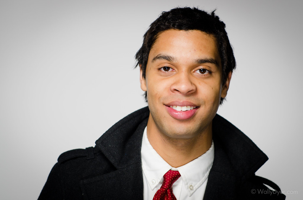
Of the two, I prefer the second one. The light on the first one looks like it might be a little to flat (i.e., straight-on) for him. With the second one, he's angled his face a little bit and so the light is a little more flattering. In post, I would bump up the background to a more pure white color, clean up some of the stray hairs (unless you want them in for a reason) and retouch the skin a little bit.
I don't know if you're a Creative Live watcher, but I watched one with Zach and Jody Gray recently and one type of lighting they suggested for men is to put the main light at 45 degrees to one side of the subject. This helps define the angles of the face. You may need a reflector or something for a little bit of fill on the other side if you want something that is not too dramatic. It might be worth trying just to see whether you like the look.
I love that you are shooting with a low aperture... it gives it a really nice feel and keeps focus on the face. Again, I think the second one is stronger, and with some of the minor tweaks I mentioned above, it has the potential to be a really great shot
It would help to know the intended use - actor, model, general not-performing-arts headshot, business.... Hard to tell from the images alone.
1 Prefer #1, although I"d have had the subject tilt their head by dropping their nose just a tad so the nostrils weren't so prominent. Not a big deal, but might have been more flattering.
2. If this was intended as hi key, the bg isn't bright enough; if not intended as hi key, then the bg reads as unevenly lit (although it's better in #1)
3. Skin tone is a tiny bit too yellow for me on this monitor, but given I'm in skin-tone hell at the moment, I'll demur to others' opinions on that.
4. Nice expression in #1. #2 is a bit pucker-up, pesudo-pouty for me.
5. The overcoat makes it feel a little more casual/trendy. I actually prefer just the suit in #2 (although again, that depends on intended use), but the expression and uneven light kill it for me.
HTH!!
PS Zoomer, in Actor Headshotland, portraits shot in landscape orientation is very popular. Most people will get both (and it's easy enough to crop one into the other), but you see a TON of landscape headshots these days
#1 is my favorite of the 2. If these are supposed to be actor headshots, #1 is a bit confusing. It reads as a commercial headshot (high key and very smiley), but the clothes aren't commercial (usually you would expect sporty and bright clothes). The background lighting doesn't work for me in either. Like divamum, I'd prefer overlit white if you want it high key. The uneven gray feels dull. The lighting on his face is OK, but I'd rather the main light be a bit higher to add some depth and move the catchlight from the very middle of his eye to the top (it looks like you were using on camera flash, perhaps?). And just a little nit: I hate the way his collar is wrinkling against his neck -- not your fault, but I'd fix it in PS.
I appreciate the constructive criticism guys. I read what you each wrote a couple of times going back and forth between your posts and the pictures lol. (lunch was definitely not on me lol).
I like not saying what the purpose of the pictures is even though I know exactly what they're for. I'll try to post some reedits later
How about some hair light, backlight, shoulder light ... It would go a long way to adding some dimension ... Nice shots...
Add the light... You'll see... Pun intended:)
Wally... I've gone back and looked at these a few times... I don't find the gray bg objectionable at all... but like i wrote above... where's the light man...?
And tell that cat to press his freaking collar...
I'm a Kidnapper... I take terrible pictures of people, then hold them for ransom.
These are great! I prefer #2, for his outfit and also because in #1 there's a dark shadow just to the side of his left eye. I would love to see one of him smiling in the suit! He looks comfortable and relaxed, and I find that's the most critical aspect of a headshot shoot. So well done there!
Also as a side note, I'm an oddball - I don't know about the rest of everyone, but I have a weirdly hard time critiquing headshots that aren't cropped to 8x10.

Comments
I don't know if you're a Creative Live watcher, but I watched one with Zach and Jody Gray recently and one type of lighting they suggested for men is to put the main light at 45 degrees to one side of the subject. This helps define the angles of the face. You may need a reflector or something for a little bit of fill on the other side if you want something that is not too dramatic. It might be worth trying just to see whether you like the look.
I love that you are shooting with a low aperture... it gives it a really nice feel and keeps focus on the face. Again, I think the second one is stronger, and with some of the minor tweaks I mentioned above, it has the potential to be a really great shot
Spread the love! Go comment on something!
I like the first one better....the expression looks natural with more personality...like you just told him lunch is on you today.
The second looks like you just told him you were kidding.
First shot looks more casual, second more business like.
Lighting is OK in both of them. Crop is interesting, most people shoot this type of shot vertical, but this works ok also, I like the spacing.
http://www.flickr.com/photos/21695902@N06/
http://500px.com/Shockey
alloutdoor.smugmug.com
http://aoboudoirboise.smugmug.com/
1 Prefer #1, although I"d have had the subject tilt their head by dropping their nose just a tad so the nostrils weren't so prominent. Not a big deal, but might have been more flattering.
2. If this was intended as hi key, the bg isn't bright enough; if not intended as hi key, then the bg reads as unevenly lit (although it's better in #1)
3. Skin tone is a tiny bit too yellow for me on this monitor, but given I'm in skin-tone hell at the moment, I'll demur to others' opinions on that.
4. Nice expression in #1. #2 is a bit pucker-up, pesudo-pouty for me.
5. The overcoat makes it feel a little more casual/trendy. I actually prefer just the suit in #2 (although again, that depends on intended use), but the expression and uneven light kill it for me.
HTH!!
PS Zoomer, in Actor Headshotland, portraits shot in landscape orientation is very popular. Most people will get both (and it's easy enough to crop one into the other), but you see a TON of landscape headshots these days
I like not saying what the purpose of the pictures is even though I know exactly what they're for. I'll try to post some reedits later
Thanks
-Wally
Hi! I'm Wally: website | blog | facebook | IG | scotchNsniff
Nikon addict. D610, Tok 11-16, Sig 24-35, Nik 24-70/70-200vr
Add the light... You'll see... Pun intended:)
Wally... I've gone back and looked at these a few times... I don't find the gray bg objectionable at all... but like i wrote above... where's the light man...?
And tell that cat to press his freaking collar...
Cowboydoug
Certified Journeyman Commercial Photographer
www.iWasThereToo.com
http://vimeo.com/35732667
Also as a side note, I'm an oddball - I don't know about the rest of everyone, but I have a weirdly hard time critiquing headshots that aren't cropped to 8x10.