Options

A Nice Day at RMNP

hstrynrdhstrynrd Registered Users Posts: 122 Major grins
edited January 31, 2015 in Landscapes
Went for a drive to Rocky Mountain National Park mainly looking for wildlife. Not much luck with that, but the light and weather seemed to be pretty cooperative for some landscape shots. C&C welcome and appreciated.

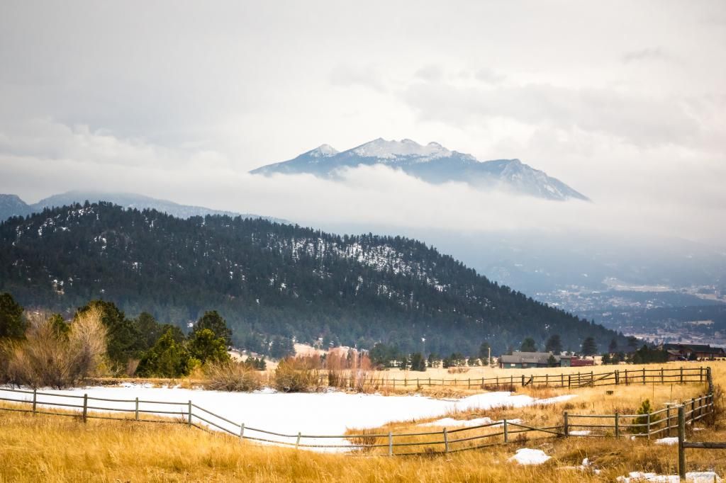
1. Our first view as we entered Estes Park, CO on our way to RMNP.
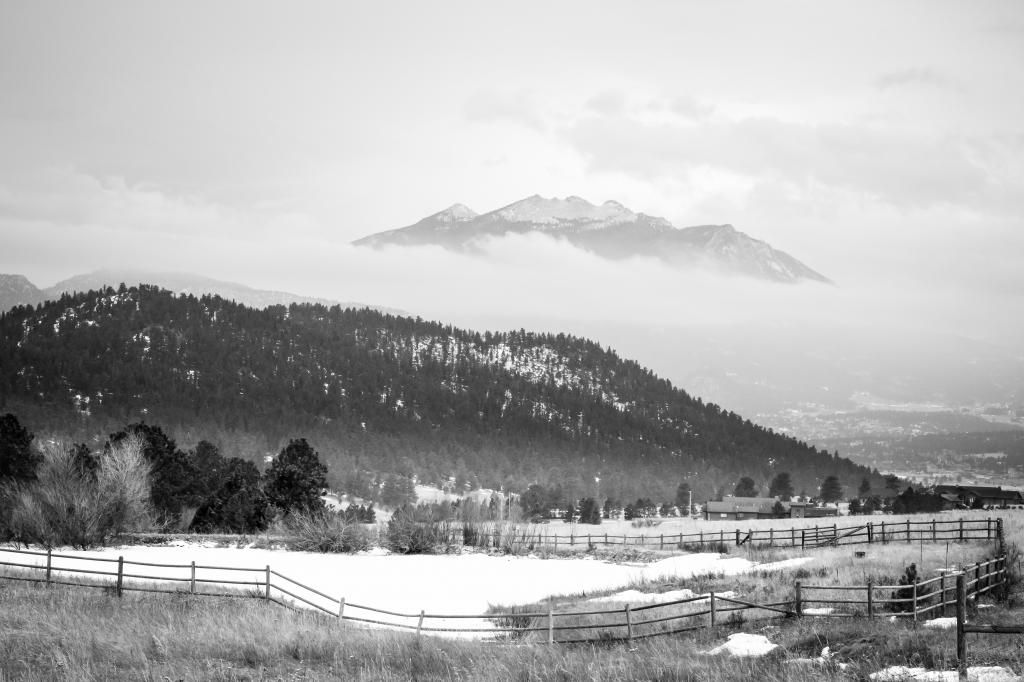
RMNP-6645_zpsf26b964f.jpg

2. B/w conversion
RMNPbw-6645_zpsc2a40c31.jpg

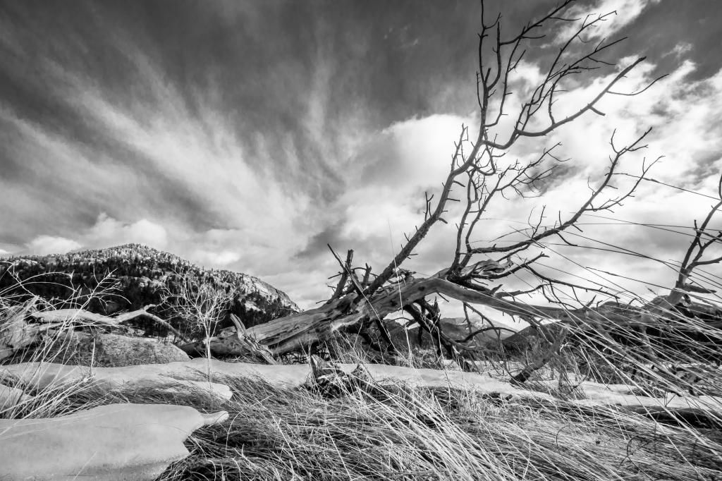
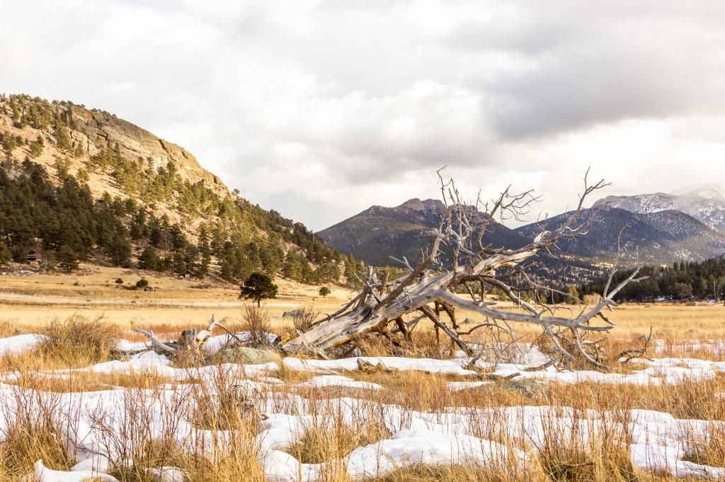
3. Saw this old fallen tree on the west side of Moraine Park in RMNP
RMNPbw-2459_zps817c2733.jpg

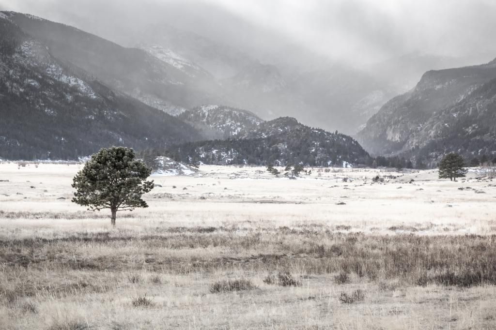
4. Shooting west into Moraine Park toward Fern Lake
RMNPbw-6653_zps4285643f.jpg

5. Another view of the fallen tree in Moraine Park
RMNP-2454_zpse7555a5c.jpg

Comments

  • Options
    StumblebumStumblebum Registered Users Posts: 8,480 Major grins
    edited January 31, 2015
    Lovely captures!
    #3 and #4iloveyou.gif
    Prefer #2 over #1.
    Cheers!
  • Options
    hstrynrdhstrynrd Registered Users Posts: 122 Major grins
    edited January 31, 2015
    Stumblebum wrote: »
    Lovely captures!
    #3 and #4iloveyou.gif
    Prefer #2 over #1.
    Cheers!

    Thanks for looking. Out of curiosity, what is it about #1 that doesn't seem to work so well? I have my suspicions, but curious what others think.
  • Options
    moose135moose135 Registered Users Posts: 1,419 Major grins
    edited January 31, 2015
    Stumblebum wrote: »
    Prefer #2 over #1.
    Same here...as to why? I think the yellow of the grass in the foreground is a little overwhelming in the frame. In B&W, it feels more balanced. Overall, a very nice series!
  • Options
    StumblebumStumblebum Registered Users Posts: 8,480 Major grins
    edited January 31, 2015
    hstrynrd wrote: »
    Thanks for looking. Out of curiosity, what is it about #1 that doesn't seem to work so well? I have my suspicions, but curious what others think.

    Just like #2 more....I think it might be cause even though yellow grass is nice pop....but it is creating slight split....between top and bottom....also somewhat cool tone above and warm below.....having said that I like #1 also.....if you din't post #2, then it probably would have given up thumbs up to #1 also!:Dthumb.gif
  • Options
    StumblebumStumblebum Registered Users Posts: 8,480 Major grins
    edited January 31, 2015
    moose135 wrote: »
    Same here...as to why? I think the yellow of the grass in the foreground is a little overwhelming in the frame. In B&W, it feels more balanced. Overall, a very nice series!

    Thanks!:D
    Seconds later I posted!
  • Options
    hstrynrdhstrynrd Registered Users Posts: 122 Major grins
    edited January 31, 2015
    moose135 wrote: »
    Same here...as to why? I think the yellow of the grass in the foreground is a little overwhelming in the frame. In B&W, it feels more balanced. Overall, a very nice series!

    That's exactly what I was thinking. I was torn about the yellow grass. Thanks for the feedback.
  • Options
    hstrynrdhstrynrd Registered Users Posts: 122 Major grins
    edited January 31, 2015
    Stumblebum wrote: »
    Just like #2 more....I think it might be cause even though yellow grass is nice pop....but it is creating slight split....between top and bottom....also somewhat cool tone above and warm below.....having said that I like #1 also.....if you din't post #2, then it probably would have given up thumbs up to #1 also!:Dthumb.gif

    That's what I was guessing. Thanks for the critique.
Sign In or Register to comment.