I agree with Greaper and like the first one better. The second one has a lot of blown highlights that are distracting. It looks like you may have lost them in post? If you post the original color file, maybe we can figure out a way to get the detail back.
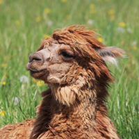
Definitely like the composition of the first photo. On my monitor, the picture is a little dark. I would like to see slightly less contrast and more midtones upper mid tones. I think it would give it a softer more tranquil feel.
Definitely like the composition of the first photo. On my monitor, the picture is a little dark. I would like to see slightly less contrast and more midtones upper mid tones. I think it would give it a softer more tranquil feel.
Brad
I agree that a softer, less contrasty tonality might give it a softer look, but the original seems to have been shot in harsh sun with backlighting, so it may be difficult to make the image real soft light - diffuse glow maybe? Lynn IS the expert at that!
 lynnma
Registered Users, Retired Mod Posts: 5,207 Major grins
lynnma
Registered Users, Retired Mod Posts: 5,207 Major grins


Comments
Dave
http://www.lifekapptured.com (gallery)
Brad
www.digismile.ca
I'm not sure about this one either... I thought maybe it would look better in black and white...
I agree that a softer, less contrasty tonality might give it a softer look, but the original seems to have been shot in harsh sun with backlighting, so it may be difficult to make the image real soft light - diffuse glow maybe? Lynn IS the expert at that!
Moderator of the Technique Forum and Finishing School on Dgrin