Options
SF3 - Pyro
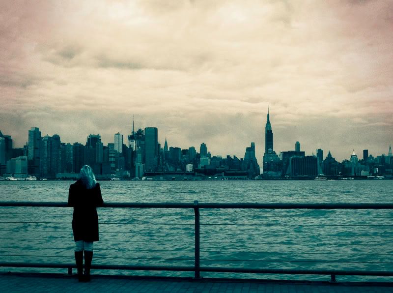
What do you think, I have some ideas for a title, but first I wanted to get some feedback from you guys.


latest:
Six Years Later, and the Rain Still Won't Stop
latest:
Six Years Later, and the Rain Still Won't Stop
0
Comments
I like #2 more (#1 is way too noisy), but I would explore other directions also
Nikon D300
Nikon 70-200mm f/2.8
Nikon 18-200mm f/3.5-5.6
Nikon 50mm f/1.8D
[SIZE=-3]Mary Beth Glasmann Photography[/SIZE]
The clouds in the sky are pretty dramatic but the yellow treatment you gave the sky looks a bit off. What does the original look like in B&W with curves applied to the clouds in the sky to give it a really ominous feel?
http://lrichters.smugmug.com
I'd curious to see the clouds a little less sallow-looking and a smidge warmer. I like the idea of the complementary colors between the top and bottom parts of the frame, and I wonder if going for it fully, by making the sky closer to orange, would help or hurt the overall feeling.
Very nice idea and composition overall.
For me, the message isn't totally clear although I get the general feeling that you are trying to portray the lonely, faceless, impersonal side of city life and I think the noise adds to that message, though I'd also agree with Nikolai that it's worth still persuing something more.
Only other comment is in relation to the file size which I'm surprised that for the simplicity of the tones the files are 410 and 360 KB each. I would have thought that you could get a much more compact file than that and still maintain the quality.
Regards,
Peter
As for the composition, I'd be tempted to crop out the top below the dark spot in the cloud, or just above it, and on the bottom just below the rail and the first wire......
www.HoofClix.com / Personal Facebook / Facebook Page
and I do believe its true.. that there are roads left in both of our shoes..
Six Years Later, and the Rain Still Won't Stop
pyroPrints.com/5819572 The Photo Section
Great cartoon!!!
:lol
http://lrichters.smugmug.com
Photoshopped? you want photoshopped? Don't make me break out Rule 34 on you
pyroPrints.com/5819572 The Photo Section
www.HoofClix.com / Personal Facebook / Facebook Page
and I do believe its true.. that there are roads left in both of our shoes..
(And being a Red Sox fan, maybe what's missing from that city is Joe Torre..)
www.HoofClix.com / Personal Facebook / Facebook Page
and I do believe its true.. that there are roads left in both of our shoes..
That would be harsh if I was a fan =cP
I'm still considering doing some work on it. But thank you for the "desktop" compliment
So is this what you were talking about?
vs old:
PS: Is the title too subtle? I don't really wanna come on strong with it, but I want the people to get it.
pyroPrints.com/5819572 The Photo Section
www.HoofClix.com / Personal Facebook / Facebook Page
and I do believe its true.. that there are roads left in both of our shoes..
Put up a photobucket version.
pyroPrints.com/5819572 The Photo Section
www.HoofClix.com / Personal Facebook / Facebook Page
and I do believe its true.. that there are roads left in both of our shoes..
That's a little too much for me. I think I'll keep it at a current crop
pyroPrints.com/5819572 The Photo Section
Honestly, this would look GREAT as a pano, but I'd rather see it as an extension of the original image, not a crop of the original.... To give you more of a feeling that she's just so over the feel of everything - that's it's really opressing even more.
But I think I really like it as is....
As for the title, at first I was like "whatever". But then as it sunk in, I really like it. Maybe in all small letters? No caps? Or is that silly. Almost like she's resigned to it.
Anyway, great shot! (And I LOVED your winner in the last contest! Sorry I never said anything.... And thanks for all the encouragement! VERY helpful! I was still shocked I won with it, though.)
www.tippiepics.com