Options
Using Color to enhance B&W (Neat tip)
Ok so I will share one secret tip, one that I have discovered alone and haven't read about anywhere. Its a bit hard to explain though but here goes:
The idea is mixing two (or more) adjustment layers:
1- Black & White
2- Color Balance/Hue and Sat/Channel Mixer - Any color related adjustment layer.
For now we will use the Color Balance
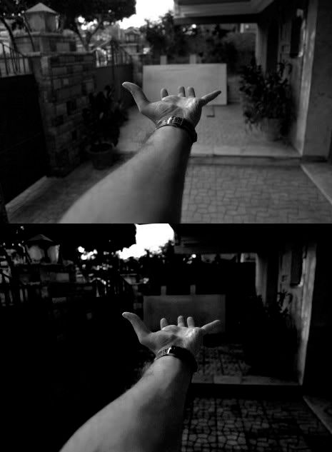
Original Photo:
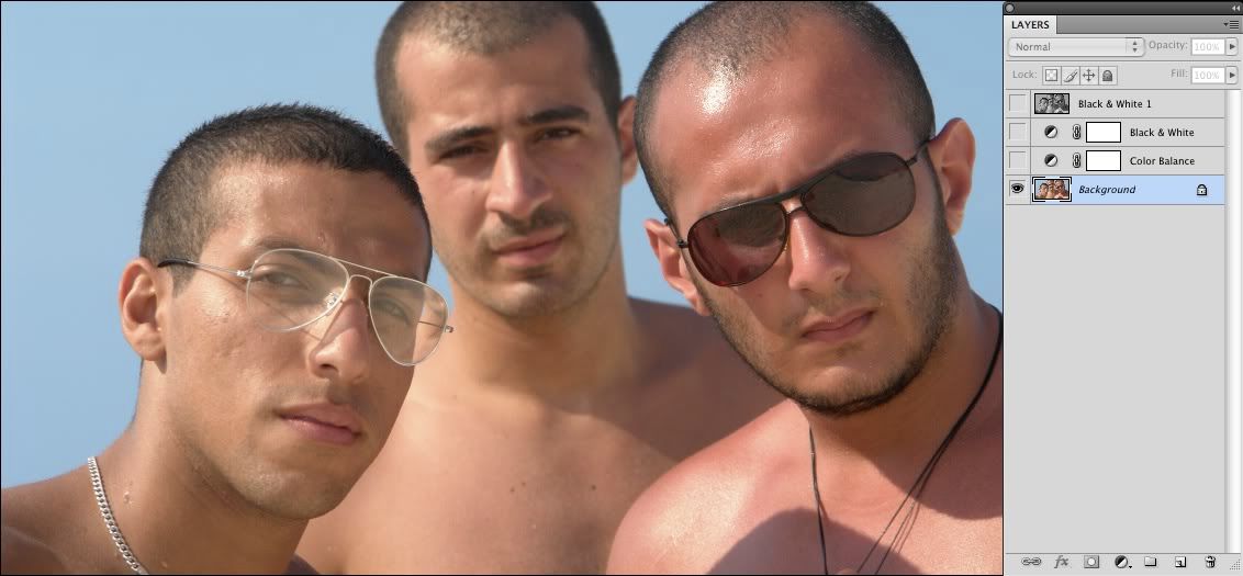
1- First apply a B&W adjustment layer to your image and play with the sliders till you get an overall look that you like.
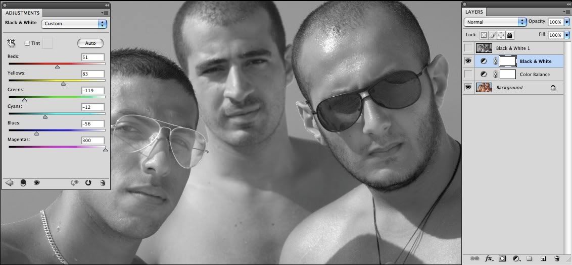
2- Beneath that B&W adjustment layer (In between the B&W and the Original pic that is) apply a Color Balance adjustment layer and play around with the sliders.
3- Alternate between both adjustment layers and see the possibilities.
This is how the image looks like with only the color balance layer applied. Of course it's wrong looking, but thats the point, you fake the colors in order to look good in black and white
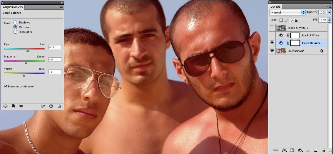
Hint: They order has to end with a B&W layer on top.
What we are doing here is setting black and white according to a certain mix between channels. Now, sometimes we can't reach a certain look with the black & white adjustment layer. What the other channel does, is that it enables us to move certain areas in the image from a color territory to another while in the same time the black and white adjustment layer hasn't changed. You can mix up to hellmillion layers on top of each other that may allow you to get total control of how your black and white composition looks like.
That is the difference, its a minimized difference to what you're able to achieve, while you may think the difference could be achieved with a Curves of a Levels adjustment layer, you are wrong. Its only that this picture didn't have so much color involved in it to start with. You have to try for yourself.
With this technique, you can never count the possibilities of lighting and darkening specific parts in an image set to Black and white.
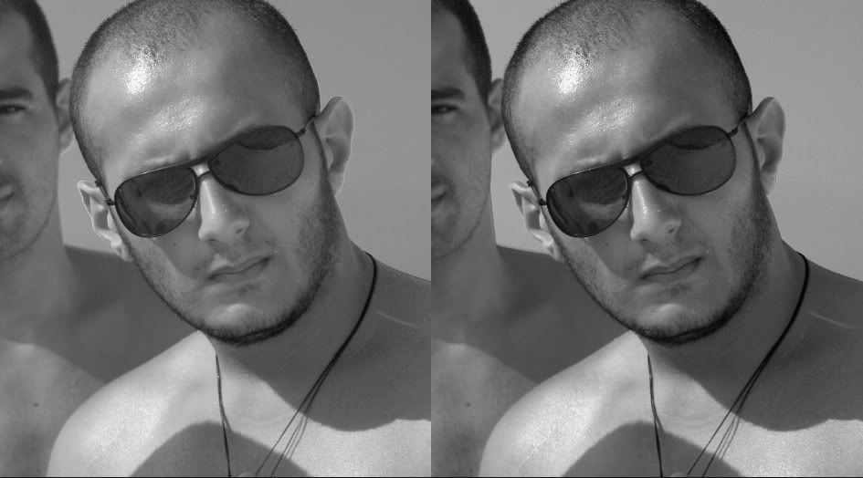
Here's an <b>extreme</b> example of what this can make. Completely altered the Luminance channel without applying and kind of masks, only used the CB and H&S adjustment layers underneath the B&W adjustment layer.
The idea is mixing two (or more) adjustment layers:
1- Black & White
2- Color Balance/Hue and Sat/Channel Mixer - Any color related adjustment layer.
For now we will use the Color Balance
Original Photo:
1- First apply a B&W adjustment layer to your image and play with the sliders till you get an overall look that you like.
2- Beneath that B&W adjustment layer (In between the B&W and the Original pic that is) apply a Color Balance adjustment layer and play around with the sliders.
3- Alternate between both adjustment layers and see the possibilities.
This is how the image looks like with only the color balance layer applied. Of course it's wrong looking, but thats the point, you fake the colors in order to look good in black and white
Hint: They order has to end with a B&W layer on top.
What we are doing here is setting black and white according to a certain mix between channels. Now, sometimes we can't reach a certain look with the black & white adjustment layer. What the other channel does, is that it enables us to move certain areas in the image from a color territory to another while in the same time the black and white adjustment layer hasn't changed. You can mix up to hellmillion layers on top of each other that may allow you to get total control of how your black and white composition looks like.
That is the difference, its a minimized difference to what you're able to achieve, while you may think the difference could be achieved with a Curves of a Levels adjustment layer, you are wrong. Its only that this picture didn't have so much color involved in it to start with. You have to try for yourself.
With this technique, you can never count the possibilities of lighting and darkening specific parts in an image set to Black and white.
Here's an <b>extreme</b> example of what this can make. Completely altered the Luminance channel without applying and kind of masks, only used the CB and H&S adjustment layers underneath the B&W adjustment layer.
In the dawn, an angel was dancing. Surrounded by an aura of light.
But in the shadows, Vysionous was watching, and with patience awaiting the night.
http://vysionous.deviantart.com
But in the shadows, Vysionous was watching, and with patience awaiting the night.
http://vysionous.deviantart.com
0
Comments
*
http://member.onemodelplace.com/member.cfm?P_ID=214042
Here is a link within Finishing School to an overview of this chapter.
http://dgrin.com/showthread.php?t=52724
Hey thanks for the referral, I've skimmed through the article now as I saw your link. I though think this technique is quite a bit different. Here I am using the B&W adjustment layer which is different than the channel mixer, it offers me 6 sliders instead of 3, plus the 9 sliders in the color balance dialog 3x3 in Shadows, Midtones and Highlights. Not to mention if you applied an a Hue and Sat adjustment layer as well giving you more options + the lightness slider for each color.
Its talking about mixing the channels to get a good B&W mix. I'm here <b>changing</b> the colors to get a good B&W mix.
Maybe I haven't read it well, as I said I just skimmed through, but from what I see, its a completely different approach yielding to completely more diverse results.
But in the shadows, Vysionous was watching, and with patience awaiting the night.
http://vysionous.deviantart.com
Anytime Richard, glad you found of of help.
But in the shadows, Vysionous was watching, and with patience awaiting the night.
http://vysionous.deviantart.com
I may have jumped to conclusions with your technique. To be honest as soon as I read that you don't care what it looks like in color, it made me think of this chapter, because that is exactly what Dan Margulis says in his chapter. I think the technique is different, but the concept may be the same. Regardless, I appreciate you spending the time to teach us new things. I think that your technique is possibly more powerfull because of the number of sliders you can use compared to Dan's.
I hope it to come to your good use one day.
But in the shadows, Vysionous was watching, and with patience awaiting the night.
http://vysionous.deviantart.com
I think there's nothing that can be done here that can't be done using Dan's techniques of curves and channel mixing. However, I suspect that few of us here have Dan's total understanding of what needs to be done to get the desired result after conversion. I know I certainly don't, not by a long shot. The B&W conversion layer in CS3 came after Dan's book was published, and it has been a game changer for me because I can keep mucking with sliders till I get it right and still not take too long. Having more sliders means even more mucking is possible, but at a certain point that can become counterproductive if you don't really have a game plan in mind.
As hue and saturation informtion does not exist in B&W, a good final mono conversion often looks very strange in full colour. This is a concept that is universal in most mono conversions that use alteration of hue, saturation or tone before the conversion to mono.
The technique in the OP is perhaps closer to the method that was made popular by Russell Brown of Adobe, which has mostly been superceeded by the new tools in later versions of ACR/ALR/Photoshop.
Russell's old method was more interactive (push the sliders and watch what happens), which is similar to the method in the OP from Vysionous - where as Dan was going at things from an evaluation and planned blending approach that was not as interactive.
The more options and tools the better, as what works well on one image may not work so well on another.
Here is a QT movie of the RB method:
http://av.adobe.com/russellbrown/ColortoBW.mov
Another use for the B&W command, this time for colour tonal editing:
http://members.ozemail.com.au/~binaryfx/howto_lumabw.html
Stephen Marsh
http://members.ozemail.com.au/~binaryfx/
http://prepression.blogspot.com/
http://members.ozemail.com.au/~binaryfx/
http://prepression.blogspot.com/