Im begging nowI have 5 more weddings coming up and would love some feedback. Heres some background, I wasnt the main photog for this wedding but was asked to shoot it, I hung back so I would be in the way. I used it as a wedding refresher as all of my weddings are later this summer starting tomorrow. Is this not the forum for this, is this more portrait based photography? Thanks for your time.
You are in the right place .....Dont think there is any reason to be mean to you with these.(or for any other reason) These are good. I havent done any weddings so I am no pro but they look like they are going in the right direction.
I definitly like 4,5,6 the best. The expression on her face in 5 is priceless....
You might want to number them for easier feedback......
Congrats on a job well done......
Thank you very much!!! Thanks, Im not sure why I didnt number them in the first place
In general I think they are pretty good. pretty standard shots. The all blurry one is interesting, I can't decide if I like it or not.
General feedback per photo...
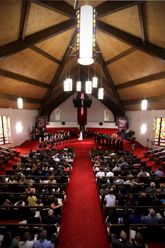
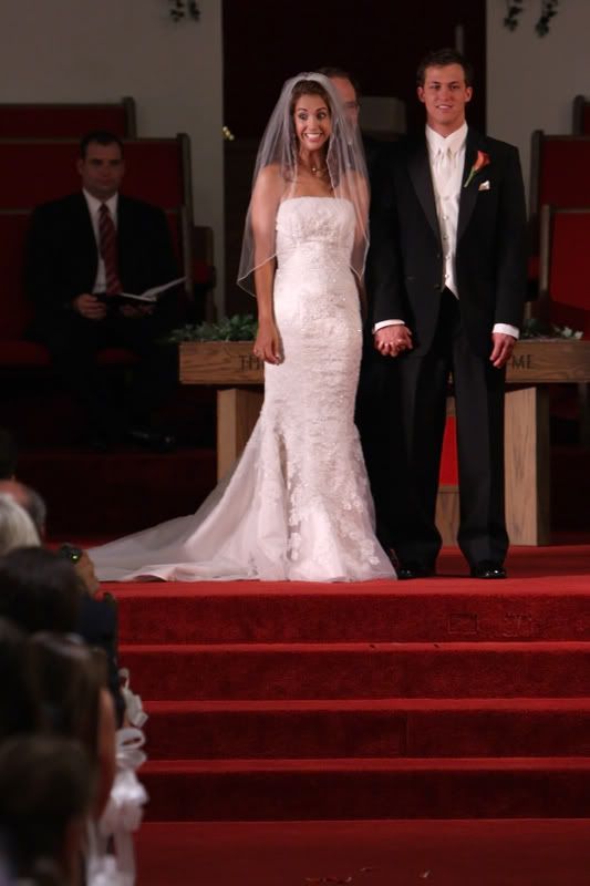
1. nice shot... gives a good idea of what everything looked like and how many people there were.
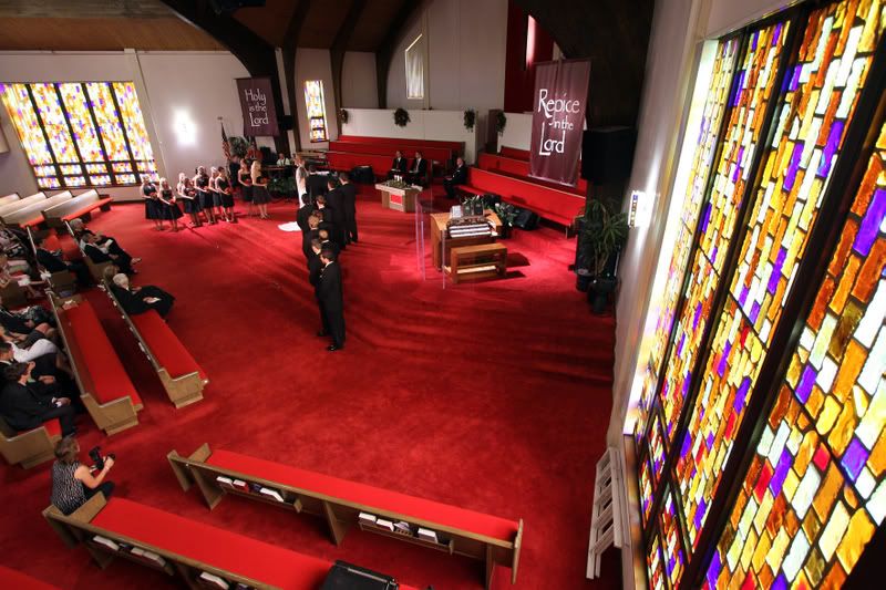
2. another nice shot, I like the angle. I would probably like it a bit more if you were able to clone or crop out the other photographer
3. another nice shot of the whole session. I think a bit more contrast may have been good but that's just my opinion.
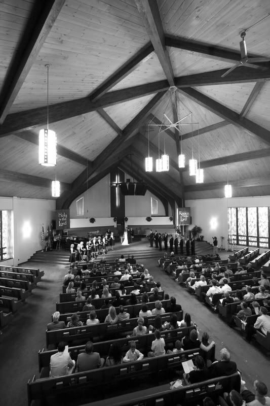
4. pretty nice, a bit noisy, but that's often ok particularly in B&W I find it a bit soft for my tastes, but may just be me. I would have liked a more dead on position for this shot as well... but again that's a taste thing.
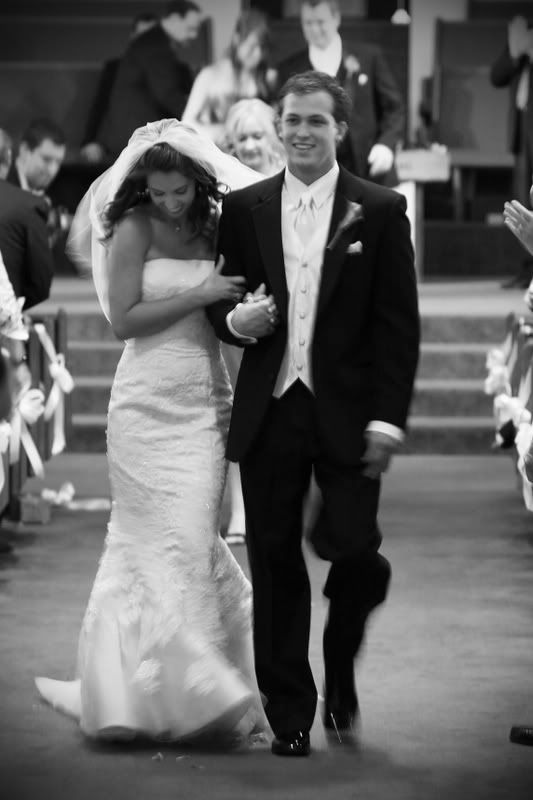
5. very uncomfortable shot. Her smile looks uncomfortabe, and he looks stiff as a board. Not much you can do about it, but I probably wouldn't show it to a client. also, I'm not a huge fan of seeing half the people on the left... just a taste thing.
6. more natural smile from her, he looks more comfortable, but this shot is way to blurry in my opinion. It's another shot that I probably wouldn't show to a client for that reason, unless you had nothing else from the recessional.
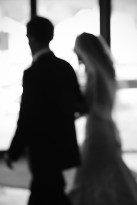
7. as I said before, I can't decide if I like it or not... I think I do as it is rather unique. I'm not quite sure how you got everything out of focus unless you used PS or something.
8. creative shot, but, in my opinion I probably wouldn't have the b&g totally in the shot if I was going to make them blurry. You could use part of them... but they probably aren't going to want to look at this much because they are so out of focus. Not counting against the shot itself just that they probably won't love it.
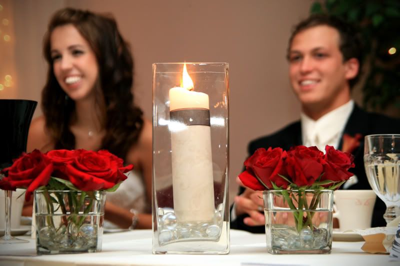
9. This is a sharp photo, but her profile makes her teeth look rather unattractive. On the bright side they both look happy and comfortable so who knows.
10. see number 5 about my opinion on the people on the left. I would probably crop them in favor of having fewer people in the shot and thus a simpler looking photo..
Take all of this with a grain of salt. I am not yet a wedding photographer, generally I just scour various forums looking at wedding galleries etc. to see what I like etc. Thus, these are just my opinions and I haven't actually had a bride tell me what work of mine she does or does not like.
In general I think they are pretty good. pretty standard shots. The all blurry one is interesting, I can't decide if I like it or not.
General feedback per photo...
1. nice shot... gives a good idea of what everything looked like and how many people there were.
2. another nice shot, I like the angle. I would probably like it a bit more if you were able to clone or crop out the other photographer
Yeah I should probably clone her out.
3. another nice shot of the whole session. I think a bit more contrast may have been good but that's just my opinion.
definitely more contrast your right.
4. pretty nice, a bit noisy, but that's often ok particularly in B&W I find it a bit soft for my tastes, but may just be me. I would have liked a more dead on position for this shot as well... but again that's a taste thing.
This is a heavy crop from up in the balcony. It is a bit soft but they love it. I have a hard time with how it looks as well.
5. very uncomfortable shot. Her smile looks uncomfortabe, and he looks stiff as a board. Not much you can do about it, but I probably wouldn't show it to a client. also, I'm not a huge fan of seeing half the people on the left... just a taste thing.
Yeah he ruins it alittle its both their versions of "what did we just do" I cropped the right side out because of the direction she was looking.
6. more natural smile from her, he looks more comfortable, but this shot is way to blurry in my opinion. It's another shot that I probably wouldn't show to a client for that reason, unless you had nothing else from the recessional.
This is their absolute favorite. I do wish it was a little sharper while still showing the motion.
7. as I said before, I can't decide if I like it or not... I think I do as it is rather unique. I'm not quite sure how you got everything out of focus unless you used PS or something.
I was panning them and this one a miss focused the rest are sharp, but I liked this one the best.
8. creative shot, but, in my opinion I probably wouldn't have the b&g totally in the shot if I was going to make them blurry. You could use part of them... but they probably aren't going to want to look at this much because they are so out of focus. Not counting against the shot itself just that they probably won't love it.
I showed this because of her teeth in #9
9. This is a sharp photo, but her profile makes her teeth look rather unattractive. On the bright side they both look happy and comfortable so who knows.
10. see number 5 about my opinion on the people on the left. I would probably crop them in favor of having fewer people in the shot and thus a simpler looking photo..
I did this because the other photographer is just outside the frame to right, and to include the two pastors in the back(her home pastors, the pastor doing the ceromony was his father) as well as the petals and the ribbons on the end of the pew's
Take all of this with a grain of salt. I am not yet a wedding photographer, generally I just scour various forums looking at wedding galleries etc. to see what I like etc. Thus, these are just my opinions and I haven't actually had a bride tell me what work of mine she does or does not like.
Thanks so much for taking the time to write all that out it is all very helpfull.... Im shooting another one this weekend, Im going to hit you up for another review here pretty soon
Nice job of covering the event. I agree with most of the former review so I won't repeat. Personally, I don't like #7 it seems something should have been in focus, a focal point. They all seem a little soft on my monitor. Maybe just a product of resizing and saving. Always happens to me. I don't know how other posters get tack sharp images into the form? Maybe someone will enlighten us. Anyway, all-in-all a great job. You'll do great at the up and coming weddings. Let us see the results.
Thank you very much ladys! They do look real soft, I just figure its photobucket and their resizing I dont link from my smugmug account(maybe I should)
Thanks again for the feed back, Im in the proccess of editing this weekends wedding so I'll post soon.
Comments
9.
10.
You can be mean, I can take it:D
I definitly like 4,5,6 the best. The expression on her face in 5 is priceless....
You might want to number them for easier feedback......
Congrats on a job well done......
www.jonbakerphotography.com
Thank you very much!!! Thanks, Im not sure why I didnt number them in the first place
General feedback per photo...
1. nice shot... gives a good idea of what everything looked like and how many people there were.
2. another nice shot, I like the angle. I would probably like it a bit more if you were able to clone or crop out the other photographer
3. another nice shot of the whole session. I think a bit more contrast may have been good but that's just my opinion.
4. pretty nice, a bit noisy, but that's often ok particularly in B&W I find it a bit soft for my tastes, but may just be me. I would have liked a more dead on position for this shot as well... but again that's a taste thing.
5. very uncomfortable shot. Her smile looks uncomfortabe, and he looks stiff as a board. Not much you can do about it, but I probably wouldn't show it to a client. also, I'm not a huge fan of seeing half the people on the left... just a taste thing.
6. more natural smile from her, he looks more comfortable, but this shot is way to blurry in my opinion. It's another shot that I probably wouldn't show to a client for that reason, unless you had nothing else from the recessional.
7. as I said before, I can't decide if I like it or not... I think I do as it is rather unique. I'm not quite sure how you got everything out of focus unless you used PS or something.
8. creative shot, but, in my opinion I probably wouldn't have the b&g totally in the shot if I was going to make them blurry. You could use part of them... but they probably aren't going to want to look at this much because they are so out of focus. Not counting against the shot itself just that they probably won't love it.
9. This is a sharp photo, but her profile makes her teeth look rather unattractive. On the bright side they both look happy and comfortable so who knows.
10. see number 5 about my opinion on the people on the left. I would probably crop them in favor of having fewer people in the shot and thus a simpler looking photo..
Take all of this with a grain of salt. I am not yet a wedding photographer, generally I just scour various forums looking at wedding galleries etc. to see what I like etc. Thus, these are just my opinions and I haven't actually had a bride tell me what work of mine she does or does not like.
-Nate
Equipment
Canon Stuff (and third party stuff as well)
Tampa Bay Wedding Photography
Thanks so much for taking the time to write all that out it is all very helpfull.... Im shooting another one this weekend, Im going to hit you up for another review here pretty soon
Thanks again for the feed back, Im in the proccess of editing this weekends wedding so I'll post soon.