Options
portfolio building e-session C&C please
 NateWagner
Registered Users Posts: 142 Major grins
NateWagner
Registered Users Posts: 142 Major grins
I have recently become friends with an engaged couple, and, as I am trying to build my portfolio I offered to take their engagement photos for free. I would like to begin charging for my work soon, and I want to know what to work on before I start doing so. Here are some shots from the session (they are actually two sessions cause the first it started pouring about 30 minutes in)
I apologize for these being relatively small. I don't like how flickr sizes things, so it was either this or something much too large.
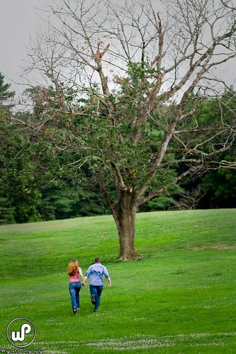
1.)
2.
3.
4.
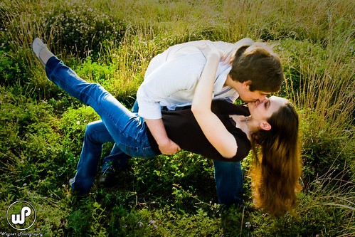
5. (I think I tend to like this sort of pose)
6.
7.
8.
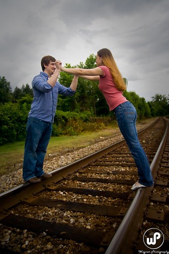
9.
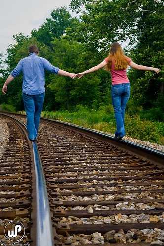
10.
11.
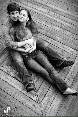
12.
They were a bit of a challenge for me because they were both very awkward in front of the camera. I worked hard to make things seem more natural, but I know that is something I need to improve on.
comments and critiques would be greatly appreciated.
I apologize for these being relatively small. I don't like how flickr sizes things, so it was either this or something much too large.
1.)
2.
3.
4.
5. (I think I tend to like this sort of pose)
6.
7.
8.
9.
10.
11.
12.
They were a bit of a challenge for me because they were both very awkward in front of the camera. I worked hard to make things seem more natural, but I know that is something I need to improve on.
comments and critiques would be greatly appreciated.
0
Comments
I like this a lot, but think it may work better in a monotone. For improvement, I think that framing with the tree a little farther right to put it in a third, and having them run up the left third of the frame...and allow a tad more time to let the sky, trees, ground fall into a thirds type composition would have been outstanding. I know that in portrature the rule of thirds cannot ALWAYS be used, but this is really a landscape, and all the elements were there with just a bit more thought into the framing.
Do you see it?
2-
I like this...maybe needs a bit more contrast...watch out for the toes at the edge. A matte or frame will cover part of her foot! Great job though.
3-
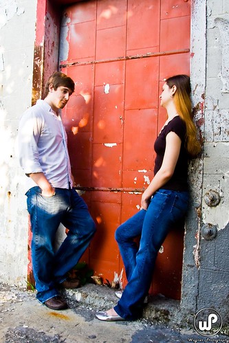
Appears a bit underexposed. I would rather see more of her face.
4-
Looks a little tilted. I like tilting, but this doesn't appear purposeful. Either tilt more....or none. Again, fingers close to the edges. I like the idea. Don't be afraid to frame looser in camera to allow for more precise cropping at print time to save fingers and toes.
5-
I am not agains dips....but the angle...and distortion from the focal length used turn me off on this one.
6-
Dappled light always looks nice when shooting the photo, but most DSLR's cannot handle the dynamic range. It ends up just being a distraction in the photo. Where's her face?
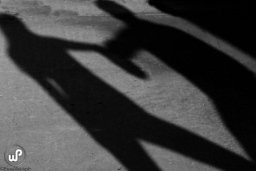
7-
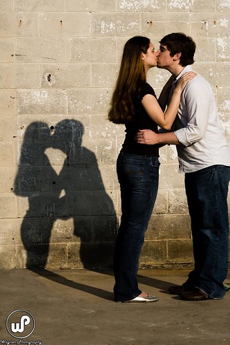
I like the play with the shadows. It has been proven in the forum that nearly kissing looks better than kissing. Search Scott Quiers posts for examples. Might also be cropped too tight against his back.
8-
But for the dappling on her shoulder....lovely.....an awesome shot.
9-
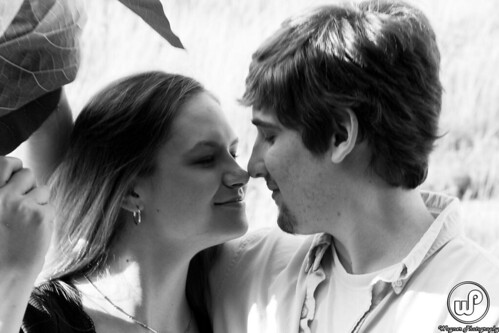
I get it....I see it....but....not sure about it.
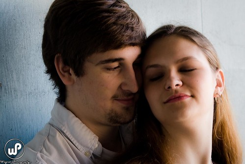
10-
He looks a bit tense, but it is still very nice. One of the best in this set.
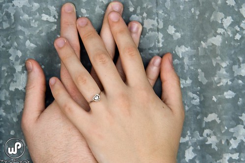
11-
I like detail shots...love em....not so sure about the galvanized metal though. BW might be the ticket here as well.
12-
Nothing technically wrong here, but not nearly as strong as some of the other compositions.
OK....there is some heavy crit! I my opinion they will be very happy, and excitedly pleased with these. There are a lot of folks out there charging for work that is far less quality than this. Room for improvement....sure.....as in any photo....but I think you have a pretty good grasp on doing this type of work for others. Get Paid!:D
Jeff
-Need help with Dgrin?; Wedding Photography Resources
-My Website - Blog - Tips for Senior Portraiture
Question for you... for each of the ones you mentioned not seeing her face, I have ones that show more of hers and less of his face. Is that preferable? or should they both always be seen?
I can see what you mean about #1, if I had been a bit more to the right and also gotten a bit more sky that could have been better composition wise.
on the bright side for number two I do have more room in the original so I can go ahead and give her more room for the feet.
On four I guess I just don't see the tilting. I wish I did cause it seems I should be able to fix it easily with a bit of a crop.
Here's another one of my shots of them dipping. is this better?
on 7 it is definitely too tight across his back. That was my mistake, I was too focused on getting it right on the left, and I missed the right a bit.
on eleven, I guess I used to do a lot of B&W so I've been working on getting my color better now, to the point where I almost never use B&W anymore. I guess I should try it more often.
Again thanks for the feedback, I greatly appreciate it, feedback of this kind is much more useful to me than "looks good".
-Nate
Equipment
Canon Stuff (and third party stuff as well)
Tampa Bay Wedding Photography
I do think they look good Nate. I was just trying to offer you something a bit deeper. I agree that "looks good" isn't much help.
I like the second dip shot less than the first.
On monotones: Most of what I do is in color also, but.....a well done contrasty BW conversion is tough to top. Look through all the old "last photog standing" threads...or any of the challenge threads and see how many of the popular photos are well executed BWs. I like to use BW as a composition tool...in such cases as when colors in the photo seem to be in conflict....and become a distraction.
Jeff
-Need help with Dgrin?; Wedding Photography Resources
-My Website - Blog - Tips for Senior Portraiture