Options
Ch37: A selection
I know it's a cliché, but this challenge was a real challenge for me.
I decided that macro/close-ups would be waaay to easy, but I didn't realise quite how hard it would be to translate patterns that I saw to a photograph.
I have one definate favourite and one maybe out of this bunch.
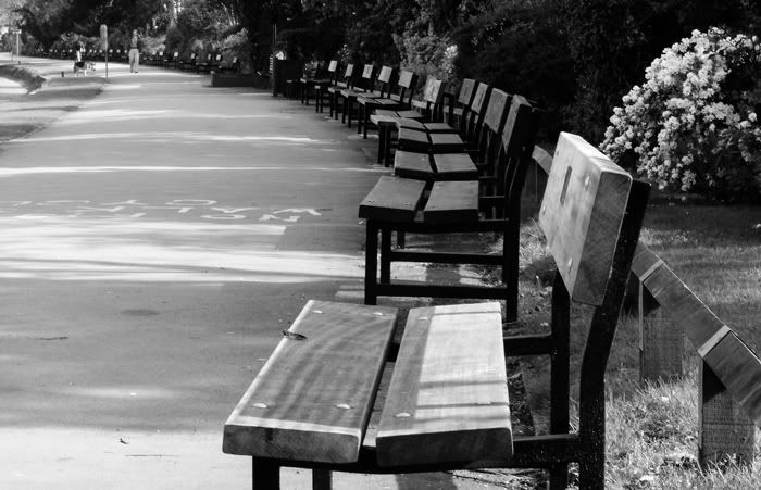
1) Empty benches.
2) Long wall

3) Trees by the Long Water - at the very end is Hampton Court Palace and this is by the man made 'pond' that's about 1km long (you can just make it out on the left)

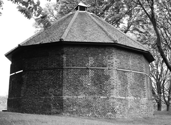
4) The Ice House - late 17th Century
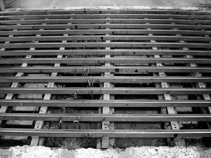
5) Cattle Grid
whad'ya think?
I decided that macro/close-ups would be waaay to easy, but I didn't realise quite how hard it would be to translate patterns that I saw to a photograph.
I have one definate favourite and one maybe out of this bunch.
1) Empty benches.
2) Long wall
3) Trees by the Long Water - at the very end is Hampton Court Palace and this is by the man made 'pond' that's about 1km long (you can just make it out on the left)
4) The Ice House - late 17th Century
5) Cattle Grid
whad'ya think?
0
Comments
maybe a slightly tighter crop, a little more contrast. I dig it for the the emptiness while still working a pattern.
And BTW, its challenge 37, I edited your thread title for ya
moderator of: The Flea Market [ guidelines ]
I like your work but I like the bench shot the best. I wish I couldn't see the people in it though, they kindof distract from it.
Brian
Moderator of: Location, Location, Location , Mind Your Own Business & Other Cool Shots
I like this one. Try a little curves to give it some contrast, maybe crop a little tighter on the right and bottom. It has nice perspective and a good pattern.
Susan Appel Photography My Blog
wow, it wouldn't be my first choice. But as proven by the last challenge, I have 'odd' tastes that are not particularly populist.
Good feedback though, thanks.
Adrian
my stuff is here.....
http://www.juliejules.com
Canon 70D, Canon EF 24-105mm F4L IS, Canon EF 16-35mm F2.8L, Canon EF 70-200mm F2.8L IS USM, Canon Ext 1.4x II, SpeedLite 430EX
http://www.juliejules.com
Canon 70D, Canon EF 24-105mm F4L IS, Canon EF 16-35mm F2.8L, Canon EF 70-200mm F2.8L IS USM, Canon Ext 1.4x II, SpeedLite 430EX
I think I'll do some more work on this.
Adrian
my stuff is here.....
yeah, it's 'sposed to be 'Trees'.
I've been fiddling and it's down to these two. (I still prefer the wall).
although I'll edit the title if I l settle with this one
Adrian
my stuff is here.....