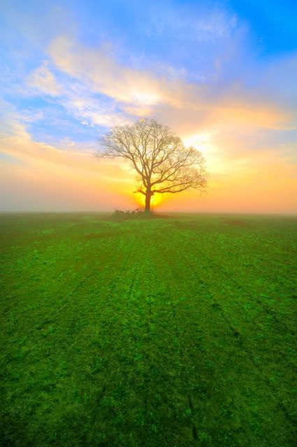
I don't think the saturation is too much. I like it. I don't think there is enough contrast. For an HDR pic, highlights still looks blown out. It looks like exposure was set on the field for your sky portion. The sunrise looks like it has some interesting detail, but it's blown out. Maybe some simple level adjustment would do the trick. I think the tree should be total black as well.
I think they call them dreamscapes? Looks like any minute now I'm going to run screaming across it chased by giant spiders.
I really like the soft cotton candy colours of the sky and the astroturf green grass. It's a very warm place even though the tree is alone.
nice, photo,
im a little concerned that you report this is the last one...? why? no need to stop.
yes its surrealish...:D , i dont consider "too much" a factor in this category.
so very nice.
nice, photo,
im a little concerned that you report this is the last one...? why? no need to stop.
yes its surrealish...:D , i dont consider "too much" a factor in this category.
so very nice.
Thanks very much for the compliment. I'm the "newbie"....didn't want to wear out my welcome with one particular series.
I really like this image! it has emotion and lots of color..and leading lines right up to the lone tree..but it needs contrast..like others have said. just doing curves for the forground grass to bring out detail especially to bring out the lines..and then again for the sky..and yeah the tree needs to be darker. and this is going to look awesome. there are plenty of people around here that can help you with making you image look better in photoshop. btw keep posting stuff like this I really like it
"Character, like a photograph, develops in darkness."-Yousuf Karsh
Comments
Like the lines, colors, loneness of the tree....
Mike in Dallas
I really like the soft cotton candy colours of the sky and the astroturf green grass. It's a very warm place even though the tree is alone.
*
http://member.onemodelplace.com/member.cfm?P_ID=214042
im a little concerned that you report this is the last one...? why? no need to stop.
yes its surrealish...:D , i dont consider "too much" a factor in this category.
so
http://danielplumer.com/
Facebook Fan Page
*
http://member.onemodelplace.com/member.cfm?P_ID=214042
Thanks very much for the compliment. I'm the "newbie"....didn't want to wear out my welcome with one particular series.
For my taste, yes and yes.
www.danielchappellphotography.com