HELP...can't decide which one...

mycapturesmycaptures Registered Users Posts: 71 Big grins
edited July 27, 2008 in The Dgrin Challenges
Beautifully Shy
2703659047_fdf761f4d2_o.jpg

What do you think??


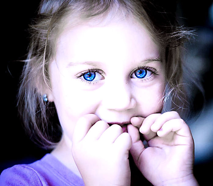
This is the one I have in already...
2681632014_48c32d6e2c.jpg?v=0

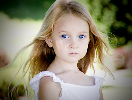
And this is one I just did today...
2703357600_c22dd01fca.jpg?v=0

So which one do you like best?
Shilowe, getting my masters in psychology,
photographing mommy to Rayne (5) and Quinlan (baby boy) and wife to Dave.:photo

Comments

  • puzzledpaulpuzzledpaul Registered Users Posts: 1,621 Major grins
    edited July 26, 2008
    << like best >>

    Although hardly qualified to comment, pic 1, - no question, imo - but whether it's what the judges are after is another matter completely :)

    (I just wonder if there's a slightly better crop lurking in there (less central, more face) ... with more blurred bg... ?)

    Great expression / eyes ...

    pp

    edit
    As the order's been changed ... and might be again - the pic with the wispy blown hair and 'the eyes' - not the one where she's checking her mouth* :)

    (*also worth checking what this one looks like without the white bg, lower r corner - if you decide to run with this'un ...)
  • TentacionTentacion Registered Users Posts: 940 Major grins
    edited July 26, 2008
    Like number 1, but am distracted by the smudge on her cheek area. I might suggest a healing filter to correct it.
    You're only as good as your next photo....
    One day, I started writing, not knowing that I had chained myself for life to a noble but merciless master. When God hands you a gift, he also hands you a whip; and the whip is intended solely for self-flagellation...I'm here alone in my dark madness, all by myself with my deck of cards --- and, of course, the whip God gave me." Truman Capote
  • VisualXpressionsVisualXpressions Registered Users Posts: 860 Major grins
    edited July 26, 2008
    Your original or the first one is much better... the second one is way to blown out... You should post a much larger image in the contest thread, it can be 800px on the longest side...
  • pyroPrints.compyroPrints.com Registered Users Posts: 1,383 Major grins
    edited July 26, 2008
    Your original or the first one is much better... the second one is way to blown out... You should post a much larger image in the contest thread, it can be 800px on the longest side...

    I'm gonna buck the trend here and say that the second one is MUCH better in my opinion. I love the fact that it's high key (or blown out as some might say =c) Sorry for not being too helpful mwink.gif
    pyroPrints.com (my little t-shirt shop)
    pyroPrints.com/5819572 The Photo Section
  • LOVEphotosLOVEphotos Registered Users Posts: 107 Major grins
    edited July 26, 2008
    2nd pic
    2nd pic ... I like better thumb.gif
  • mycapturesmycaptures Registered Users Posts: 71 Big grins
    edited July 26, 2008
    ARGH..I'm still undecided...I do see the smudge though now on her face so I have to go fix that no matter what. I like the high key too of the second one and the way her eyes just pop right out at ya. But I LOVE the expression and her hair in the first one. You see my dilemma? HELP ME DECIDE!!! :)
    Shilowe, getting my masters in psychology,
    photographing mommy to Rayne (5) and Quinlan (baby boy) and wife to Dave.:photo
  • goldenstarphotogoldenstarphoto Registered Users Posts: 252 Major grins
    edited July 26, 2008
    #2
    I like both of them....but if I had to pick I would go with #2 because of the way the eyes just stand out.
  • TentacionTentacion Registered Users Posts: 940 Major grins
    edited July 26, 2008
    Since reading the thread about "Filters"...I would go (personally) with the second one, I really like the High Dynamic Range in that shot, and although true that the eyes just pop out at you, the rest of the photo pops also...my only thought would be to rid the photo of that white specular area in the upper right hand corner, as the high keystone lighting is entering from the left and not the right...In my opinion the viewers eyes are drawn to that and distracts from your focal point which is the child.

    Which ever you choose..GOOD LUCK and Best Wishes!!
    Donna
    You're only as good as your next photo....
    One day, I started writing, not knowing that I had chained myself for life to a noble but merciless master. When God hands you a gift, he also hands you a whip; and the whip is intended solely for self-flagellation...I'm here alone in my dark madness, all by myself with my deck of cards --- and, of course, the whip God gave me." Truman Capote
  • mycapturesmycaptures Registered Users Posts: 71 Big grins
    edited July 26, 2008
    bump for the 1 I chose
    Shilowe, getting my masters in psychology,
    photographing mommy to Rayne (5) and Quinlan (baby boy) and wife to Dave.:photo
  • puzzledpaulpuzzledpaul Registered Users Posts: 1,621 Major grins
    edited July 27, 2008
    My edited first post included a comment re current choice (edits don't bump) ... I'd also suggest that the 'one with the hands' hides the shape of her face ... which, imo ... is a shame :)

    pp
  • VelvtRideVelvtRide Registered Users Posts: 364 Major grins
    edited July 27, 2008
    My edited first post included a comment re current choice (edits don't bump) ... I'd also suggest that the 'one with the hands' hides the shape of her face ... which, imo ... is a shame :)

    pp

    It might be a shame, but it's her eyes that make the photo - all other instances of the photo are enhancing. thumb.gif

    Excellent job! My vote is for #1 - Beautifully Shy. clap.gif
  • puzzledpaulpuzzledpaul Registered Users Posts: 1,621 Major grins
    edited July 27, 2008
    << It might be a shame, but it's her eyes that make the photo ... >>

    Well, I know the choice has been made, but the other (to me) has a very enigmatic quality about it - sufficiently so as to make me comment :)

    There's also a big difference in (main) subject matter area (and therefore visual impact) between these 2 photos ... it'd be interesting to see a crop of the first that's closer to the 'hands' one - and 'levels this playing field' :)

    pp
  • mycapturesmycaptures Registered Users Posts: 71 Big grins
    edited July 27, 2008
    I love the tinkerbell one myself, but it's just too soft for this challenge I think. The one I chose has a crisper focus. That's what ultimately made me decide because I was really torn.
    Shilowe, getting my masters in psychology,
    photographing mommy to Rayne (5) and Quinlan (baby boy) and wife to Dave.:photo
Sign In or Register to comment.