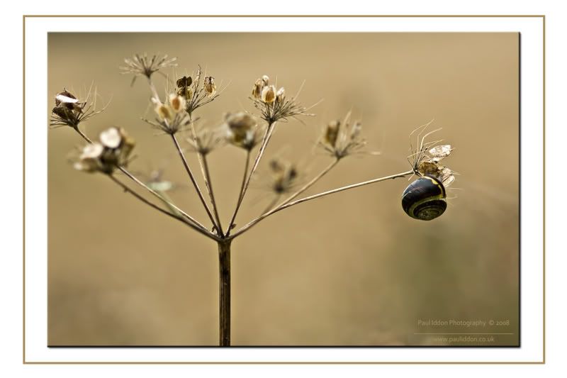
Snail Suspension
Was out walking down by the River Ribble again, looking for subjects to do for a "trio" theme for the camera club 1st Round hand-in in September, and (I have found something, more on that later - on a similar theme to this in a way) I spotted this snail suspended upside down atop a seedhead. The background is a wheatfield but I set the aperture good and wide to give the background some nice relief and to lift the subject out.
Exif:
Camera Make: Canon
Camera Model: Canon EOS 400D DIGITAL
Image Date: 2008:08:29 15:09:56
Flash Used: No
Focal Length: 105.0mm
CCD Width: 22.79mm
Exposure Time: 0.0013 s (1/800)
Aperture: f/2.8
ISO equiv: 100
Exposure Bias: -1.00
White Balance: Auto
Metering Mode: Matrix
Exposure: aperture priority (semi-auto)
Exposure Mode: Auto Bracketing

C&C as always appreciated.
Paul.
Exif:
Camera Make: Canon
Camera Model: Canon EOS 400D DIGITAL
Image Date: 2008:08:29 15:09:56
Flash Used: No
Focal Length: 105.0mm
CCD Width: 22.79mm
Exposure Time: 0.0013 s (1/800)
Aperture: f/2.8
ISO equiv: 100
Exposure Bias: -1.00
White Balance: Auto
Metering Mode: Matrix
Exposure: aperture priority (semi-auto)
Exposure Mode: Auto Bracketing

C&C as always appreciated.
Paul.
0
Comments
a little to close on the leftside maybe?
whats a trio theme specifically? what the criteria?
My Photoshop skills are not amongst the best, but I tried a little cloning of the left edge of the seedhead to make it appear further form the edge.
Has that helped, and is it noticeable?
Paul.
Link to my personal website: http://www.pauliddon.co.uk
Brian v.
http://www.flickr.com/photos/lordv/
http://www.lordv.smugmug.com/
may i make a different suggestion?
leave that section of the brush in the shot, i think its really important to the composition...i would suggest making the canvas size bigger and fill that space in with your bokeh. does that make sense?
Yeah, I see what you mean.
Don't know if I'm that good though. Will have a tinker though.
Paul.
Link to my personal website: http://www.pauliddon.co.uk
good luck! i love your work and i look forward to whats coming up next too!
btw, what the trio thing i asked about?
Aaron, I took a deep breath and worked the canvas and then decided to move the seedhead a fraction and blurred it to match some of the others. The more I looked, the more I thought it competed with the snail with them being on a similar plane. So I added a gaussian blur to the moved head which helps to hide the edit too.
The trio is a theme for the first round of photographs at the camera club I go to and the season starts mid-September, with first round needing to be handed in at the end of that month or early October. The subject has to be three of the same subject, not 3 connected images. So I had a go at preparing my entry today. I'll add them to a thread shortly.
Paul.
Link to my personal website: http://www.pauliddon.co.uk
I like this second shot best Paul
Thats a great Nature shot, it's plane and simple and not overly colourful.
... iiiiiiiiiii Like it
.
Skippy (Australia) - Moderator of "HOLY MACRO" and "OTHER COOL SHOTS"
ALBUM http://ozzieskip.smugmug.com/
:skippy Everyone has the right to be stupid, but some people just abuse the privilege :dgrin
Its a bit different I guess. There were a good few of these snails by the river - and strange that I never have any like this in the garden - just the plain ugly ones !
Paul.
Link to my personal website: http://www.pauliddon.co.uk