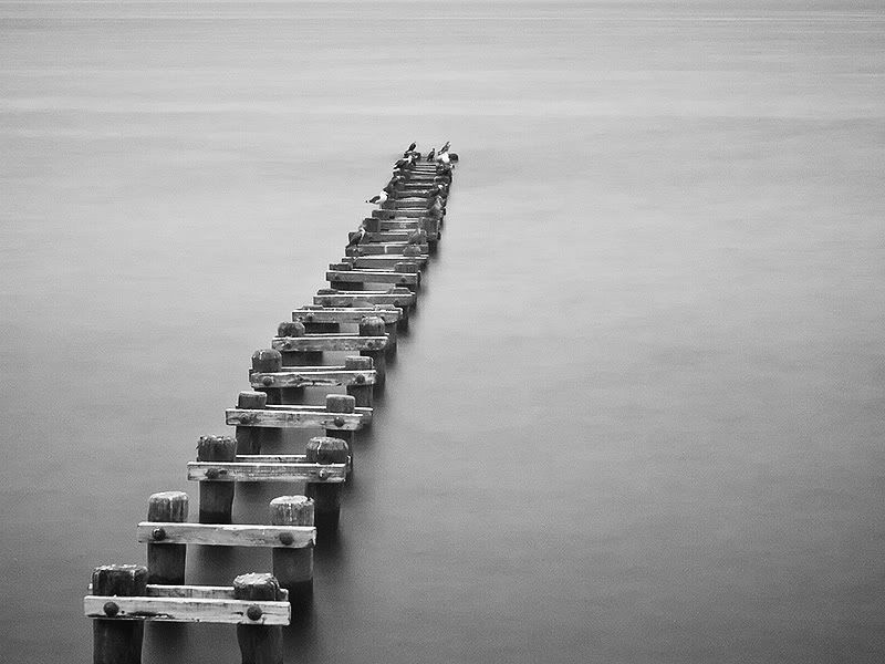
Path to nowhere (7) Pyro

pyroPrints.compyroPrints.com Registered Users Posts: 1,383 Major grins
edited September 16, 2008 in The Dgrin Challenges
So I finally got out to the bay, though unfortunately it was overcast. But I'll work with what I got.

Not sure the polling works now, so leave comments if you're feedbacking =c)

1.
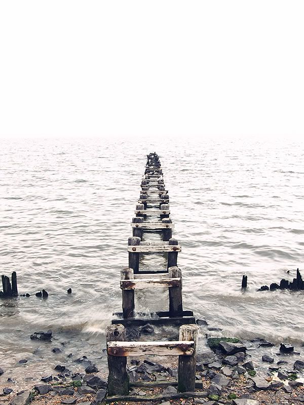
P9131846.jpg

2.
P9131846_1.jpg

3.
P9131859.jpg

4.
P9131894.jpg

5.
P9131908.jpg

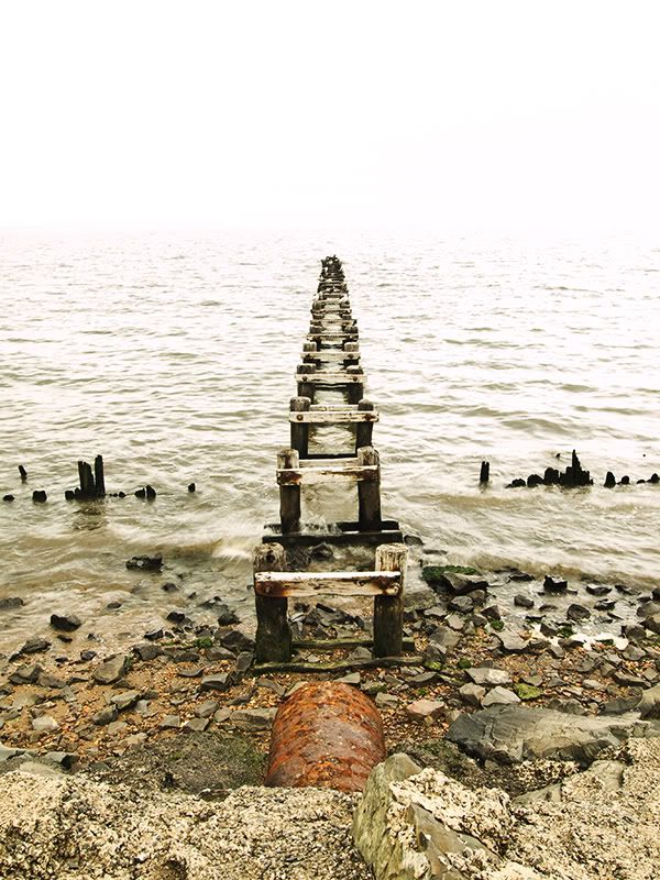
Infrared (not too sharp when there is no sun out), came out sorta old timey
6.
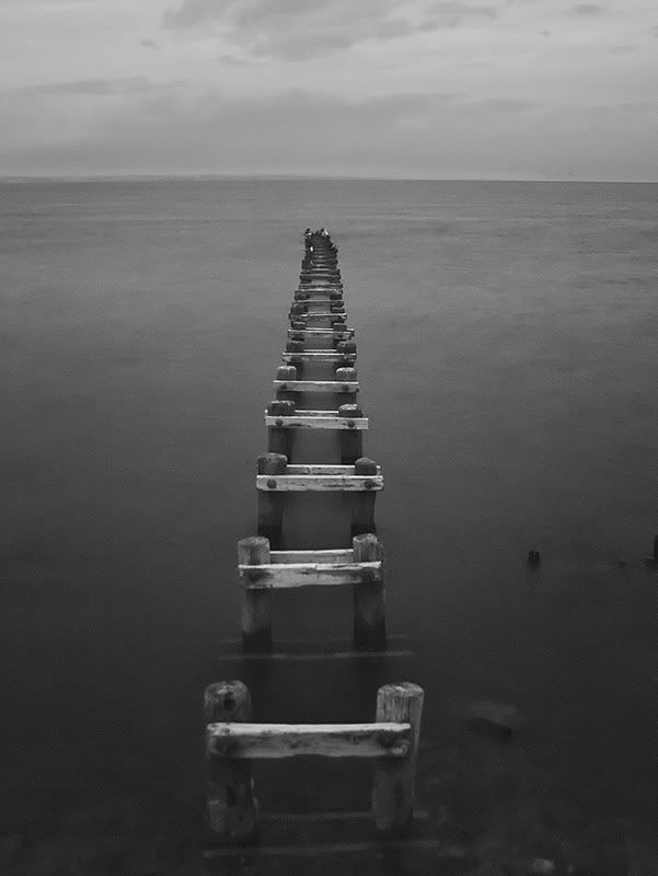
P9131940.jpg

7.
P9131958.jpg

8.
WalkingOnWater.jpg
pyroPrints.com (my little t-shirt shop)
pyroPrints.com/5819572 The Photo Section

Photoarray 28 votes

1
14% 4 votes
2
3% 1 vote
3
14% 4 votes
4
3% 1 vote
5
28% 8 votes
6
7% 2 votes
7
17% 5 votes
8 (original)
10% 3 votes
none of the above
0% 0 votes

Comments

  • VelvtRideVelvtRide Registered Users Posts: 364 Major grins
    edited September 14, 2008
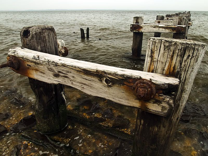
    #5 kicks butt! clap.gif


    Great angle, Pyro thumb.gif
  • pemmettpemmett Registered Users Posts: 507 Major grins
    edited September 14, 2008
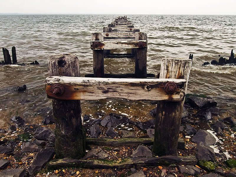
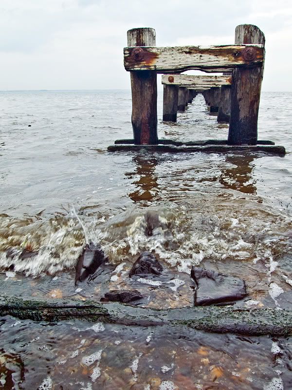
    the angle of #5 with the height of #3 I think would really look cool. If you can't re-shoot I agree with VelvtRide and go with #5.
    "Take a moment to capture a memory that will last forever"
    My images | My blog | My free course
  • VelvtRideVelvtRide Registered Users Posts: 364 Major grins
    edited September 14, 2008
    pemmett wrote:
    the angle of #5 with the height of #3 I think would really look cool. If you can't re-shoot I agree with VelvtRide and go with #5.

    #3 and #5 were my favs, too. lol3.gif
  • KevXmanKevXman Registered Users Posts: 945 Major grins
    edited September 14, 2008
    I'll have to go along with the others. 3 and 5 are my favs with 3 edging out. Sorry, I have something about symetry, even though it supposedly breaks about a half dozen rules.

    — Kevin
    Enjoy today, tomorrow is not guaranteed.

    My Site, My Book
  • idiomidiom Registered Users Posts: 132 Major grins
    edited September 14, 2008
    I like 5 and 7. I like that you widened your DOF enough to get mostly the whole pier in focus, and 7 I really like, but i'm not a fan of the noise that it seems to have. I assume the noise is PP, because the other photos are very clear.
  • pyroPrints.compyroPrints.com Registered Users Posts: 1,383 Major grins
    edited September 15, 2008
    Thanks for the feedback everyone. I'll probably reprocess 3&5 more carefully now. If I have time I'll try to get out there for a reshoot, but I'm not sure that'll work out.
    pyroPrints.com (my little t-shirt shop)
    pyroPrints.com/5819572 The Photo Section
  • TangoTango Registered Users Posts: 4,592 Major grins
    edited September 15, 2008
    #1 for me....and let me ask why are you not using a ND filter? to me it sure would help with this scene..... for weathered theme
    Aaron Nelson
  • pyroPrints.compyroPrints.com Registered Users Posts: 1,383 Major grins
    edited September 15, 2008
    #1 for me....and let me ask why are you not using a ND filter? to me it sure would help with this scene..... for weathered theme

    don't got one =c/ it's on the list (both ND and GradND)

    Plus for #1/2 I was going for a high key kinda photo
    pyroPrints.com (my little t-shirt shop)
    pyroPrints.com/5819572 The Photo Section
  • TangoTango Registered Users Posts: 4,592 Major grins
    edited September 15, 2008
    ya i like the high key you have done...but cant you use a ND to make the water steamy/milky and still do this high keyish?...
    im just wondering?

    anyway, i have two ND filters, one is very thin and will not vignette like the thinker one does...so when you get one pay a little more for the lower profiled one!
    Aaron Nelson
  • SystemSystem Registered Users Posts: 8,186 moderator
    edited September 15, 2008
    I really like both 1 and 2, they make me want to venture out to see what more is out there.
  • chuckinsocalchuckinsocal Registered Users Posts: 932 Major grins
    edited September 15, 2008
    I guess I'm an odd ball cuz I like #1 the best. I like the depth, the colors of seem true, and I like the way the pier kind of disappears into the water and the water just fades into the white sky.
    Chuck Cannova
    www.socalimages.com

    Artistically & Creatively Challenged
  • NikolaiNikolai Registered Users Posts: 19,035 Major grins
    edited September 16, 2008
    #1, and I'd add some fog...(it's rather simple in post if no real one comes your way)
    "May the f/stop be with you!"
  • richterslrichtersl Registered Users Posts: 3,322 Major grins
    edited September 16, 2008
    #1 is pretty cool. Is it possible to make the separation of the water and the sky less distinct?
  • nalvareznalvarez Registered Users Posts: 152 Major grins
    edited September 16, 2008
    #5 for sure!
Sign In or Register to comment.