Path To Nowhere Beta (7) Pyro

pyroPrints.compyroPrints.com Registered Users Posts: 1,383 Major grins
edited September 18, 2008 in The Dgrin Challenges
Reprocessed the likely contenders, probably the final pass, just wanted to get some feedback beforeI post.

Path To Nowhere


1.
PathToNowhere_1.jpg

2.
PathToNowhere_2.jpg

3.
PathToNowhere_3.jpg
pyroPrints.com (my little t-shirt shop)
pyroPrints.com/5819572 The Photo Section

Photoarray 21 votes

1
38% 8 votes
2
47% 10 votes
3
14% 3 votes

Comments

  • KevXmanKevXman Registered Users Posts: 945 Major grins
    edited September 17, 2008
    Its a toss-up between #2 and #3. Even though I made the comment about symetry earlier #2 has grown on me.

    On a side note, where is this? Just in case I'm in the area some time. (Parents have a new house in Bethany, DE.)

    — Kevin
    Enjoy today, tomorrow is not guaranteed.

    My Site, My Book
  • VelvtRideVelvtRide Registered Users Posts: 364 Major grins
    edited September 17, 2008
    OK - here goes - and please don't kill me. lol3.gif

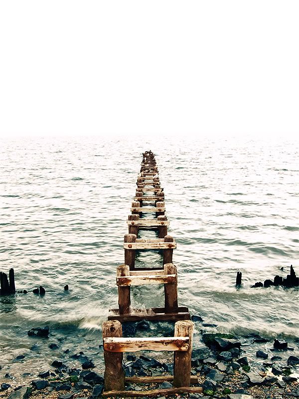
    #1 - Too much 'white' for my taste. I feel like it's too blown out and takes away from the beauty of the subject. Where you have really nice movement to the water up near the beach, it's hardly noticeable. The water doesn't have a nice, soft, true color to compliment the subject. However, the composition is fantastic!

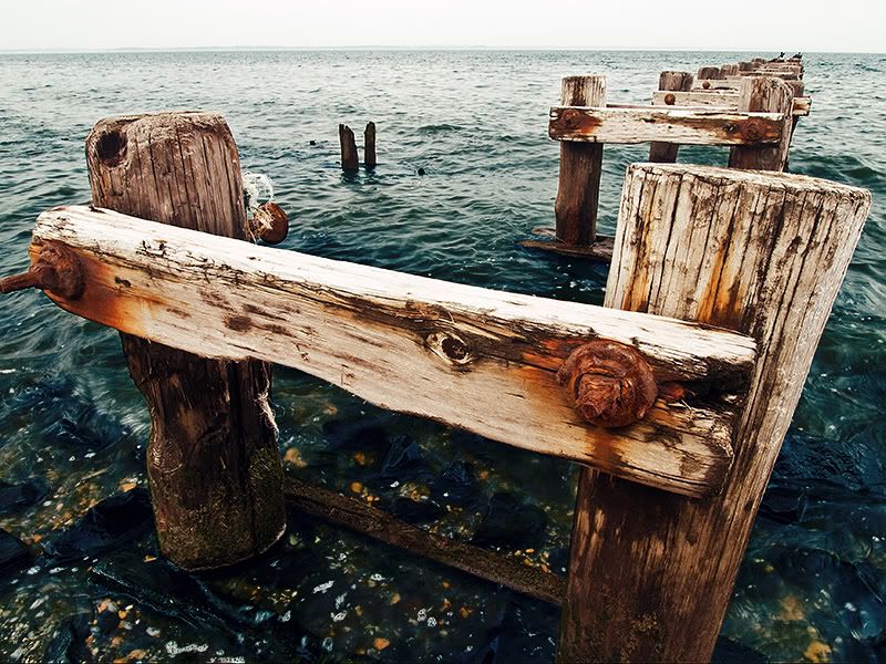
    #2 - I really like this one - rich in color, the subject is BAM! in your face and leaves no room for guessing. This has more story to it, IMHO. I love the fact that you can see what's beneath the water on the floor of the ocean - a nice added color that goes with the subject. thumb.gif

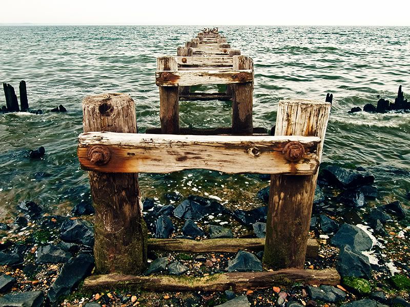
    #3 - I like this almost as much as I like #2, however, I think you lose some of the POW factor not being able to really see the extent of the subject. Colors are fantastic and I really love the capture in the foreground. Kinda makes me wish I was there. :D


    Hope that wasn't too harsh!
  • TangoTango Registered Users Posts: 4,592 Major grins
    edited September 17, 2008
    #1 gets my vote....but i would like to see B&W version too....
    Aaron Nelson
  • pyroPrints.compyroPrints.com Registered Users Posts: 1,383 Major grins
    edited September 17, 2008
    KevXman wrote:
    Its a toss-up between #2 and #3. Even though I made the comment about symetry earlier #2 has grown on me.

    On a side note, where is this? Just in case I'm in the area some time. (Parents have a new house in Bethany, DE.)

    — Kevin

    http://maps.google.com/maps?f=d&saddr=&daddr=40.44943,-74.214422&hl=en&geocode=&mra=mi&mrsp=0&sz=18&sll=40.449527,-74.213564&sspn=0.003262,0.005005&ie=UTF8&ll=40.449666,-74.213945&spn=0.003262,0.005005&t=h&z=18
    pyroPrints.com (my little t-shirt shop)
    pyroPrints.com/5819572 The Photo Section
  • ic4uic4u Registered Users Posts: 1,455 Major grins
    edited September 17, 2008
    #2 and #3 are both really good images. But for me #2 has much more WOW factor (IMO)thumb.gif
    Karin


    "Dance like no one is watching. Sing like no one is listening. Love like you've never been hurt and live like it's heaven on Earth." — Mark Twain
  • jeffreaux2jeffreaux2 Registered Users Posts: 4,762 Major grins
    edited September 17, 2008
    I like #2 best, but would lose the sky/ horizon.
  • SystemSystem Registered Users Posts: 8,186 moderator
    edited September 18, 2008
    #1 gets my vote....but i would like to see B&W version too....
    15524779-Ti.gif
  • TravisTravis Registered Users Posts: 1,472 Major grins
    edited September 18, 2008
    jeffreaux2 wrote:
    I like #2 best, but would lose the sky/ horizon.

    15524779-Ti.gif
Sign In or Register to comment.