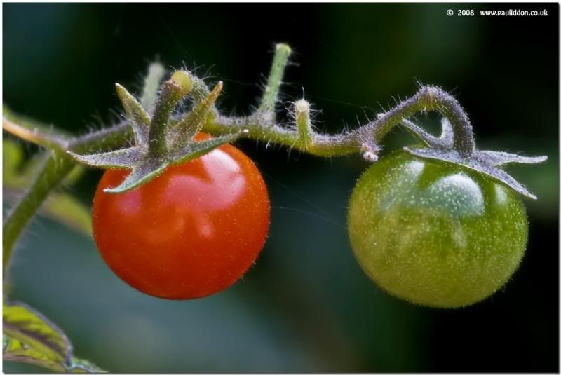
Signature in pics: Improving them?
I like to put some sort of © signiture in my pics (as you may already have noticed).
When I look at mine compared to some others who use text, mine look like they are on a blocky background compared to other people's.
How can I get my © sigs look less blocky/blurry?
EG:
Look closely at the © part in the corner... it looks soft and blurry and on a "block" behind it.

Is it caused by the hosting on Photobucket or flickr when sized for forums, cos in my editing software it looks spot on?
Can anyone who does similar but better, explain either here or via a PM?
Regards.
Paul.
When I look at mine compared to some others who use text, mine look like they are on a blocky background compared to other people's.
How can I get my © sigs look less blocky/blurry?
EG:
Look closely at the © part in the corner... it looks soft and blurry and on a "block" behind it.

Is it caused by the hosting on Photobucket or flickr when sized for forums, cos in my editing software it looks spot on?
Can anyone who does similar but better, explain either here or via a PM?
Regards.
Paul.
0
Comments
How, exactly, did you create the signature image and how are you placing you signature on the image?
Your's looks like the background is not wholly transparent and is causing some pixelation. That's just a guess though.
I created mine using a tablet, as an image at 240 ppi, and saved the resultant image as a brush in Photoshop. I use the brush tool to "stamp" the signature in a new layer when I am done. I resize it as necessary.
GreyLeaf PhotoGraphy
Is that right?
Paul.
Link to my personal website: http://www.pauliddon.co.uk
Yes, your issue is mostly because of resizing from your hosting site (not their fault, it's just what it is).
Making your signature a brush is an excellent way to do this. When in photoshop (or similar editor), the brush is vector based, meaning that it can be resized larger/smaller along with the photo and retain it's original format.
In the end, it's your final resolution of your jpg that counts. If you take a look at the original file that you uploaded, I expect that the signature looks sharp. I'm also guessing that the file is much larger than the typical size you are displaying on forums. The signature will no longer resize accurately (larger or smaller). This is actually the case for the any detail in the photo. Your best display size is its original size. Anything larger or smaller will suffer from some kind of interpolation.
For photos that I want to display in forums such as dgrin, i generally size my original photo to the size that I will likely display (e.g. 800 x XXX). It then has the optimum sharpness, etc. (i.e. you control the sharpening, not the hosting site).
Try this on a photo and I think you will see a major difference.
www.digismile.ca
Yes, Brad/DigiSmile is on target. You can resize text in Photoshop with good results, because it uses vector graphics to draw them, and vector graphics are designed for exactly that use; scalability. Once you save your image to jpeg format for uploading, those vector graphics are converted to bitmaps, because the jpeg format doesn't support vectors; it's a purely bitmapped format.
The problem comes when you resize the image, because the text is stored as the digital equivalent of fairly large blocks compared to the photo image. Huge, really, by comparison, although still very small on an absolute scale. That's why you can resize the image quite a bit before you start seeing image degradation (losing resolution), but the text degrades much sooner.
To put it in photo terms, the photo is, say, a 10MP image, but the text is about a 0.5MP image (WAG warning: I have no idea what the actual conversion rate would be. I suspect I'm being generous when I say 0.5MP). You've probably seen how you can reduce your photos quite a bit without losing quality, but eventually you reach a limit where it suddenly goes really bad. It's the same with the text, except that you start out just above that limit, so there's very little room for adjustment.
What does all that mean? Just what Brad/DigiSmile said