#10 - the sequel

divamumdivamum Registered Users Posts: 9,021 Major grins
edited October 16, 2008 in The Dgrin Challenges
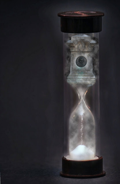
Well, not exactly the sequel to yesterday's attempt since it's a completely different idea (and I thought of this one first).

I like the idea, but the execution is proving really really tough, not least because it's so hard to make out the details - I need a bigger hourglass (and haven't - yet - been able to find one...). This is definitely stretching my pp skills (I figured after NO pp last time, why not? :D) I wish I could make the text of the name clearer, but nothing I've tried has quite worked (edited to add: see image in subsequent post - marginal improvement)

Thoughts?
poe7.jpg

Comments

  • idiomidiom Registered Users Posts: 132 Major grins
    edited October 11, 2008
    This is neat for sure, I like the image. But, you really do need to find a nice hour glass, instead of the pictionary (sp??) one.. haha. ;) And a bigger hourglass might be enable you to get the tombstone photoshopped in a bit nicer.

    Neat idea for sure. :)
  • divamumdivamum Registered Users Posts: 9,021 Major grins
    edited October 11, 2008
    idiom wrote:
    This is neat for sure, I like the image. But, you really do need to find a nice hour glass, instead of the pictionary (sp??) one.. haha. ;) And a bigger hourglass might be enable you to get the tombstone photoshopped in a bit nicer.

    Neat idea for sure. :)

    Scrabble, actually rolleyes1.gif

    I was just trying to sneak back to replace the one above with the next version before anybody replied, but you beat me to it!! lol. I'm not sure this solves the problems you mention (with which I agree), but at least the text is slightly more legible... (I can see tomorrow is going to be my quest for an hourglass. Do dollar stores carry them??!?!?!?! :giggle

    poe8.jpg
  • idiomidiom Registered Users Posts: 132 Major grins
    edited October 11, 2008
    The text is definitely much better. :D The first time, I didn't actually notice it until I read your message with it. :)

    divamum wrote:
    Scrabble, actually rolleyes1.gif

    I was just trying to sneak back to replace the one above with the next version before anybody replied, but you beat me to it!! lol. I'm not sure this solves the problems you mention (with which I agree), but at least the text is slightly more legible... (I can see tomorrow is going to be my quest for an hourglass. Do dollar stores carry them??!?!?!?! :giggle
  • ilbcnuilbcnu Registered Users Posts: 311 Major grins
    edited October 11, 2008
    great concept! Maybe if you can't find another hourglass try cropping off the top and bottom of this one?
    Amanda
    It is never to late to become what you might have been.
    www.behindthezoom.com
  • VelvtRideVelvtRide Registered Users Posts: 364 Major grins
    edited October 11, 2008
    Great idea! I love the image, however the tombstone looks a little bit tilted to me. Can't wait to see this one through... thumb.gif
  • divamumdivamum Registered Users Posts: 9,021 Major grins
    edited October 12, 2008
    Ok, steaming right along here (read: obsessively sitting in front of the computer for the last 4 hrs! eek7.gifD:D). Title maybe something like "Gothic Grave", or "Gothic Poet"

    Whadda we think?

    (edited to add: I went ahead and entered yet another version is for the time being, but please keep the comments coming, and THANKS for all the feedback!! My eyes are now bugging out so it is time to STOP for a day or two!!)


    poeposted2red.jpg
  • idiomidiom Registered Users Posts: 132 Major grins
    edited October 13, 2008
    I like the PP on the third one the best so far, but something bugs me about the quality of the image, like its too soft or something.
  • divamumdivamum Registered Users Posts: 9,021 Major grins
    edited October 13, 2008
    Thanks Idiom, and I agree. Both original images are sharp - obviously, the smoke effect softens the tombstone, but that one doesn't bother me so much - but the fuzzy hourglass itself DOES. Which is why I reshot the hourglass again but, as I realised after doing another batch, it's a combination of the dust from the sand itself INSIDE the tube (so I can't get at it), and the way the light bounces between the two tubes - you don't notice it so much when you see the entire object, but by de-emphasising the outer tube (I took the levels and contrast way down on the background only), you get a soft-looking inner tube; the eye can't see the 2nd layer, it just sees fuzz :cry Fwiw, here's the original image of it (yes, I'm a complete dufus n00b at ligthing - it's all a bit trial and error still...):

    IMG_1878shourglass2.JPG


    Despite WAY too much time on my part (I mean, come on ps - you can't make a turn-cheap-plastic-into-antique-sparkling-glass action?!) - it shares the problem (if in different ways). I wish I could find a better prop, but at this point I'm stuck with this one (and this week is frantically busy so I'm not expecting to have extra time to shoot again). Anyway, here's the current entry:

    IMG_1878shourglasscroptint2.jpg


    I intentionally centered it - not sure if this is a case where "breaking the rule" works or not, but it seemed to warrant it. As always, C&C welcomed!
  • richterslrichtersl Registered Users Posts: 3,322 Major grins
    edited October 13, 2008
    Actually, I like being able to see the entire hourglass:

    poe8.jpg


    The lighting in this one is really nice. The red version is OK. But this particular one stands out for me.
  • divamumdivamum Registered Users Posts: 9,021 Major grins
    edited October 13, 2008
    richtersl wrote:
    Actually, I like being able to see the entire hourglass:


    The lighting in this one is really nice. The red version is OK. But this particular one stands out for me.

    Thanks Linda. I'm still not 100% happy with either if I'm honest (and a trip to the dollar store today yielded yet another idea to footle around with)... I'm just short on TIME this week and don't know if I'll get to do what I want with them. I'm so new to really using PS that everything takes me forever as there's a huge element of trial and error involved (even with a good reference book). We'll see (hmm... that laundry doesn't REALLY need doing does it? And we could eat on paper plates this week and that'll gain me an extra half hour to spend with Photoshop.... rolleyes1.gif Yes, j/k! (mostly)

    Thanks!
  • divamumdivamum Registered Users Posts: 9,021 Major grins
    edited October 14, 2008
    One last try. My brain is fried. I'm getting so obsessed by this it's a bit sad, really (although I AM enjoying it and I have learned soooo many ps abilities, filters, and techniques in the process!)

    Current entry:
    poe9.jpg

    Positively Final Absolutely Last Attempt (yeah, right :giggle)

    hourglass1try4.jpg

    Put me out of my misery!! rolleyes1.gif

    (Edited to add: the really sad thing is that I've had yet another - and rather more human - idea for this one, but I don't think I"ll get a chance to shoot it. Oh well - next time!)
  • TentacionTentacion Registered Users Posts: 940 Major grins
    edited October 15, 2008
    Not sure if this will help....but on the bottom of the tombstone, you might want to try the "Liquify" filter, to give it the appearance of going thru the glass.

    Peace,
    Donna
    You're only as good as your next photo....
    One day, I started writing, not knowing that I had chained myself for life to a noble but merciless master. When God hands you a gift, he also hands you a whip; and the whip is intended solely for self-flagellation...I'm here alone in my dark madness, all by myself with my deck of cards --- and, of course, the whip God gave me." Truman Capote
  • EarthDogEarthDog Registered Users Posts: 123 Major grins
    edited October 15, 2008
    Another idea
    Another idea you could think about (like you aren't busy enough) is having the tombstone on the bottom. The falling sand could then coalesce into the tombstone, becoming a visual analogy of the accumulation of time leading to the inevitable end.
    Once upon a time, they all lived happily ever after.
  • divamumdivamum Registered Users Posts: 9,021 Major grins
    edited October 16, 2008
    Thanks Tentacion and Earthdog. Liquify is great, I just couldn't quite make it do what I wanted. And Earthdog, I too thought of using the tomb image as the bottom half, but I just couldn't quite get the effect - the shape didn't quiiiitteee work (and the falling sand was lost in the process).

    I did, however, get lucky last night in that we had a (nearly) full moon and it was clear. I've changed the entry yet again... I'm not sure if I actually *like* it, but even if it's rubbish I can consider it the best tutorial in photoshop effects EVER - my word but I know more about it now than when I started a few days ago....

    (That said: can anybdoy tell me why when I have a layer that I use with a mask - eg to add an effect - it will work great, UNTIL I go work on another layer. If I then come back to the first one, the brushes will act as black and white instead of add/subtract, and I can't for the LIFE of me figure out why! All answers gratefully received....)

    In any case, BIG THANKS to everybody who's chimed in on this. It's been fun!
  • richterslrichtersl Registered Users Posts: 3,322 Major grins
    edited October 16, 2008
    Lookin' good! thumb.gif Don't you love it when everything falls into place with your creative side. mwink.gif
  • KevXmanKevXman Registered Users Posts: 945 Major grins
    edited October 16, 2008
    divamum wrote:
    (That said: can anybdoy tell me why when I have a layer that I use with a mask - eg to add an effect - it will work great, UNTIL I go work on another layer. If I then come back to the first one, the brushes will act as black and white instead of add/subtract, and I can't for the LIFE of me figure out why! All answers gratefully received....)

    When you go back to the layer with the mask, make sure that you click on the right-hand window for that layer.

    395446517_Focjj-L.jpg

    The left is what ever is on that layer. The right is the mask itself. Good luck! Feel free to PM me if you need to.

    — Kevin
    Enjoy today, tomorrow is not guaranteed.

    My Site, My Book
  • divamumdivamum Registered Users Posts: 9,021 Major grins
    edited October 16, 2008
    KevXman wrote:
    When you go back to the layer with the mask, make sure that you click on the right-hand window for that layer.


    The left is what ever is on that layer. The right is the mask itself. Good luck! Feel free to PM me if you need to.

    — Kevin

    :ivarTHANK YOU! wings.gif

    Ok, I had no clue that you had to "reactivate" the mask, as it were - I was just clicking on the layer without even noticing if the mask was higlighted, so that MUST be what it is! Wow, I wish I'd had the sense to post this question 2 hrs ago... it would have saved me a lot of deleting and re-doing from scratch!! eek7.gif
  • divamumdivamum Registered Users Posts: 9,021 Major grins
    edited October 16, 2008
    richtersl wrote:
    Lookin' good! thumb.gif Don't you love it when everything falls into place with your creative side. mwink.gif

    Thanks! I'm still not sure I actually *like* the image I've produced, but it's the best I could do given the means I have available to me (no pretty hourglass, no macro lens, no studio lights etc etc etc!). And it was VERY cool to photograph the moon last night (and big props to dgrin on that, too, since I remembered seeing a technique thread about it commenting on how tricky it was so I just went and looked up the advice there before spending hours figuring it out on my own! So easy when you know how.... ) thumb.gif
Sign In or Register to comment.