Which version of this photo is the best?
I've tried processing this photo in several different ways, colour, BW, high contrast, old style, split tone(-ish) etc. and can't decide which version I think is the best - I like them all in a way!
Which one (or more) would you pick as the best one? Maybe think which one would you like to see printed on your wall (if you liked the photo naturally)
1. 2.
2. 
3. 4.
4. 
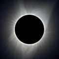
5. 6.
6. 
7.
Edit: I backed the clarity down on presets used for 6 and 7 as I think that's what introduced the banding - but it still appears
Cheers, Jase
Which one (or more) would you pick as the best one? Maybe think which one would you like to see printed on your wall (if you liked the photo naturally)
1.
2. 3.
4. 5.
6. 7.
Edit: I backed the clarity down on presets used for 6 and 7 as I think that's what introduced the banding - but it still appears
Cheers, Jase
Jase // www.stonesque.com
Which version of this photo works the best? 14 votes
Regular colour
21%
BW high contrast
21%
High contrast Sepia
0%
Outstanding preset
7%
 1 vote
Golden preset
0%
Sin City Dark Red preset
14%
Nostalgic effect preset
35%

0
Comments
Thanks for the _really_ quick reply
I only just noticed the banding - and it shouldn't be there - these are 90% jpgs exported from LR2 where I edited the RAW files - I'm going to go back and check it out.
Jase // www.stonesque.com
have you heard of the "300" plug-in preset for LR?
try that one...
http://mikelao.wordpress.com/2007/04/02/300-like-effects/
Jeff Meyers
Jack
(My real name is John but Jack'll do)
i didnt know you were color blind....
My Gallery
As it is people are tending towards my favorites too - which are 2 and 7, although it's nice to see that people like the original photo I took in full colour too :ivar
Hopefully after some more opinions a real trend will develop!
Cheers, Jase
Jase // www.stonesque.com