I guess I'm first - #11 c&c
Judging by the deafening silence (pun intended), I guess I'm not the only one who's having to think hard about this one!
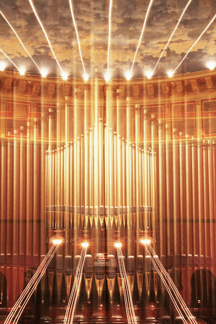
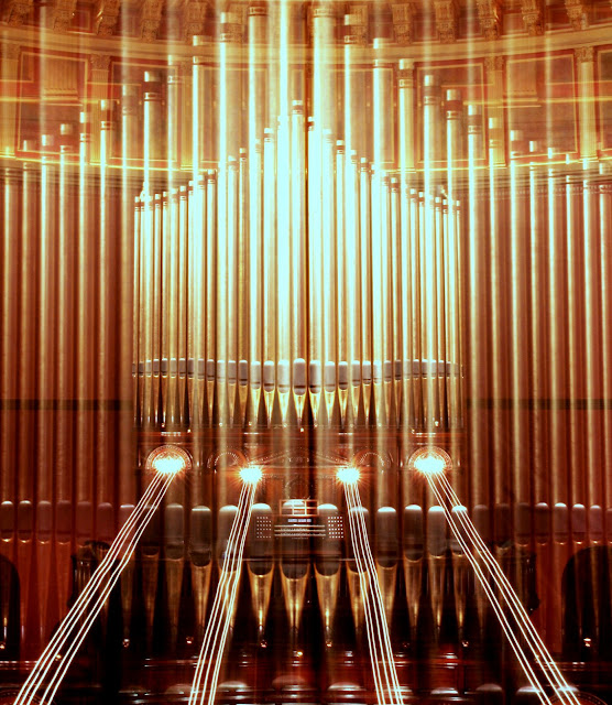
However, this morning I did get to shoot an idea I had. Still need to continue working on the processing (I guess #11 is going to be my "learn all about colour balancing" round.... lol) - I'm not happy with these now I see them against the black of dgrin's skin, and I think I overcooked them a little (was playing around in both PS and picasa, and they're more washed out now they're uploaded).
However, that's easily fixsed. Thoughts on it as a concept? Does it work? All C&C gratefully received, as always!
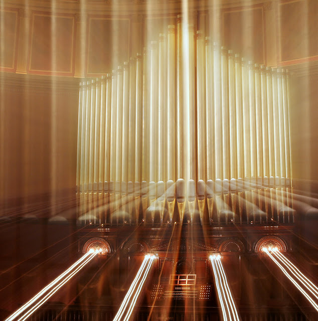
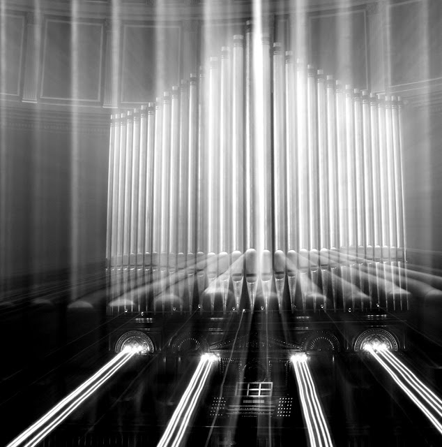
(edited to add: no photoshop magic or composites involved with these - the clouds are a painted ceiling, and everything else is just the result of the zooming effect. Fwiw...)
1
2. cropped
3
4
However, this morning I did get to shoot an idea I had. Still need to continue working on the processing (I guess #11 is going to be my "learn all about colour balancing" round.... lol) - I'm not happy with these now I see them against the black of dgrin's skin, and I think I overcooked them a little (was playing around in both PS and picasa, and they're more washed out now they're uploaded).
However, that's easily fixsed. Thoughts on it as a concept? Does it work? All C&C gratefully received, as always!
(edited to add: no photoshop magic or composites involved with these - the clouds are a painted ceiling, and everything else is just the result of the zooming effect. Fwiw...)
1

2. cropped

3

4

facebook | photo site |
0
Comments
http://www.anitamatthews.ca
Have you though of instead of doing a zoom with the lens, doing it in photoshop? Get a nice clear crisp image of the pipe organ and surrounding area. In photoshop, duplicate the layer. Do a zoom radial blur of the bottom layer. Put a layer mask on the top layer and start from the outside edges working your way in into the center. This way the center of your image will stay sharp and you still have the sound blast effect. I grabbed an image off of the web and did a real quick and dirty example to show you what I'm talking about.
Just a thought.
— Kevin
My Site, My Book
I have been driving my family nuts with scenerios for #11. I have a few good ideas in mind. Going to try this weekend to get some shots.
I have to agree with other feedback that this doesn't denote sound to me, despite the fact I can tell it's an organ. Still a really interesting image, though!
Thanks!
Bwahahahaha "master this zooming effect" - what, you mean practice in my living room using the unsuspecting dog - with NO successful results at all - and then hope to luck and the digital luxury of shooting WAY too many shots once I got there? Yeah, if that's "mastery", then that's what I did all right....
But I only have a cat .. so how am I to master this technique?!! Dammit!
Btw, I copied and pasted the organ keybord console from another (unzoomed) shot in the same series as a new layer to bump up the clarity of that one section. Does anybody know if I need to declare that as a second image for the sake of the rules? It's not, strictly speaking, a composite image - I just used that to patch and touch up what was already there on the original image, but for the sake of full disclosure... Anybody know the position on that?
As always, thoughts and C&C welcomed.
As entered
same image with different colour processing
Other options (I tilted it to decenter it and try to get the console into a compositionally better place, but now that I'm looking at it (and looking at it, and looking at it...
1.
2.
I think that you might have asked this in a different thread, but just to be sure... Yep, got to declare every image used. Might as well anyways just to be on the safe side.
I like your new image btw.
— Kevin
My Site, My Book
Yes (for the record) Emily confirmed that it needs to be included so I have added the information for the second image.
And thanks for the feedback!