Amateur E-Shoot
Do these work? No flash. Minor post-prod work. Done for free....wanted some experience. C&C welcome.
His cheeks are always that "rosey" and getting him to smile was a bit....rough. :scratch
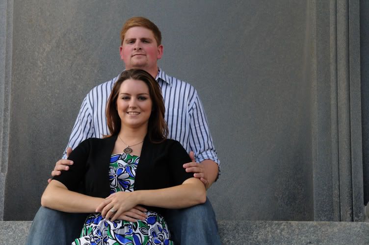
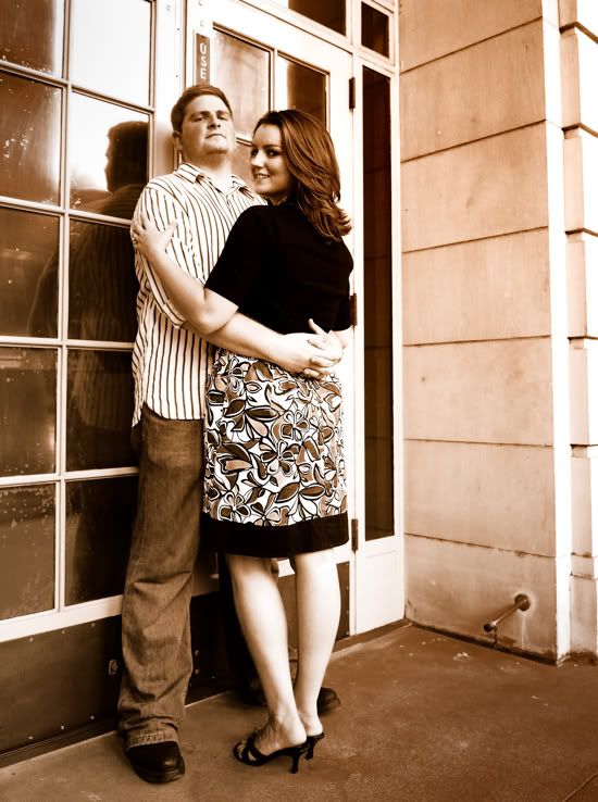
#1
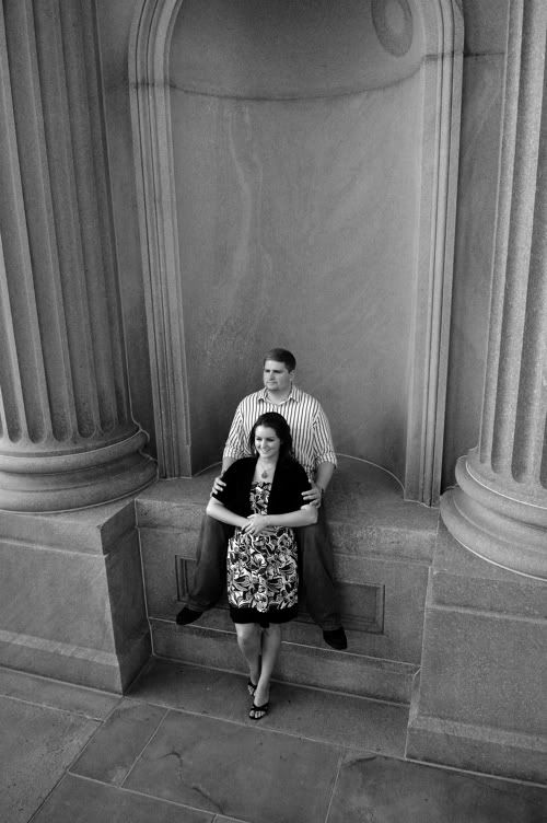
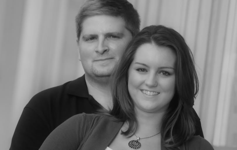
#2
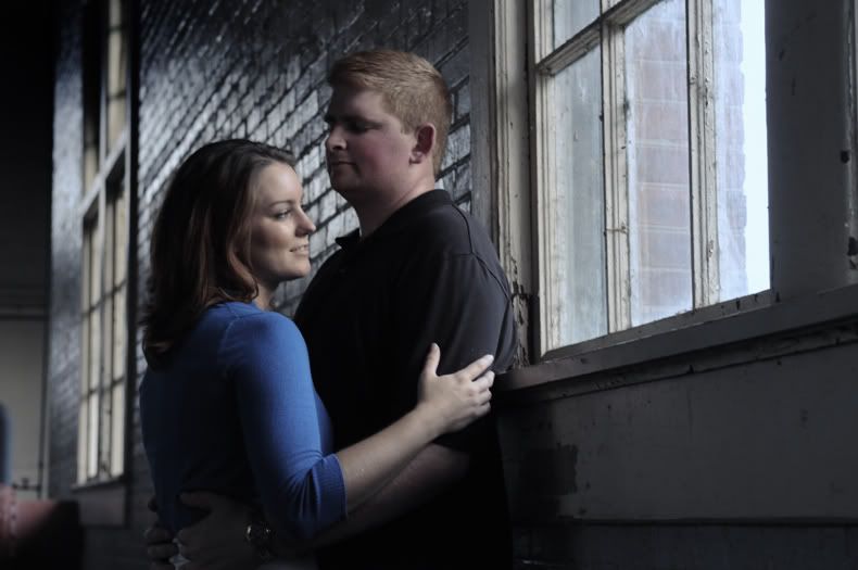
#3
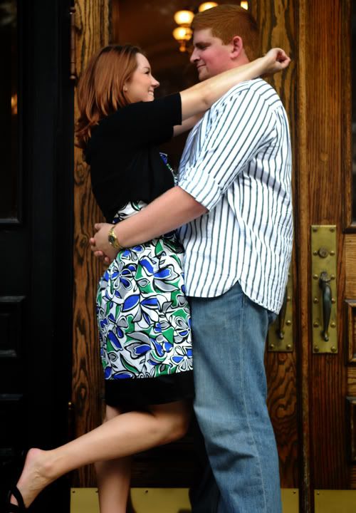
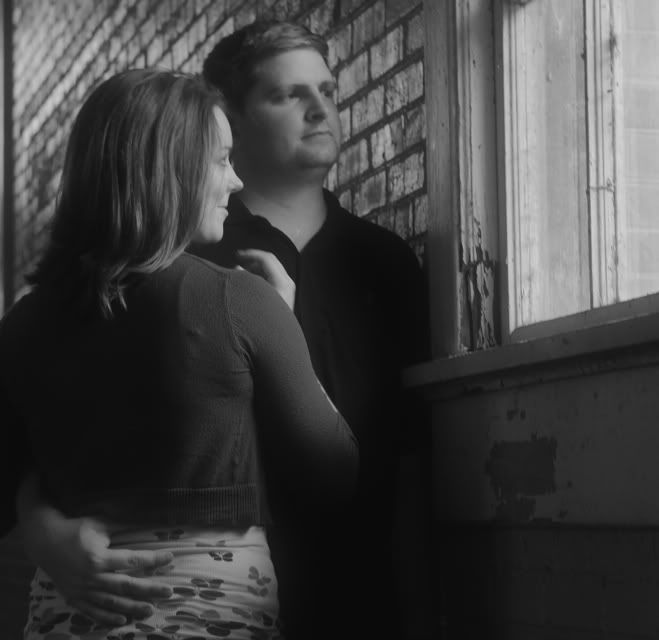
#4
#5
#6
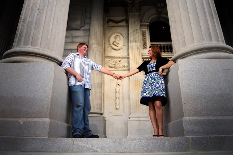
#7
#8
His cheeks are always that "rosey" and getting him to smile was a bit....rough. :scratch
#1
#2
#3
#4
#5
#6
#7
#8
0
Comments
some cropping would do for most of them... also there are eyes out of focus, thats like a broken #1 rule right there!
keep it up!
The rest - yeah, there's more than one home run in that group. Hard to pick a favorite but I know you clients will be quite pleased with these!!
My Photos
Thoughts on photographing a wedding, How to post a picture, AF Microadjustments?, Light Scoop
Equipment List - Check my profile
The photos don't pop and they look a bit blurry.
Composition is ok on most of them and the poses work.
So I guess a C+ from me.
http://www.flickr.com/photos/21695902@N06/
http://500px.com/Shockey
alloutdoor.smugmug.com
http://aoboudoirboise.smugmug.com/
I wish her toes weren't cut off in #3. From what I've read and seen (I'm a noob with the flash), a little fill flash will eliminate the dark eyes problems in #1, 3, 5, and maybe 7. I say maybe 7 because too much flash might destroy the "dark alley" batman type of shot that you've got going here. She's lit nicely, he's lit not so great...
Overall nice. They'll be happy with them. I think, though, if the guy would have been a little less excited to be there, and would tone it down a little - you know - not be SO overjoyed or happy to be there...
Despite the high cost of living, it remains popular.
Why do people post their equipment in their sig. Isn't it kind of like bragging? That having been said...
Canon 40d Gripped (x2), Rebel (Original), Canon 70-200 f/2.8 USM L, Canon 300 f/4, Tamron 28-75 f/2.8, Canon 50mm f/1.8, Canon 17-55 f/3.5-5.6, ThinkTank Airport TakeOff
Atlanta, GA USA
my smugmug
Atlanta Modern Wedding Photographer
SheriJohnsonPhotography.com
There seems to be some softness here. I'm not certain...this could be my monitor, compression issues, etc. But here is what I see.
#1 I would prefer two things. A higher angle and more lines. There seems like there is some interesting structure to work with, I would have sacrificed closeness to include more interesting architecture. Here I think alot of gray takes away.
#2 There you go! However, clients pay for their faces. I would present the same with them looking right at you.
#3. I think your focal point caught his left arm. With a background like this you can really close down that aperature. I would definately be at f5.6 and have no fear at f8 for this shot. That way I can concentrate more on directing the models than worrying about pinpoint focus accuracy.
#4 Good. I would try a slight vignette on the bottom.
#5 Tough model. Hindsight is 20-20 but this shot has got me thinking that if I run across this situation, I might try some shots that play up on this theme. Him with the same expression and pose but her doing something more antimated, like leg kicked up head laying on his chest (low), looking up to him. Maybe the "reverse purposal (sp?)" shot. You have to be careful in todays society of protraying the woman as subserviant but if you keep it light and fun most brides to be would at least give it a try, they can always reject the photos later.
#6 I believe DOF bit you here, causing the softness. A larger aperature number would have made this sharper, front to back, I think.
#7 I agree with others and feel this is the winner of the bunch. Again softness, maybe camera shake, but possibly the sharpest part of the image is closest to the camera? Hard to tell.
#8 So if #7 is strong why doesn't #8 get equal praise? Basically, very similar images. I believe the reason is one of the fundamental rules of portrait photography. Your models are disconnected from each other. In #7 he is making a connection with her. In #8 neither is making a connection with each other and it really removes the strength from the photo.
Perhaps you were trying to convey the message of them looking out at their future but unfortunately for a "E" session I think it falls short because they are not connecting with one another.
A classic example is the couple sitting on a bench, viewing a scenic overlook (lake, valley, etc.), shot from the back and slightly silhoetted. Even though they are not making eye contact, the connection is usually established by arms around each other and heads gently resting on each other. Them viewing out to the lake conveys the message of them "pondering" their future days ahead.
If that is what you were going for you could have tried it that way, looking out the window, shot from behind, heads tilted and resting on each other, arms around each others waist.
Oh yeah, forgot to add, if you leave #8 as is and cropped it as in landscape mode instead, I think this image would instantly be a stronger image IMHO. Try it.
O.k., just caught it!! Look at #8, her hand. Definate motion blur. My guess is you may have been pushing the low limit of your shutter speed in most of these. You certainly were in #8. I have no idea what camera you were using but there are very few prosumer cameras made today that can't comfortably shoot at ISO 800, especially if you have some Noise Reduction software or are willing to convert to B+W.
Visit our [FONT=Arial, sans-serif]Kalamazoo Wedding Photographers[/FONT] website!
View my Facebook Fan Page!
Visit our Kalamazoo Photography blog!