Shoe Ortons...
I have to submit 3 photos into a quick comp at the camera club in the " 3 on a theme " category, and I wanted of course to be different from everyone else.
Racked my brains and remembered and forum buddies photo of a boot, and thought "I'll use shoes". Then used the "orton effect" to make them stand out more.
So thanks go to my friend CJ for this idea.
These are 3 photos.
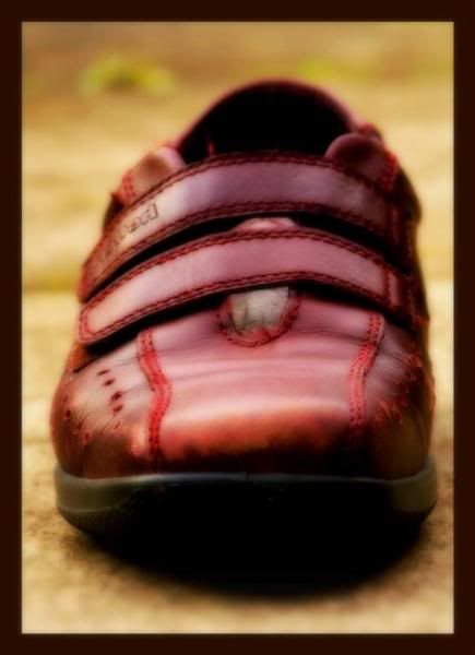
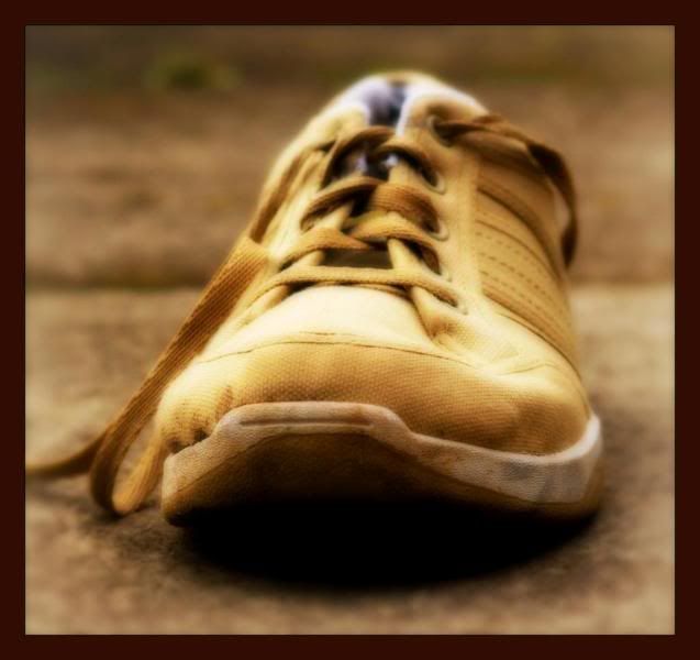
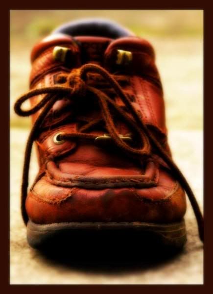
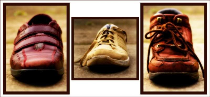
Which makes the rotation on screen like so:
What do you think?
Paul.
Racked my brains and remembered and forum buddies photo of a boot, and thought "I'll use shoes". Then used the "orton effect" to make them stand out more.
So thanks go to my friend CJ for this idea.
These are 3 photos.


Which makes the rotation on screen like so:

What do you think?
Paul.
0
Comments
If I was offer my £0.02p I'd suggest:
1. for a triptych to really work (for me at least) I like the 3 images to be the same size - so the squarish layout of the middle shoe breaks it up too much
2. I'd use a thinner border - maybe with a light shadow
3. maybe slightly more space between the images - give them some breathing room
But hey criticism is _always_ easier than getting off your bum and getting out and doing it yourself! So kudos!
Be interested to see how it looks with the suggestions - maybe I'm wrong
Cheers, Jase
Jase // www.stonesque.com
It won't be views as a triptych, each one is viewed individually. I just added that at the end to show the order of presentation.
Cheers for looking and your thoughts though.
Paul.
Link to my personal website: http://www.pauliddon.co.uk
In that case ignore everything I said
I'd still like to see thinner borders
Cheers, Jase
Jase // www.stonesque.com
Wow I never knew that people not putting their shoes away could make for a nice Phot Op
If my name was Jake the Peg I'd have a big smile on my moosh
http://www.youtube.com/watch?v=KJleJbn9G6Y
I think your entry will do well
.
Skippy (Australia) - Moderator of "HOLY MACRO" and "OTHER COOL SHOTS"
ALBUM http://ozzieskip.smugmug.com/
:skippy Everyone has the right to be stupid, but some people just abuse the privilege :dgrin
My daughter loved the RH vid when she saw it.
Paul.
Link to my personal website: http://www.pauliddon.co.uk