#12 Help...suggestions...bag it??

mycapturesmycaptures Registered Users Posts: 71 Big grins
edited November 15, 2008 in The Dgrin Challenges
Details
3030382853_2ab27d7ee3.jpg?v=0

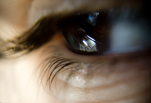
Eye protection
3030382859_020ae8b9b4.jpg?v=0

Eye protection (in black and white)
3030382861_4eb2df0cac.jpg?v=0
Shilowe, getting my masters in psychology,
photographing mommy to Rayne (5) and Quinlan (baby boy) and wife to Dave.:photo

Comments

  • PaulThomasMcKeePaulThomasMcKee Registered Users Posts: 429 Major grins
    edited November 14, 2008
    I think the eye photos can fit the theme pretty well. Emily said in her instructions to make "size in the Extream" the main focus for this round. So a really nice frame-filling closeup of a small thing like an eye & eyelashes works for me. I think I prefer the color version over the b/w...
  • swintonphotoswintonphoto Registered Users Posts: 1,664 Major grins
    edited November 14, 2008
    I think the first image is very interesting. However, I know people will criticize it because the theme doesn't resound in it - even though it is compositionally fabulous.
  • eoren1eoren1 Registered Users Posts: 2,391 Major grins
    edited November 15, 2008
    15524779-Ti.gif That first photo is very well done with great diagonals and awesome DOF. However, it doesn't say 'miniscule' to me. The eye shot would be better if you were able to get more 'macro-ish' on the eyelashes.
    E
  • pyroPrints.compyroPrints.com Registered Users Posts: 1,383 Major grins
    edited November 15, 2008
    I like both but ould like to see a little more sharpening. and if there was more DOF in the eye shot, that would be my vote
    pyroPrints.com (my little t-shirt shop)
    pyroPrints.com/5819572 The Photo Section
Sign In or Register to comment.