#12 about that green processing (feedback sought)
Since so many people commented on The Hideous Green Cross Processing and asked why I did it that way, I figured I'd explain how I arrived at it and throw this out for feedback, especially since "getting it right in camera" has been under discussion. I would REALLY appreciate feedback on how you more experienced photogs might have handled this scenario, both at the time of shooting an in pp. I'm SURE there were more aesthetically pleasing options, but my lack of experience came into play - I'd love to know how y'all might have approached this yourselves!
I was limited by lenses (widest I go is 28mm on a 1.6x camera), the weather (flat, grey and blah) and there was no opportunity to reshoot (I was on the road 150 miles from home) - I had to make it work with the equipment I had on that day.
Here's three other angles to put it into context:
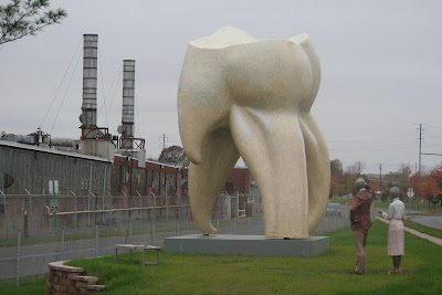
and
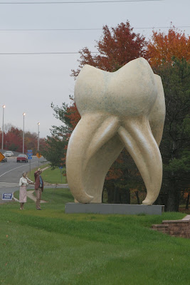
The road at the back is a freeway entrance, and the one to the side is a FAST moving 4-lane road with no median - backing up and standing in the middle of it wasn't an option (although I admit it, I considered it!!)
This was my favorite angle, but even once I'd cloned out the street signs and passing cars (!) I couldn't figure out what to do about the distracting "line" that the trees formed (I saw it as I shot and would have LOVED to move in further but had no WA lens, and I couldn't move BACK further eithr because I was right up against the chainlink fence).
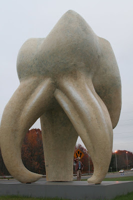
This angle ultimately seemed the best option:
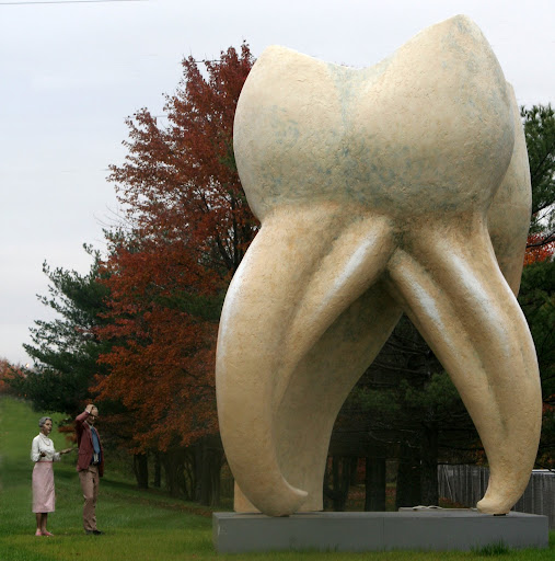
Relatively few distractions once I'd cropped it down, and the freeway entrance behind the figures required only the tiniest amount of cloning to remove it. But I STILL wasn't happy with the contrast (light tooth edge against that miserable pale, flat sky) and the complexity of tree colours which swallowed the figures, as the jacket of the male was so close in tone to the autumn trees and just blended in.
So, I finally had a composition that I could live with (if not what I had envisaged) but I still didn't think it worked, even after I cloned in some tree above the tooth (to mimic shots taken from slightly further back, and increase contrast between tooth and sky). I tried everything I could think of with curves, contrast, assorted lightroom filters (lomo, velvia etc etc) to get it to work in colour, but I didn't like any of them; it always looked either unbalanced, or dull.
I then tried all kinds of B&W, but none of those really floated my boat
either - the contrast issues were still there, and in some cases only served to make the cloning/dodging/blurring along the bottom right (where the chainlink fence was) stand out and look really cheesy. And when I fixed contrast in one area, it made another area look nasty.
An infrared treatment only looked ok, and when so many people are doing really good in-camera IR, it seemed a foolish choice to do it badly with PS!
So I just started playing with sliders until I hit on the cross-processed B&W
combo, ie... green. The honest truth? I HATE the green aesthetically but... it solved all of my problems: it evened out the red/green leaves so they became a more uniform background, it darkened the shadows behind and along the right hand side of the tooth, and the figures stood out more as they lightened and became separated from the background.
So, that's how and why I arrived at that choice - it was a series of compromises, but that's all I could come up with. I would LOVE to know how I could have done it differently so that I can build up my arsenal of skills for the future!
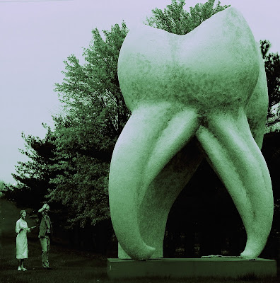
I was limited by lenses (widest I go is 28mm on a 1.6x camera), the weather (flat, grey and blah) and there was no opportunity to reshoot (I was on the road 150 miles from home) - I had to make it work with the equipment I had on that day.
Here's three other angles to put it into context:

and

The road at the back is a freeway entrance, and the one to the side is a FAST moving 4-lane road with no median - backing up and standing in the middle of it wasn't an option (although I admit it, I considered it!!)
This was my favorite angle, but even once I'd cloned out the street signs and passing cars (!) I couldn't figure out what to do about the distracting "line" that the trees formed (I saw it as I shot and would have LOVED to move in further but had no WA lens, and I couldn't move BACK further eithr because I was right up against the chainlink fence).

This angle ultimately seemed the best option:

Relatively few distractions once I'd cropped it down, and the freeway entrance behind the figures required only the tiniest amount of cloning to remove it. But I STILL wasn't happy with the contrast (light tooth edge against that miserable pale, flat sky) and the complexity of tree colours which swallowed the figures, as the jacket of the male was so close in tone to the autumn trees and just blended in.
So, I finally had a composition that I could live with (if not what I had envisaged) but I still didn't think it worked, even after I cloned in some tree above the tooth (to mimic shots taken from slightly further back, and increase contrast between tooth and sky). I tried everything I could think of with curves, contrast, assorted lightroom filters (lomo, velvia etc etc) to get it to work in colour, but I didn't like any of them; it always looked either unbalanced, or dull.
I then tried all kinds of B&W, but none of those really floated my boat
either - the contrast issues were still there, and in some cases only served to make the cloning/dodging/blurring along the bottom right (where the chainlink fence was) stand out and look really cheesy. And when I fixed contrast in one area, it made another area look nasty.
An infrared treatment only looked ok, and when so many people are doing really good in-camera IR, it seemed a foolish choice to do it badly with PS!
So I just started playing with sliders until I hit on the cross-processed B&W
combo, ie... green. The honest truth? I HATE the green aesthetically but... it solved all of my problems: it evened out the red/green leaves so they became a more uniform background, it darkened the shadows behind and along the right hand side of the tooth, and the figures stood out more as they lightened and became separated from the background.
So, that's how and why I arrived at that choice - it was a series of compromises, but that's all I could come up with. I would LOVE to know how I could have done it differently so that I can build up my arsenal of skills for the future!

facebook | photo site |
0
Comments
I had fiddled around with one of your versions -- just something quick and dirty, but this is what I had come up with:
Of course there are dozens of other variations to play with.
http://lrichters.smugmug.com
Btw, in case anybody's wondering WHY I pressed ahead with it despite the obvious problems, it was this: I figure that to learn, I have to try and come up with something DESPITE shortcomings, rather than simply give in to them. (Either that or I'm simply nuts which is of course a possibility, but given I'm still in the "excited about learning" phase, I'll stick with the latter theory for now!!
Why is that an either/or proposition? Isn't it possible you're both persistent and nuts?
Seriously though, you made the right choice. You work with what you have and try to put the best out there given the limitations. I'm sure you've had occasion to sing without being in good voice--you reach in your bag of tricks and tweak things to get the best performance you can. Same thing with photography.
Music and photography are very much alike -- in both mediums there always is more than one way to skin a cat.
http://lrichters.smugmug.com
And yeah, I certainly see the similarities between this and musical activity (and Halite, are you a musician too? The expression "in voice" isn't so commonly used by "laypeople"...
BTW, I like the B&W and the natural color shots better. But that's just me.
Jeff Meyers
http://www.flickr.com/photos/npj/2623292161/
And another one just up the road:
http://flickr.com/photos/15539913@N00/497894371/
http://lrichters.smugmug.com
Oh my. Duh. What a dunce I am. :flush
No wonder they look so odd!
Jeff Meyers
Do they allow you to park by that tooth now? Last time I drove past there I remember seeing "No Parking" signs right around it.
http://lrichters.smugmug.com
I pulled into the driveway of the Amtico factory (it was about 4.30 on a Friday and they seemed closed) and just walked along the grass strip up to the statue itself. I made sure my car was pretty obviously "just stopping for a minute" but even so, when a truck pulled into the factory I was worried I'd get ticketed (or ploughed - that was a biiiiggg truck!!)
I have a couple of other NY trips booked for December, so maybe I'll get a chance to visit the sculpture gardens before the year is out (and as a footnote: I've never been so relieved to get auditions in my life - SO many companies are either cancelling their NY trips and hiring people they already know or, alternatively, are cancelling entire SEASONS and thus have no need to audition - or hire - at all :cry)