Street Entertainers in Chester
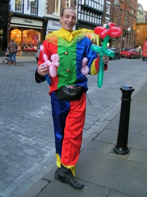
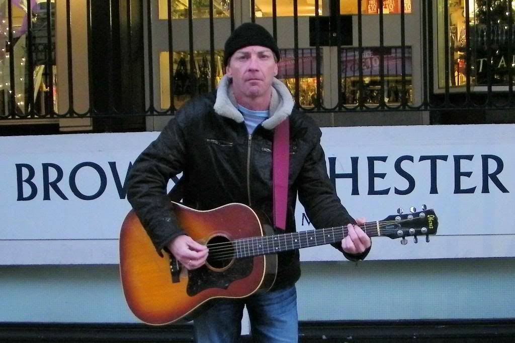
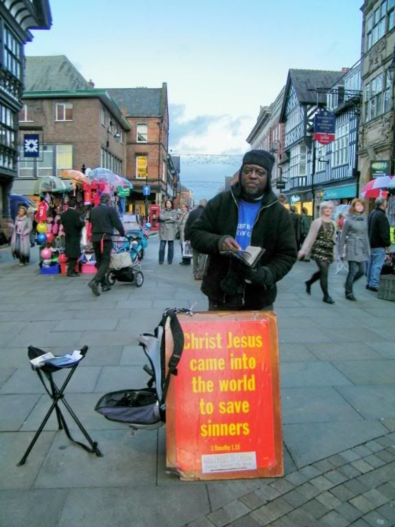
Last week I went for a visit to the beautiful city of Chester where I met a couple of street artists, going about their business. They very kindly posed for my photos and given me permission, to use them on my website...
The Balloon Artist:
The Musician:
The Street Preacher:
Thank you most kindly, gentlemen....
The Balloon Artist:

The Musician:

The Street Preacher:

Thank you most kindly, gentlemen....
Kind regards, Feline
www.abracacamera.com :photo
www.abracacamera.com :photo
0
Comments
www.abracacamera.com :photo
It appears your camera is back-focusing something horrible. In #1, the focus is on the buildings in the background. #2 on the sign behind your subjects. In #3, I can't find anything in focus.
That having been said, I think these are a good start. A little more attention to composition and light and you would have some winners.
I really love the colors in #1 and his smile is so engaging - you did a good job photographing him.
#2 - the light is very flat. A little more context is needed to bring this up to the next level - what is he doing, where is he doing it? Is he one of those with an open case on the gound looking for spare change? What about including some of the audience in the shot? Just some ideas to expand/increase the interest.
#3 - Just crop a bit of the blank sky from the top of the photo and do what might be needed to increase the sharpness of the photo - it's a little "fuzzy" or soft. If it were sharper this would be good as a high-contrast B&W - maybe?
I'm really looking forward to seeing more of your work!
My Photos
Thoughts on photographing a wedding, How to post a picture, AF Microadjustments?, Light Scoop
Equipment List - Check my profile
Judging by the backfocusing and the flaming red, are you shooting Sony by any chance? I know I had the same issues when I was....
You were right about the Musician, Scott. He did have his open guitar case in front of him. Here is the original picture:
Apart from that, I didn't want anyone else in the pictures, just the artists themselves.
I am off on another trip tomorrow ... I will take your advice and have another go ....
www.abracacamera.com :photo
http://wildwally.smugmug.com/
For next time, before you press the shutter button review the edges of the frame. Make sure that you have included all you intend/need to include and nothing that you don't. Performing this check, you would have seen that you didn't quite get all the case in the photo - oh well, next time.
Another little tip - if you can, include a little extra in the image so you have rooom to crop.
Nice start!
My Photos
Thoughts on photographing a wedding, How to post a picture, AF Microadjustments?, Light Scoop
Equipment List - Check my profile