Thanks to low temps, another idea for #13
Went out onto the deck this morning and there on the table were these sheets of ice with leaves frozen into them. I couldn't resist!
Here's the current entry:

And here are the new kids in town. Minimal processing on these, I'm happy to say - this is just what it looked like!
#1
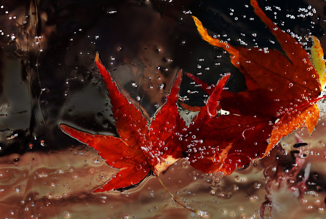
#1 was actually the first shot I took... and as soon as I'd snapped the pic the piece of ice melted just enough to fall off where I had it propped on the deck rail and shattered on the ground (so it's a good thing the first one was decently exposed and in focus!!). Fortunately, later I discovered another piece and had another go.
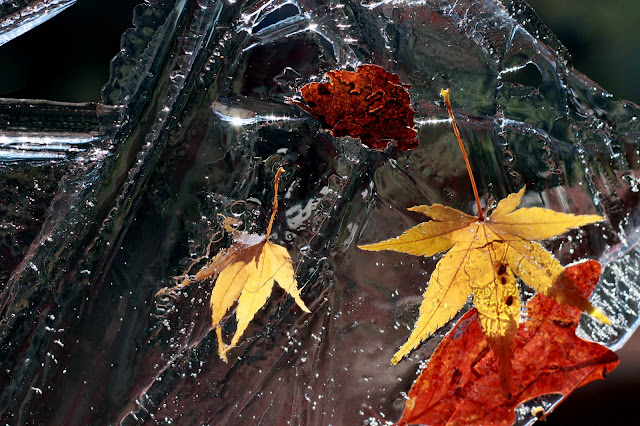
#2
SHould I stick with plan A, or work with one of these? There's another one where I managed to get some stars through the ice - it's neat, but seems there's too much wrong with it between the blown highlights and slightly odd composition to use as an entry, I think. However, I'm open to persuasion")

Here's the current entry:
And here are the new kids in town. Minimal processing on these, I'm happy to say - this is just what it looked like!
#1
#1 was actually the first shot I took... and as soon as I'd snapped the pic the piece of ice melted just enough to fall off where I had it propped on the deck rail and shattered on the ground (so it's a good thing the first one was decently exposed and in focus!!). Fortunately, later I discovered another piece and had another go.
#2
SHould I stick with plan A, or work with one of these? There's another one where I managed to get some stars through the ice - it's neat, but seems there's too much wrong with it between the blown highlights and slightly odd composition to use as an entry, I think. However, I'm open to persuasion
facebook | photo site |
0
Comments
Winston
http://AnnaLeisa.smugmug.com/gallery/4752424_e4AsW/1/281905690_9QZEs
Moderator of the People and Go Figure forums
My Smug Site
Number 3 is more dramatic. Both beat the rose bud IMO.
It is interesting to see your ideas developing
pyroPrints.com/5819572 The Photo Section
#3 is very dramatic. I like the star effect you achieved and don't care about the blown highlights because IMO they're part of the composition. But there's no telling that a judge is going to feel the same way.
#1 is an attention grabber as is. You have dramatic color and texture working in your favor.
#2 might benefit from a crop. You have a bit too much dead space on the left so I'd try playing with several crops to see if any of them work for you. The ice texture in #2 is pretty interesting to look at.
http://lrichters.smugmug.com
Btw, I only got those stars because of reading around in here - I don't even remember the thread, but somebody described *exactly* how to do it, and it stuck in my mind so I stopped 'er down to 22 and had a go! I sure wish I'd had the first piece of ice to do stars with too (the leaves were so much better compositionally spaced!) but such is life.
Thanks all!
http://pyryekholm.kuvat.fi/
Thanks! I think #1 of the leaves is still my favorite, but I also did some work on one of the other star shots and came up with this:
Any better?
I can't help thinking the ice should be clearer..
However, make it a square crop by losing the right hand side and the comp should be pretty much bang on.
http://pyryekholm.kuvat.fi/
http://www.fountaincityphotography.com
Camera Gear: Canon 400D (XTi), 18-55 f/3.5-5.6, 75-300 f/4.0-5.6, 70-200 f/4 L, 50 f/1.8 II