How did I do on this Flyer?
 Capt Rick Hiott
Registered Users Posts: 22 Big grins
Capt Rick Hiott
Registered Users Posts: 22 Big grins
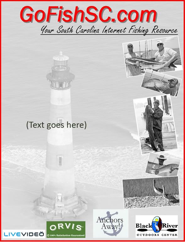
I just did this for one of my clients.
He will be handing these out to advertise his web site.
How can I improve on these?

He will be handing these out to advertise his web site.
How can I improve on these?
0
Comments
Canon 50D, 30D and Digital Rebel (plus some old friends - FTB and AE1)
Long-time amateur.....wishing for more time to play
Autocross and Track junkie
tonyp.smugmug.com
Sam
Looks like somebody just threw them on a table and said,,"Man, look at these fish",,ya know.
Sorry Ill do better next time..................:ivar
Charleston, South Carolina.
www.reelfishhead.com
Here is something that I just did. I didn't spend much time, but you get the idea.
One thing I have learnt is that you want to maintain a good look through your typefaces and choose something that is clear and you can use it when it is small or big. Here the font is Adobe Gills Sans.
Please don't take it the wrong way...just trying to give you ideas.
Also, note to vertically center align those logos rather then the way you had. Something to do when you have such logos is to put them in their " own boxes". You could just draw lines around it as if to separate them.
I put the pictures on the right side cause most people are visual and with pictures on right side, their eyes will go there first and miss the "text". This way, their eyes will take them to left and start reading to right..like we normally do. Also, add some drop shadows to them to make it look 3d.
You definitely need a headline as well...something to capture people to make them read more. I just made up one.
Btw, I am not a ad designer.
WildViper
From Nikon D70s > Nikon D300s & D700
Nikon 50/1.8, Tamron 28-75/2.8 1st gen, Nikkor 12-24/4, Nikkor 70-200/2.8 ED VR, SB600, SB900, SB-26 and Gitzo 2 Series Carbon Fiber with Kirk Ballhead