I shot a whole lot of images, but I can't process all of them that quickly. =c) This is the first in the set.
hey P -
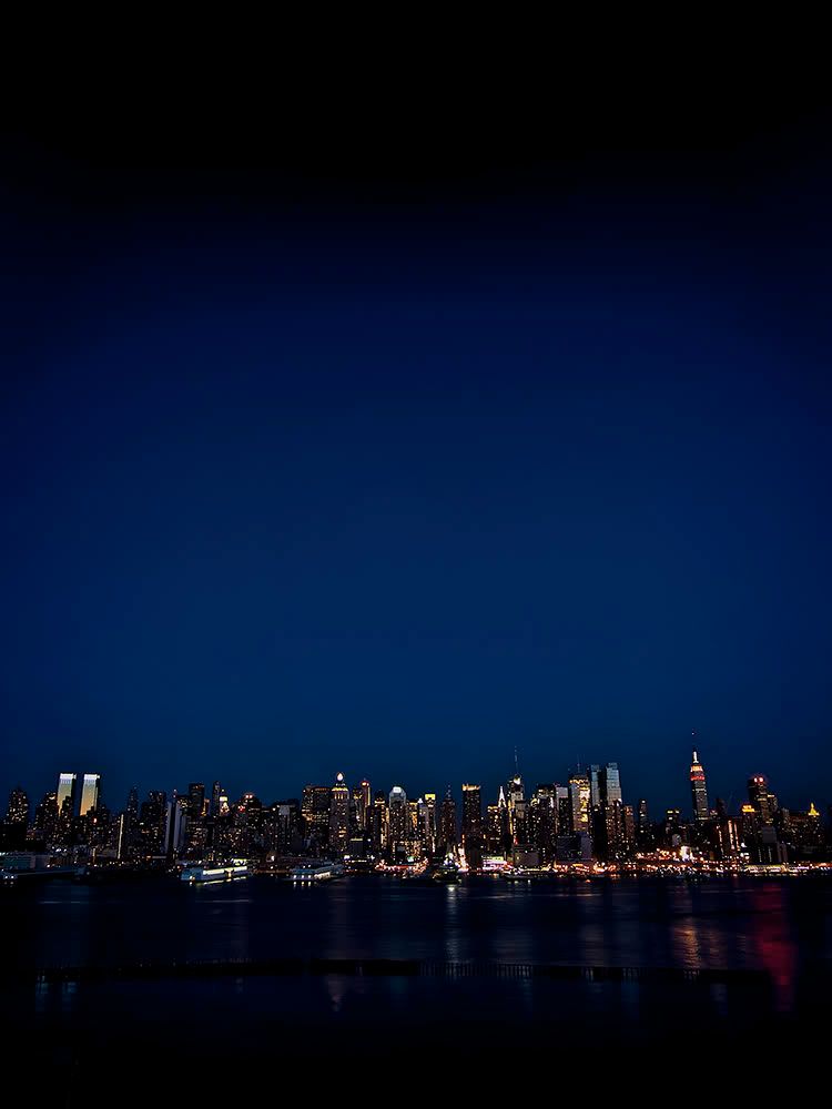
Are these pano (ie stitched)? At least at this end I'm getting a fair bit of distortion, with the skyline tilting inwards and away from me. If you can get it vertical, then awesome, but with a skyline as familiar as NYC it's hard not to notice it.
What I'm missing from here is an interesting foreground. The skyline just seems to be floating in darkness. Do you have a version with more foreground detail? I'd like to see a version with more reflections in the water and get a better look at that pier-thing.
I agree that you need to consider a crop but not necessarily all from the bottom. Those painted patterns on the street are interesting and seem to lead the eye into the photograph. The top of the photo is dark and there's not much of interest there. Maybe an idea would be to crop the dark area from the bottom of your photo and take more off the top.
I really like the 2nd one or the last one. I really like selective color when it is used right but I have noticed that most photographers do not like it. That being said, for an entry I vote for the 2nd one but for my personal fav -I like the yellow taxis
"Whether you think you can or you can't, you are right."
These latest variations look good. I can now see detail on the buildings in the background whereas before everything was just too dark. Of these latest three #1 - the Bronze two tone appeals to me the most. The silver treatment is OK but makes the streetlights look blown out. I find myself looking more at their auras that at the rest of the photo. If you're going to try additional variations, leave the shot all B&W, it'll have more of a classic NY feel to it adding selective coloring to it.
I like the crop of #2 and the toning of #1. The selective coloring is well done (especially on the movement streaks!), but overpowers the composition a bit too much for my taste. Really cool scene, regardless.
Comments
hey P -
Are these pano (ie stitched)? At least at this end I'm getting a fair bit of distortion, with the skyline tilting inwards and away from me. If you can get it vertical, then awesome, but with a skyline as familiar as NYC it's hard not to notice it.
I'm jealous you live there and can shoot it!!!!!
pyroPrints.com/5819572 The Photo Section
What I'm missing from here is an interesting foreground. The skyline just seems to be floating in darkness. Do you have a version with more foreground detail? I'd like to see a version with more reflections in the water and get a better look at that pier-thing.
http://lrichters.smugmug.com
The Pace of New York
pyroPrints.com/5819572 The Photo Section
I really like this one! For my taste - maybe just a little off the bottom. Cool photo!
I agree!
Virginia
"A photograph is a secret about a secret. The more it tells you, the less you know." Diane Arbus
Email
I agree that you need to consider a crop but not necessarily all from the bottom. Those painted patterns on the street are interesting and seem to lead the eye into the photograph. The top of the photo is dark and there's not much of interest there. Maybe an idea would be to crop the dark area from the bottom of your photo and take more off the top.
http://lrichters.smugmug.com
1. The Pace of New York (original crop, bronze 2 tone)
2. The Pace of New York (tight crop, silver 2 tone)
3. The Color of New York Evenings
pyroPrints.com/5819572 The Photo Section
I think I like the original crop or the yellow taxis - both are super
*
http://member.onemodelplace.com/member.cfm?P_ID=214042
http://lrichters.smugmug.com
(single, lonely color taxi)
pyroPrints.com/5819572 The Photo Section
*
http://member.onemodelplace.com/member.cfm?P_ID=214042