Correct this photo

goldilocksandmy3bearsgoldilocksandmy3bears Registered Users Posts: 423 Major grins
edited March 5, 2009 in Finishing School
Hey all I haven't been here in a while and looks like Ive missed a bunch!
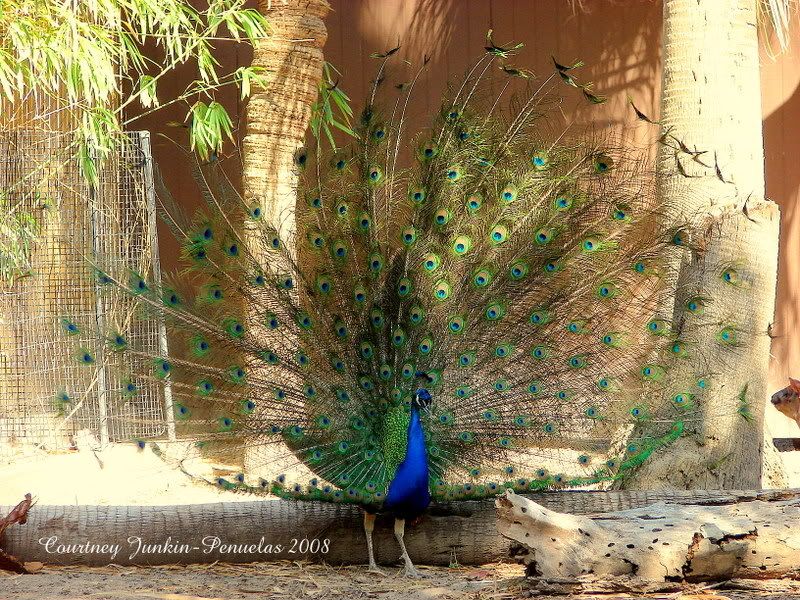
I recently started my own business making customized invitations. I have yet to think of a business name but would really like to call it something with the name Peacock and use this picture as part of my "logo" if you will. I posted this picture a while back - some liked it others said the background is distracting. What do you think and how would you change it? I can't crop anymore without cutting out the feathers. I'm planning on using this picture on my business cards (black background) Would you even change it? Any tutorials and/or advise would help. Thanks!!
gpz2.jpg
thank you!
Courtney
Courtney

Comments

  • TonyCooperTonyCooper Registered Users Posts: 2,276 Major grins
    edited February 18, 2009
    Sure you can crop a peacock and still have a good peacock image. I spotted this peacock in, of all places, a boatyard. A pet of the owners, I suppose.
    http://tonycooper.smugmug.com/photos/476281315_kUfHS-M.jpg

    I agree with the posters who said that your background is distracting. Shoot the bird or shoot a pulled-back shot that includes the bird. Your image is between the two. If you want to feature the peacock, make the shot just the peacock. It doesn't have to be all of the peacock, though.
    Tony Cooper - Orlando, Florida
    http://tonycooper.smugmug.com/
  • JustPlainMeJustPlainMe Registered Users Posts: 190 Major grins
    edited February 18, 2009
    I agree that the background is distracting. Is this at a location where you can go back and just shoot peacocks (with the camera, of course!) until you get a "more peacock" shot?

    I was able to sneak up on one at my local zoo with my point & shoot and get this, it's more abstract and I think something like this would work for a small graphic---more peacock detail, less distraction. Congrats on taking the steps to start your own business! I love peacocks, too.

    3291999948_222d1c0057.jpg
    Please ignore my opinions! And if I ask for constructive criticism, please give it to me. I have really thick skin! :huh
  • Miguel DelinquentoMiguel Delinquento Registered Users Posts: 904 Major grins
    edited February 18, 2009
    The idea of using a peacock as part of your graphic identity program is wonderful. This shot, however, is far more valuable as an art picture--there is too much going on to serve as a logo component.
    Peacocks are not that uncommon as pets; if you call around to pet dealers, they may suggest where you can find a few to photograph. One of our local zoos has them running around the grounds.
    Even easier is to purchase a stock photo and adapt that to your marketing and design plan. These days stock photos are plentiful and pretty cheap.

    M
  • goldilocksandmy3bearsgoldilocksandmy3bears Registered Users Posts: 423 Major grins
    edited February 21, 2009
    I agree that the background is distracting. Is this at a location where you can go back and just shoot peacocks (with the camera, of course!) until you get a "more peacock" shot?

    I was able to sneak up on one at my local zoo with my point & shoot and get this, it's more abstract and I think something like this would work for a small graphic---more peacock detail, less distraction. Congrats on taking the steps to start your own business! I love peacocks, too.

    3291999948_222d1c0057.jpg
    What a beautiful shot you have there. The photo was taken at the zoo - they only have one peacock and it roams around.. In the past 15 years this is Maybe the 5th time I've seen it.. and the first time I've seen it with its feathers spread like that..:cry
    Courtney
  • redriskerredrisker Registered Users Posts: 16 Big grins
    edited February 21, 2009
    I'm planning on using this picture on my business cards (black background) Would you even change it?
    Just my 2 cents worth, but if you'll be using it as part of your logo or business card, I would suggest isolating the peacock from the background and putting it onto a solid background so that the feathers would stand out.
  • RichardRichard Administrators, Vanilla Admin Posts: 19,962 moderator
    edited February 21, 2009
    redrisker wrote:
    Just my 2 cents worth, but if you'll be using it as part of your logo or business card, I would suggest isolating the peacock from the background and putting it onto a solid background so that the feathers would stand out.
    :yikes With this shot, that would take me weeks, and it probably wouldn't be very good. I think the solution is to go back and take some more shots. A logo needs to be simple to work well, and this shot has way too much going on. I like the idea of using a detail shot rather than whole bird. If you could get a closeup of the head with the tail feathers as a background, that would do the trick.
  • redriskerredrisker Registered Users Posts: 16 Big grins
    edited February 22, 2009
    Richard wrote:
    :yikes With this shot, that would take me weeks, and it probably wouldn't be very good. I think the solution is to go back and take some more shots.
    Well, if one really wants to use that specific image for the logo, you'll move heaven and earth just to hack into it :D. But I think it can be done, especially if there's a higher resolution image available.
  • JustPlainMeJustPlainMe Registered Users Posts: 190 Major grins
    edited March 2, 2009
    What a beautiful shot you have there. The photo was taken at the zoo - they only have one peacock and it roams around.. In the past 15 years this is Maybe the 5th time I've seen it.. and the first time I've seen it with its feathers spread like that..:cry

    Thank you. I shoot the peacocks every time we go, so I have about a bazillion shots, but only 2 or 3 great ones. I think if you could go back a few times, you might be able to get something that would work even better than what you have there. If you know where the one bird tends to hang out, you can go during the height of mating season when his feathers are the fullest. Good luck on your logo! I think peacocks are beautiful, their colors are just mesmerizing. And for a logo, you know, maybe just one feather? Everyone knows a peacock feather, and it would stand out.
    Please ignore my opinions! And if I ask for constructive criticism, please give it to me. I have really thick skin! :huh
  • jaxjax Registered Users Posts: 143 Major grins
    edited March 3, 2009
    How about converting it to a black and white but leave the bird in it's full colors?
  • Jack'll doJack'll do Registered Users Posts: 2,977 Major grins
    edited March 5, 2009
    I cropped your image like this which is more appropiate for a logo and avoids the cluttered bg. As others have mentioned, you don't need the whole bird in the final image. You have the original I presume so play around with that in various crop compositions

    485645171_B6rGP-XL.jpg

    485648483_SZYew-XL.jpg

    Or maybe something like this

    485841292_SEYUT-XL.jpg

    Jack
    (My real name is John but Jack'll do)
  • AnthonyAnthony Registered Users Posts: 149 Major grins
    edited March 5, 2009
    I don't want to appear as a curmudgeon, but the picture being discussed is never going to be a logo as it stands. I am sure it can be used on business cards/compliment slips/letterheads/etc. as an illustration and look good: but a logo, logotype or ideogram should be a simple, highly recognisable symbol representing the business. Just think of famous brands; Shell, Apple, MacDonalds, Samsung... they all have simple, strong symbols.

    This link is offered as a better description of logos than I could put together...

    http://en.wikipedia.org/wiki/Logo

    Please don't misunderstand me, I think the picture is fine but having designed and commissioned logos and logotypes over the years, I have found that a simple symbol is the way to go.

    Anthony.
  • Jack'll doJack'll do Registered Users Posts: 2,977 Major grins
    edited March 5, 2009
    Anthony wrote:
    I am sure it can be used on business cards/compliment slips/letterheads/etc. as an illustration and look good

    Anthony.

    I believe that's what the lady has in mind.

    Jack
    (My real name is John but Jack'll do)
Sign In or Register to comment.