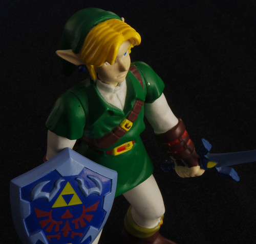
Action Figure Series
This is an action figure series (well, technically number five is actually a model, but it can be argued that it is an action figure by the definition of the term) that I've been working on for a few weeks, perhaps even a month. The timespan is mainly due to shooting opportunities; scheduling basically. All were shot in my room, on my desk. Background is a black t-shirt the I taped to my wall, except for number four, in which it was taped to my desk because of the angle. All of them are lit with clip-on lights with attached metal reflectors (the cheap kind you can get from a hardware store). All use two 30W bulbs except for number four and number seven. Four used two 30W bulbs and one 75W bulb. Four used one 30W bulb. All have been post-processed in Photoshop CS3.
One

Two

Three

Four

Five

Six

Seven

In case you have a Mac, I know that Macs usually display with a higher black point than the computer I am using, so hopefully they appear bright enough. Also, if you can notice any flaws from cloning, please tell me; I had to clone out specks of dust that got on my lens and on the shirt, and in number two I cloned out a lot of haze from frogetting to wipe off my lens, and I cloned out a few pieces of that action figure as well, small parts though. I'm just wondering if the cloning is noticeable... okay, not just wondering that, obviously I would like more C+C than that, lol.
One

Two

Three

Four

Five

Six

Seven

In case you have a Mac, I know that Macs usually display with a higher black point than the computer I am using, so hopefully they appear bright enough. Also, if you can notice any flaws from cloning, please tell me; I had to clone out specks of dust that got on my lens and on the shirt, and in number two I cloned out a lot of haze from frogetting to wipe off my lens, and I cloned out a few pieces of that action figure as well, small parts though. I'm just wondering if the cloning is noticeable... okay, not just wondering that, obviously I would like more C+C than that, lol.
Hmmmmm... blarrgh...
0
Comments
#4, I like the figure but the lighting is not as good here. It would be a great product shot for a magazine but isn't as dramatic as the rest of the lighting here.
Overall i really like the series a lot.
Thanks. I couldn't really get good lighting on the Grendel figure (#4) because of the figure and because I was borrowing it from my teacher, so I had a time limit. I also hadn't started shooting in RAW yet, so there was less I could do in post, but I like it anyway.
I would probably say that the Spawn one is the best. I also did the most post-processing on it, like an hour to an hour and a half of work in Photoshop, mainly cloning out dust and haze.
The Master Chief one I also had to do a bit of post-processing to because the visor needed some leveling, but the rest of it didn't. And I had to dodge a bit on the Assault Rifle.
Of course I also color corrected all of these, which is what took most of the time for post processing because I was being a perfectionist,
Anyway, again, thanks for the comment.
Edit: I just posted this and I saw your comment summerz, so I decided to, instead of posting a new reply, I decided to just make an edit to say thanks to you for the comment as well. So, thanks.
Thanks. I'm thinking of submitting the Spawn one to the Whipping Post, but I don't know for sure if I should or not. I probably should, but I'm so hard on my own work that I'm not really sure if it is good enough for it. Maybe I just will submit it, I don't know.
Also, I think I am going to edit three and six a bit more because on my computer at home I noticed some stuff that could use some cloning, I'm at school now and it isn't really noticeable on the computer I am on, so I might not do any more work to them. But, if I do, should I edit my first post, or should I put the new versions in a new post?
Thanks. This was actually pretty much my first time using studio lighting (I had used it before, but just for three self portraitsm all taken within one forty minute-ish period that I never did anything with, which I partially used just for practice with lighting), so hearing that the lighting is very nice is good and makes me a bit more sure about posting number two in the Whipping Post.