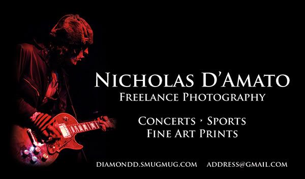
Business Card opinions please
I know this thread appears from time to time, so thanks for bearing with me. I'm looking for opinions on the overall layout, the image, and the text.
The purpose of this card is to have something with my gallery link and email address on it to give to all the people who strike up a conversation with me while I'm taking photos. This way they can browse a gallery from a concert they were at, a sporting event, etc. I have sold a number of landscape prints, and with an increased ability to connect with those interested in my shots, I think I could increase those numbers a bit. I do not have any aspirations of booking jobs, etc, at the moment so no need for phone number.
As far as the design goes, this is my first time doing this. This is one of my concert images I most like, however I realize that I may be overestimating how clear the image is as a "concert photo" because it's mine and I like it. If there are lots of negative opinions, I am not against dropping it and just going with a more plain background. Thank you for your comments and criticisms!

http://diamondd.smugmug.com
Nikon D80
Nikkor 50mm/f1.8, 18-135/f3.5-5.6, 70-300VR/f4-5.6
Tokina 11-16/f2.8
Nikon D80
Nikkor 50mm/f1.8, 18-135/f3.5-5.6, 70-300VR/f4-5.6
Tokina 11-16/f2.8
Failed to load the poll.
0