Food photography anyone?
Greetings,
I understand it's normal for a food stylist to prepare the dish for the photographer but I thought I would work through the process to get a better feel for what's involved.
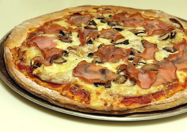
This was my first shot with continuous CF lights just to get an idea of angles, etc. a home made pizza...
Next I tried a series of shots of supper with my normal plates and found their decoration to be a distraction. So off I went shopping for a shape with a little more interest in a plain white.
My thinking was the shape might have an unconscious impact on the viewer but the color would virtually go unnoticed.
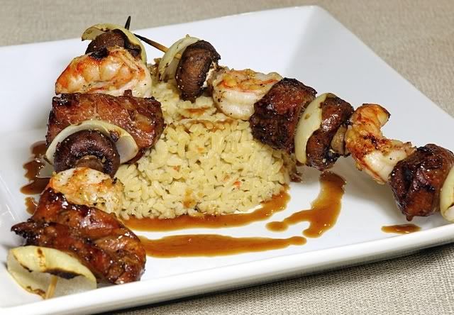
Another test shot with CF lights, unfortunately I was out of tomatoes and/or peppers. The kabobs could use some color....
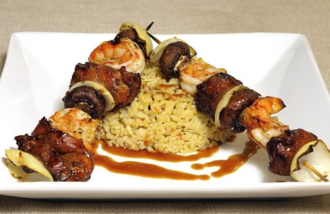
Another shot with what I think is a better angle..
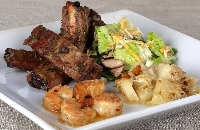
And lastly, a little more of a serious attempt. Still shot on the kitchen table but with 2 - B1600 strobes and 2' x 3' softboxes. Camera right light at table height, camera left light higher and angled down.
For the food, the Greek style ribs were left on the BBQ too long for color but I decided to go for taste over looks :wink
The ribs, shrimp and scalloped potatoes were allowed to cool till the juices/sauces firmed up.
I had eight shrimp to work with and I tried various placements, tails in, tails out, etc. Once plated I reheated the honey garlic sauce and dribbled it onto the shrimp.
For the scalloped potatoes I added crushed red peppers and scraped the brown ring off the baking dish for color...
The salad I prepared at the last minute and left the egg out of the dressing, thinking it may cloud the image?
I'd be interested to hear thoughts on plate shapes and colors and the number of elements in the shot.
For instance I think a square plate can support four ingredients whereas using a round plate three might be enough.
For these shots I didn't add plate settings, glasses, etc. because the end use for the images were to be on a recipe site.
C & C welcome.
Cheers, Don
I understand it's normal for a food stylist to prepare the dish for the photographer but I thought I would work through the process to get a better feel for what's involved.
This was my first shot with continuous CF lights just to get an idea of angles, etc. a home made pizza...

Next I tried a series of shots of supper with my normal plates and found their decoration to be a distraction. So off I went shopping for a shape with a little more interest in a plain white.
My thinking was the shape might have an unconscious impact on the viewer but the color would virtually go unnoticed.
Another test shot with CF lights, unfortunately I was out of tomatoes and/or peppers. The kabobs could use some color....

Another shot with what I think is a better angle..

And lastly, a little more of a serious attempt. Still shot on the kitchen table but with 2 - B1600 strobes and 2' x 3' softboxes. Camera right light at table height, camera left light higher and angled down.
For the food, the Greek style ribs were left on the BBQ too long for color but I decided to go for taste over looks :wink
The ribs, shrimp and scalloped potatoes were allowed to cool till the juices/sauces firmed up.
I had eight shrimp to work with and I tried various placements, tails in, tails out, etc. Once plated I reheated the honey garlic sauce and dribbled it onto the shrimp.
For the scalloped potatoes I added crushed red peppers and scraped the brown ring off the baking dish for color...
The salad I prepared at the last minute and left the egg out of the dressing, thinking it may cloud the image?

I'd be interested to hear thoughts on plate shapes and colors and the number of elements in the shot.
For instance I think a square plate can support four ingredients whereas using a round plate three might be enough.
For these shots I didn't add plate settings, glasses, etc. because the end use for the images were to be on a recipe site.
C & C welcome.
Cheers, Don
0
Comments
You have good control over the lighting and you are producing images that have a lot going for them. I suggest that just a little different technique is required of many food shots to make them stand out.
Check out the links in this post:
http://www.dgrin.com/showpost.php?p=454531&postcount=8
Also this post from our Kisi:
http://www.dgrin.com/showpost.php?p=1051553&postcount=5
Moderator of the Cameras and Accessories forums
That should satisfy the readaholic in me for a while
Cheers, Don
Product Photography
My Acreage Bird Photographs
Check these out mate!
And I'm sorry to steal your thread.
My Web Site
No problem,
I hope you don't mind a critique
As I said on Your thread about the onion rings, I think the color on the rim of the plate is distracting.
I would like to see less rings/pieces more artfully arranged. Perhaps a couple slices of lemon, coarse salt, etc. to garnish.
Some light on the background would give this image a different feel.... consider trying a lower angle and get in closer, see if you like that.
Hmmmm, leftovers in a plastic bowl.
Some kind of chunky peanut sauce?
I'm actually confused by this one.
Ah, I get it. It's the tool to cut the rings..... Would have got it right away if the focal point was the blade and/or part of an onion was in the frame. I do like the lighting more on this one and the DOF aside from the focal point
I would try a larger plate and a lower sided bowl, also shot from a lower angle. Perhaps move one of the top bagel pieces over so we can see what's inside. Again some color would help, say some lettuce and cheese wedges....
A BBQ'ed roast of some kind?
I'd guess a glazed pork rib roast ?
I understand the tinfoil relates to how it was cooked but I think I'd rather see it plated, maybe potatoes, brocolli, carrots and without a chunk missing
Hold the pineapple
The cheese is a little blown, again a lower angle would help and perhaps leave enough shadow to see that indeed the pizza is sliced.
I see that you also missed the one detail that I did too. Brush the flour off the crust before baking or turn that portion to the back. A golden crust has more eye appeal. I sometimes brush the crust with olive oil before baking.
I'd probably slice the whole pizza, get in close for a 2/3 shot and lose the tool, it's an unnecessary element. Just to make it even more difficult you could add a glass of beer and a napkin
With all due respect, it appears you are taking snapshots of supper just before eating it.
No problem with that, I've been there, done that...
If you care to take it to the next level, I suggest you read some of the links ziggy53 has provided. Try shooting with natural light or acquire some lights and be prepared to have to warm supper up again.
Bon appetit, Don
Product Photography
My Acreage Bird Photographs
And your right, I am taking photos of dinner right before I eat it. and I will be taking it to the next level when I start my photography class in June.
The sauce you see in the picture is a BBQ sauce I make out of Dr Pepper, and I was showing everyone the fruits of my labor, Also the other shots are right on when you called them.
By the I love critique, so critique away!
Thank again Don.
My Web Site
Here is the shot for you to see 1 light from behind-left (2 feet above the surface) and a bounce card:
p.s. your choice of plates was fine. Your cooking ain't bad either.
cheers.
____________
Eat MY SHOT
The Food Photographer
Greetings,
I am going to assume that by flat you mean lack of shadows?
On my monitor it appears quite a bit brighter than your example.
You didn't make it clear if you prepared the food in your shot?
And please, what is the brown stuff under the shrimp?
Cheers, Don
Product Photography
My Acreage Bird Photographs
1. the subject should be lit.
When i say subject i mean the food. Not the plate, not the props, not the background not the foreground
there a few elements to think about
a) highlight - non of your shot have it
b) shadow non of your shots have it
c) gradation of light - non of your shots have it
the light is flat
you should aim for all three
The pizza- light is too defused
The kebabs-to hard
The ribs - too flat
the brown stuff are lentils. They are good for you.
____________
Eat MY SHOT
The Food Photographer
Thanks Sasha, I'll keep that in mind for the future.
As I said, I was working through angles, focal length, plates and presentation. At this stage fine tuning the lighting was secondary and I will admit to having tunnel vision concerning the plate's shape and color.
You didn't say if you had anything to do with the styling?
Not to worry, I'll share my thoughts on that anyhow
Keep in mind, this is just my opinion and although I am using your shot as an example for discussion, my comments are not meant as an attack of your work...
Onwards...
They may be but I find the color doesn't compliment the shrimp very well. Perhaps a smaller portion of a rice dish would be more appealing, of course if this is the actual dish to be presented that won't work..
The shrimp appear dry, a quick dunk in butter or a spray of glycerin might be in order. I would likely move the pieces at the back of the plate forward.
I'm going to guess the garnish is a sprinkle of dried parsley? If so, I feel the size/amount and placement of this appears messy or dirty. Coarsely chopped fresh parsley may be a better choice.
I have the same issue with the meat plate, the garnish is too small and must be a pain to place
I think the meat dish could benefit from some searing marks and the asperagus looks over cooked.
And finally, the fork looks out of place and the zig zag background is distracting. But, removing them may change the mood of the image..
Looking forward to hearing your thoughts.
Cheers, Don
Product Photography
My Acreage Bird Photographs