DSS #24 - Could really use some feedback
 anonymouscuban
Registered Users, Retired Mod Posts: 4,586 Major grins
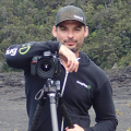
So based on my previous post, I am trying to emulate Andrzej Dragan's very dark and moody style of portraiture, which over the past week or so I have found to be an impossible task.
I first tried shooting a few self portraits, which really helped to practice the PP technique but really failed at getting the context of his images. I hoping this picture has capture the essence of Dragan's work but with a bit of me in it as well.
I'd really appreciate any feedback that you can give me. Here is the final image and the original I started with for comparison.
EDIT...
I did some more work on the image based on some of the feedback you guys have provided. I brought out some of detail in his clothing and I also cut back just a bit on the facial highlights.
So which one, the first or the second?


Original Image:

I first tried shooting a few self portraits, which really helped to practice the PP technique but really failed at getting the context of his images. I hoping this picture has capture the essence of Dragan's work but with a bit of me in it as well.
I'd really appreciate any feedback that you can give me. Here is the final image and the original I started with for comparison.
EDIT...
I did some more work on the image based on some of the feedback you guys have provided. I brought out some of detail in his clothing and I also cut back just a bit on the facial highlights.
So which one, the first or the second?


Original Image:

"I'm not yelling. I'm Cuban. That's how we talk."
Moderator of the People and Go Figure forums
My Smug Site
Moderator of the People and Go Figure forums
My Smug Site
0
Comments
This looks like you hand painted it.......
This is a winner in my opinion..
You would be crazy not to enter this work. It is awesome.. you simply must share how you pulled this off after the voting is closed..please...
Is this mostly light work? I mean it looks like a painting and it has superb 3-d depth to it.. Your choice of colors here are in perfect contrast..
I immediately thought of Doug Lindstrand.. I own a lot of his print work.
He is a photographer who sketches what he shoots..He works on Alaskan culture and wildlife and
if you go to this link and scroll down to
"First Snow"
http://douglindstrand.com/alaskan_sketches.htm
this is what your Photo brought to my mind immediately.. He used to photograph and sketch old miners in Alaska..
Awesome Job..
Kat
Dan
http://danielplumer.com/
Facebook Fan Page
I posted the original image in my first post so you can compare.
Moderator of the People and Go Figure forums
My Smug Site
Only nit I have, the highlights on the nose, cheekbones and over the eyes look a little too bright. I've looked at Dragan's work before, but not closely enough to know if that's a distinct characteristic of his work. They are a bit distracting at the moment... if you could tone them down just a bit, I think it would really help!
SmugMug QA
My Photos
Moderator of the People and Go Figure forums
My Smug Site
Virginia
"A photograph is a secret about a secret. The more it tells you, the less you know." Diane Arbus
Email
F800GS
Let me know which one of the two images you like best and if there is anything else I can do to improve it. One thing that would be helpful is to check on your monitor if you see any artifacts in the background. I don't see any on mine but you may on yours.
Thanks.
Alex
Moderator of the People and Go Figure forums
My Smug Site
http://danielplumer.com/
Facebook Fan Page
You mean the plastic chair doesn't add interest to the picture?
Moderator of the People and Go Figure forums
My Smug Site
Love the new vest work, it adds depth and texture; and nice job on the face and brightening up those eyes. I was worried that by toning down the face it would make it too flat,, but you left just enough highlight and pulled it off nicely... great job and very competitive.
Kat
— Kevin
My Site, My Book