Alexa's Senior Shoot
A few from a day with Alexa. Please feel free to comment.
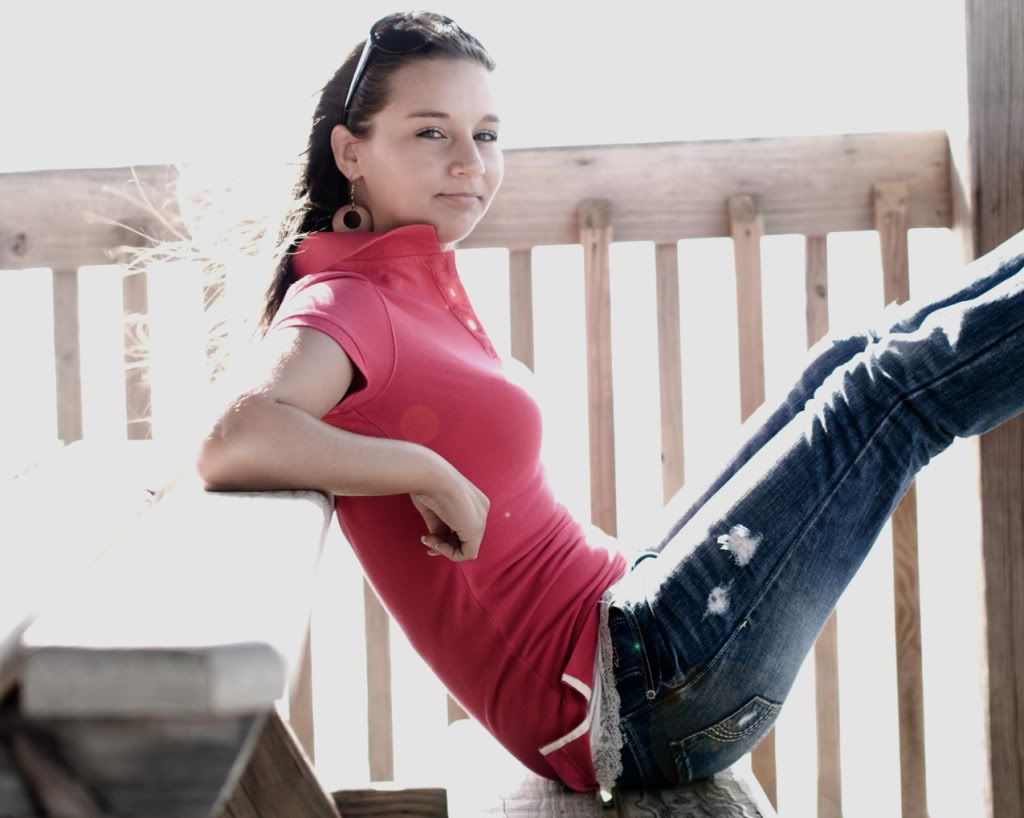
1. (trying for some lens flare)
2. (semi-serious but the eyes make this one ok maybe?)

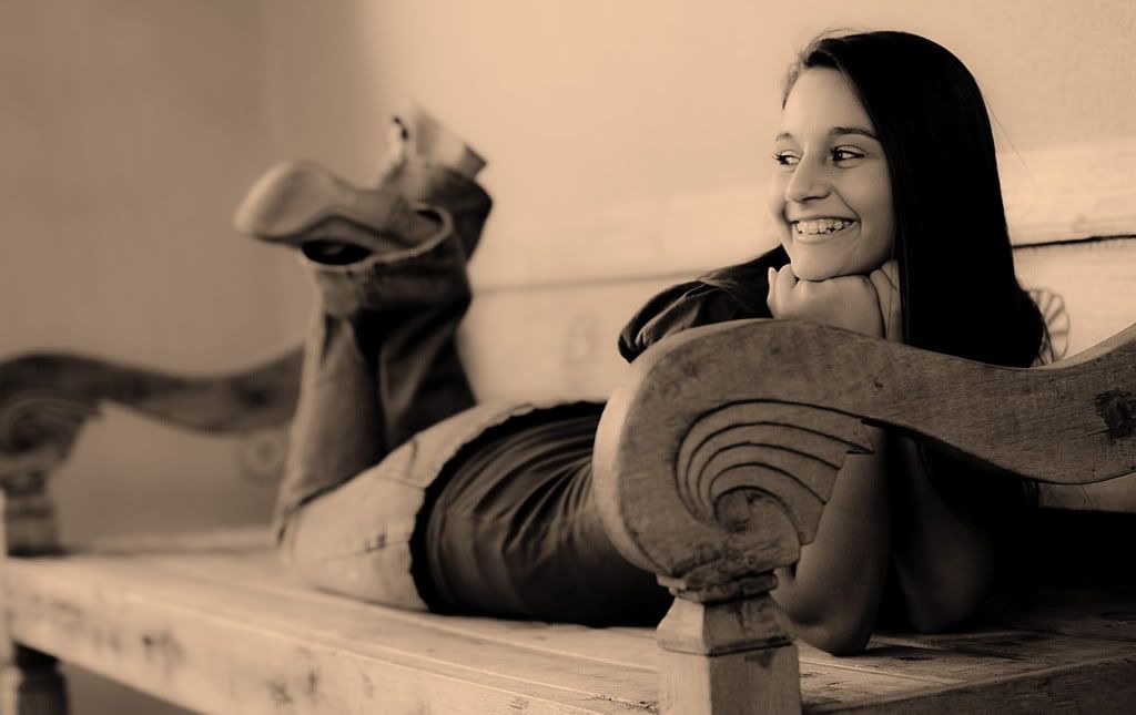
3. (a beautiful smile...she was worried about the braces....too noticeable?)
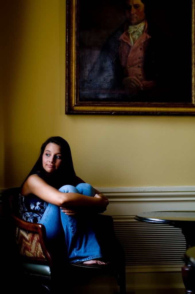
4. (window light only....but darn it (the expression) she just seemed to be a bit shy)
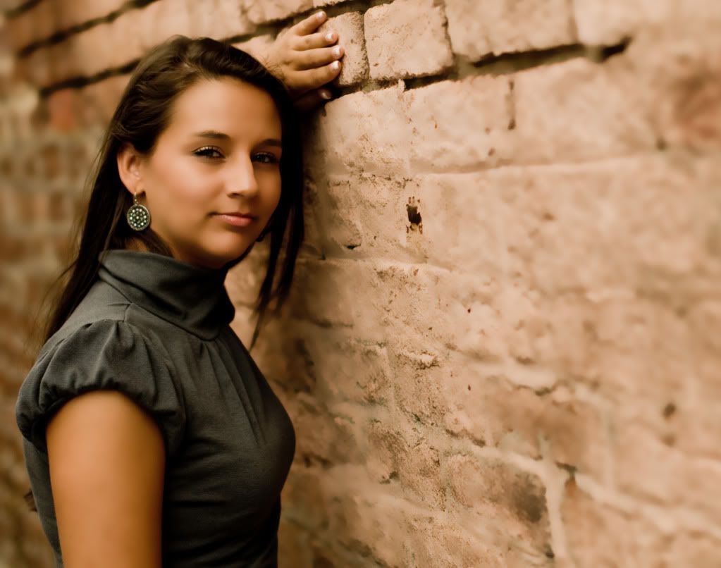
5. (the "on-purpose" serious/sophisticated glare....? :wink )
1. (trying for some lens flare)

2. (semi-serious but the eyes make this one ok maybe?)

3. (a beautiful smile...she was worried about the braces....too noticeable?)

4. (window light only....but darn it (the expression) she just seemed to be a bit shy)

5. (the "on-purpose" serious/sophisticated glare....? :wink )

0
Comments
14-24 24-70 70-200mm (vr2)
85 and 50 1.4
45 PC and sb910 x2
http://www.danielkimphotography.com
1. I'm not liking the "portrait near ground zero of a nuclear blast" look, although I realize it was intentional. For flare shots, I would suggest something where the light is coming in through a small portion of the frame, like sunlight through some trees, etc but having most of the shot in shade. That way you'll get the flare effect without blowing out everything else. It will also be more noticeable; in this shot you don't see that much of it because it's overwhelmed by the blown out highlights on everything else.
2. Beautiful location, I love the wall for a background. Nice light as well. It looks like the focus is on the wall though. That could be a result of over-blurring the face though... nothing in the face looks sharp to me, anyway, while the wall texture is very crisp.
3. I like this one and wouldn't have noticed the braces if you hadn't mentioned it. I'd lean towards a little more contrast but that's a personal thing.
4. Nice spot to shoot (except maybe for the vent) and I like the window light, but again it looks like either the focus is on the wall or there's some heavy blurring applied to the subject.
5. Nice pose, light, composition, but the expression leaves something to be desired. Mainly though I think you went a little overboard on the processing. Her skin looks very plasticy/blurry here and not very natural. This processing might be the reason that the focus looks off in the other photos... I always try to maintain skin texture when retouching. It makes it a lot harder and more time consuming but if your subject sees the photo and thinks "Wow, I look great!" as opposed to "Wow, the photographer really did a lot of photoshop on my face to get rid of blemishes!" then it's all worth it IMO. It's like makeup: if it's done right you don't notice that it's there.
I think you're doing a great job of picking locations, composing, and finding good natural light (which I know is not easy... unless of course you lit these shots, which is also cool because the light is good either way). I'd try to work on subject interaction/direction (it's hard, I know... I've shot hundreds of photos with great light and composition only to sift through them later and find that there isn't a single one with a great expression on the face...) and also try to develop your post processing technique beyond the "blur-it-all-away" method (which is where I started myself, so I know it's tempting). Good luck!
http://blog.timkphotography.com
Thanks for the info and comments everyone....definately good information to build on.
-Dan K.
www.dank-photo.blogspot.com
Nikon D90|17-55 f/2.8|50mm f/1.4G
CC always welcome and appreciated!
Now, if only that hand wasn't there - it's not connected to anything and detracts from the image for me! The black mark on the wall in front of the face could also be dealt with.