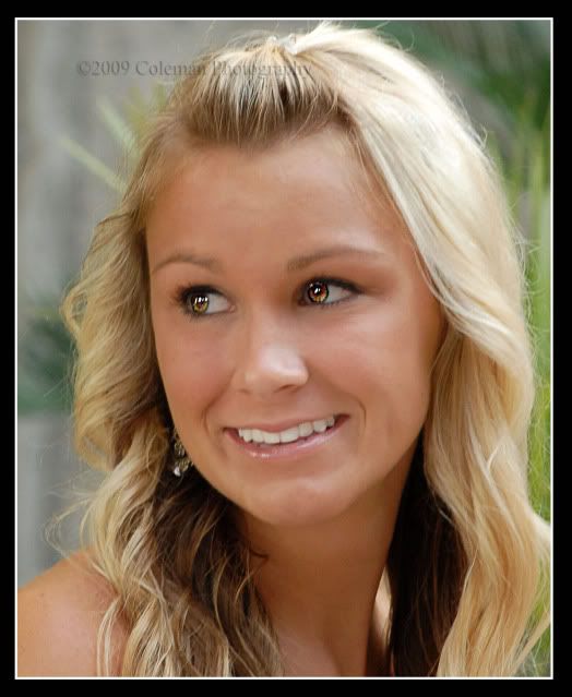
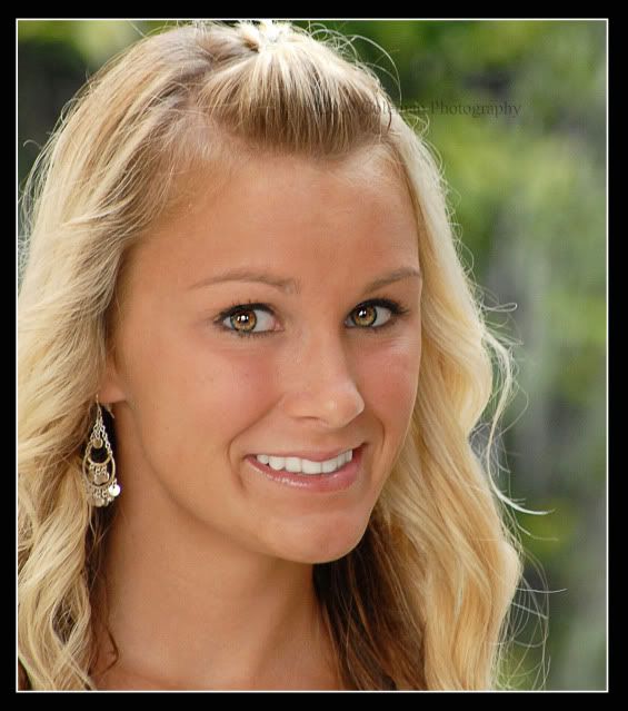
First and second look a bit blurry, moreso the first one, skin tone looks a bit off.
Smiles look forced.
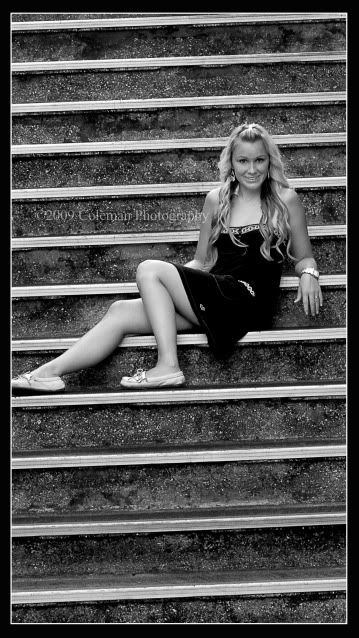
Third one I like the idea, tilt a bit more or straighten it, her foot is cut in half and smile looks forced.
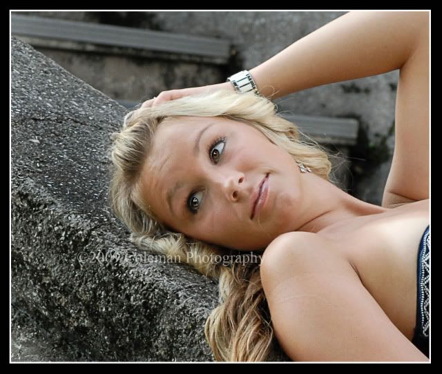
Last one has a more natural look, but forehead is crinkled, to much space on the left of the frame. This photo is better shot from the side or slightly above not so much from below.
Lighting looks a bit flat but OK.
I hope this does not come across as harsh, but if I told you I loved them that would not help you much for the next time.
She is a very pretty girl.
Keep shooting!!
The first two are broad lite which makes the face fatter, watch out for that. They could use more of a ratio in bright to dark on the face. I like the third but watch the toe cut off. Don't know what is happening in the 4th. It is not reflective if that was your aim.
thanks guys, yes in my original with out the border toe is not cut off. i thought the eyes came out a little over processed as well. is there a way i can fix skin tone you are talking about, and what do you mean not reclective in number 4. I love this site i have leaned so much on here.
Eyes are overdone.....Did you do this in PS? I also sharpen eyes selectively...but not to that degree...looks "supernatural"...which I don't think is what you were looking for.
.
The last one is the best....I don't mind the space to the left at all....that is where her eyes are taking you and in lends more towards an interaction with the environment...which I like and feel adds to the photograph.
.
There are errant pieces of hair across her chin in that one and on her arm that should have been removed. IMO.
Comments
Smiles look forced.
Third one I like the idea, tilt a bit more or straighten it, her foot is cut in half and smile looks forced.
Last one has a more natural look, but forehead is crinkled, to much space on the left of the frame. This photo is better shot from the side or slightly above not so much from below.
Lighting looks a bit flat but OK.
I hope this does not come across as harsh, but if I told you I loved them that would not help you much for the next time.
She is a very pretty girl.
Keep shooting!!
http://www.flickr.com/photos/21695902@N06/
http://500px.com/Shockey
alloutdoor.smugmug.com
http://aoboudoirboise.smugmug.com/
EF 2.0x II extender BG-E6
www.cameraone.biz
My Web Site
.
The last one is the best....I don't mind the space to the left at all....that is where her eyes are taking you and in lends more towards an interaction with the environment...which I like and feel adds to the photograph.
.
There are errant pieces of hair across her chin in that one and on her arm that should have been removed. IMO.