Finally got around to doing some post.. CC please
These are some before and after post shots that i took a few weeks ago. Is the post to much? to saturated? Also, I have question about MP, I shoot with a D50 (for now, till i can get a 700) and it's only 6mp.. will this be enough to goto a 20x30 print.. or will it lose it clarity? I printed out some of these (SOOC) on 8x10 and they looked great.. just wondering how large I can go. thanks in advance for any and all C&C. Oh, and please excuse my rookie skills at photoshop .. i'm still learning how to use.
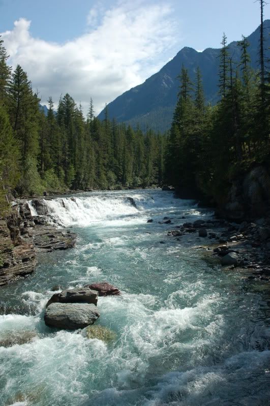
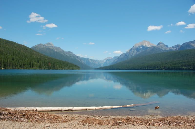
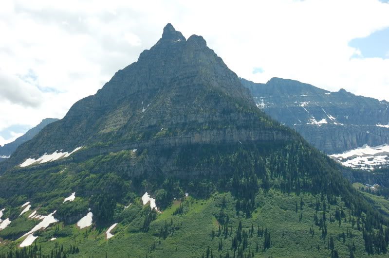
#1
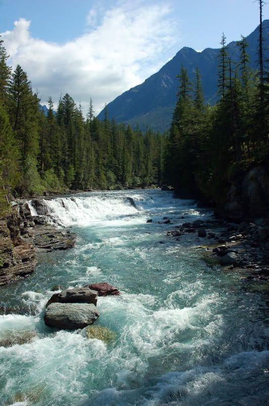
#2
#3
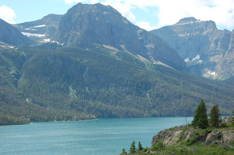
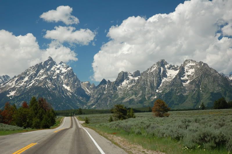
#4
#5
Thanks for looking
Devin.
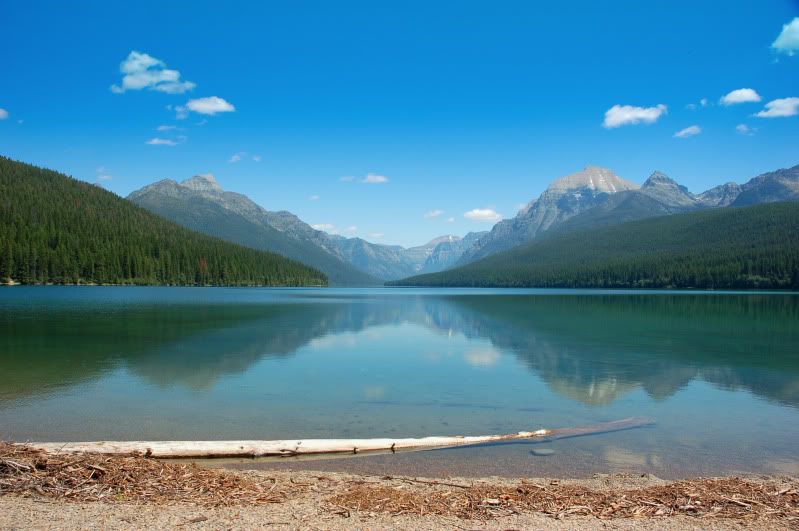
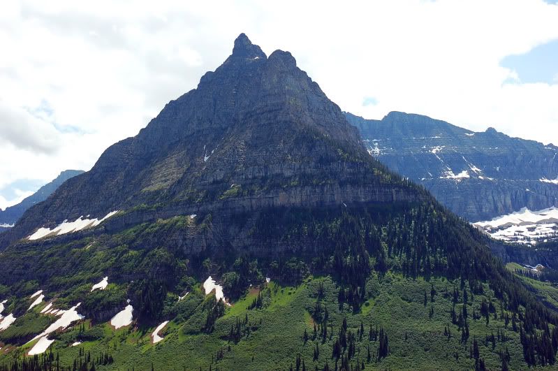
#1
#2
#3
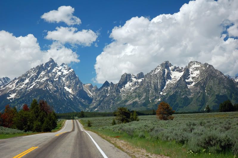
#4
#5
Thanks for looking
Devin.
Devin
0
Comments
I do like images 1 and 3 though, at the moment before you've edited them.
Ian
Where are these taken?
Cheers,
Marc.
all but #4 were taken at Glacier National Park.. 4 was taken at the tetons.
I realize that I probably put these in the wrong place (being that most of what i was asking is to do with the post on them), mods please feel free to move.
back to the drawing board in photoshop..
Ok - went back and toned down the saturation a bit... any better ?
It isn't just saturation, it's contrast too. A lot of the whites really got blown out in some of them. The water in the first one, for example - and the clouds. The saturation in the sky on that one is way over-done too. Instead of a nice blue with cloud details it now has a harsh blue/cyan with white blotchy-looking clouds.
On the positive side though, the trees and rocks have more life to them. If you want to boost the saturation try dealing with individual channels (green and yellow), or do an overall increase while dropping blue/cyan.
If you think you need more contrast try playing with the curve instead of the contrast/brightness controls. Sometimes adjusting the lower-end of the curve while leaving the higher-end will give nice shadow depth without being too harsh. An alternative would be to bring the highlights down with the shadow/highlights control after making your contrast adjustments.
ah, good stuff.. exactly what i was looking for.. many thanks Scott
Think you overdid it with the photoshop in some, your SOOC's are pretty nice as they are, only need minor adjustments IMO
Mahesh
http://www.StarvingPhotographer.com
Thanks, I did post in dwayne's thread.. he is the one that tweaked #3 in that thread.. so I was just practicing the things he did to my photo.. obiously i missed the mark by a bit..
I went back and toned them down.. the original posted edit's (see comments 1 &2 ) were even worse. I think i need to find a happy medium, but for now SOOC seem to be better than my software skills.
thanks for your comments
Thanks Mahesh