"Engagement Practice"

goldilocksandmy3bearsgoldilocksandmy3bears Registered Users Posts: 423 Major grins
edited July 31, 2009 in Weddings
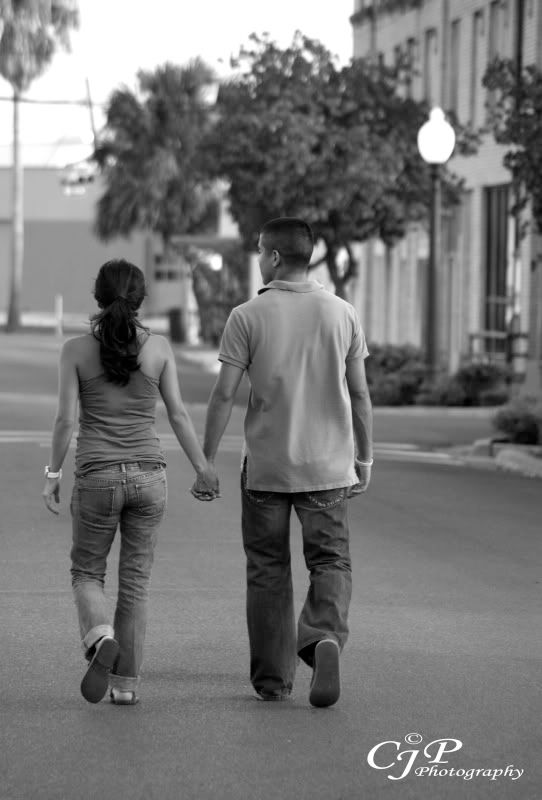
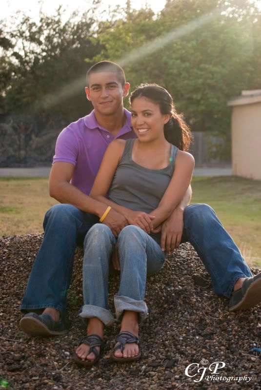
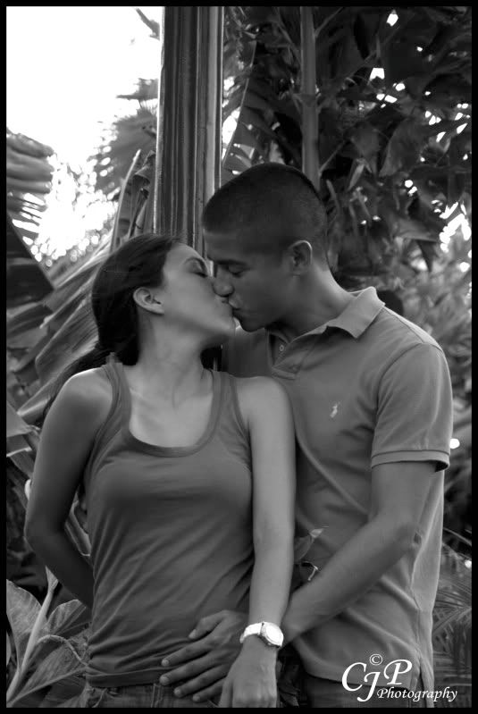
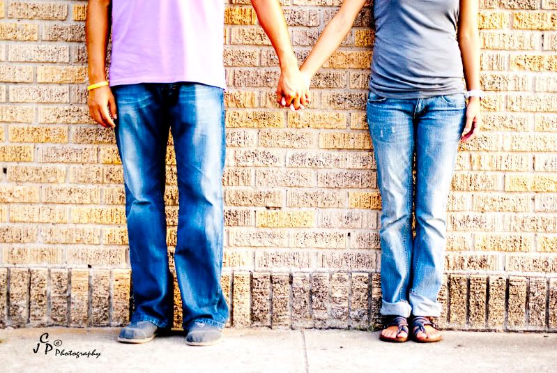
Here are a few pics of my sister in law and her b/f I told them I needed some engagment shots for my portfo. so pretend ha..(they aren't engaged). C&C welcome.
6-1.jpg
12.jpg
DSC07359.jpg
17.jpg
Courtney

Comments

  • RichardRichard Administrators, Vanilla Admin Posts: 19,962 moderator
    edited July 30, 2009
    Hey Courtney,

    I understand that it's just pretend, but you'll probably get better feedback in the Weddings forum.

    Cheers,
  • goldilocksandmy3bearsgoldilocksandmy3bears Registered Users Posts: 423 Major grins
    edited July 30, 2009
    Richard wrote:
    Hey Courtney,

    I understand that it's just pretend, but you'll probably get better feedback in the Weddings forum.

    Cheers,
    Thanks Richard! :D
    Courtney
  • KellyCKellyC Registered Users Posts: 129 Major grins
    edited July 30, 2009
    I dislike #1, pretty everything about it, if you found it in a box of pictures 5 years from now you most likely would not know why it was taken or who was in it. Not fond of #2 either, the DOF not good, his head blends in to the trees. #3 is better, but not sure about the streak running across the boyfriend's head, and the cut-off foot. #4 is too dark, and has some blowout in the upper left corner.

    They look like a good couple to work with, so keep trying.

    These are my personal feelings about the images, it is not meant to offend you.

    Kelly
  • heatherfeatherheatherfeather Registered Users Posts: 2,738 Major grins
    edited July 30, 2009
    Oh contraire... #1 was the one I liked best out of the set. Miles better than the others.
  • elizabeth_Lunaelizabeth_Luna Registered Users Posts: 308 Major grins
    edited July 30, 2009
    Oh contraire... #1 was the one I liked best out of the set. Miles better than the others.


    I agree with you on that one.thumb.gif
  • divamumdivamum Registered Users Posts: 9,021 Major grins
    edited July 30, 2009
    I agree with you on that one.thumb.gif

    15524779-Ti.gif me three

    That said, the "hands only" shot is one that's currently very popular from what I've seen; it's possible it might seem "dated" in 30 years, but I think in some ways that's ok. NOTHING is timeless (makeup, clothing, cars etc etc) and will help place it in a specific time and place. For an engagement shoot (if this were a real one), I'm not sure that's a bad thing :)
  • JulieLawsonPhotographyJulieLawsonPhotography Registered Users Posts: 787 Major grins
    edited July 30, 2009
    
    I'm with the majority...Loving #1 very cool                        
  • jeffreaux2jeffreaux2 Registered Users Posts: 4,762 Major grins
    edited July 30, 2009
    I agree that #1 is your best shot, but Im bugged a bit about it not being straight. On shots like this I prefer to see EVERYTHING square to the camera.....and in that case your cameras sensor should have been straight on to the wall. Here, the lower part is straight, but the upper part of the frame shows the mortar in the bricks to be unlevel. Bricks arent laid that way!:D
  • goldilocksandmy3bearsgoldilocksandmy3bears Registered Users Posts: 423 Major grins
    edited July 31, 2009
    thank you for all the c&c. I agree with the first photo being an "in style" photograph. Perhaps in a few years it will be "out dated" however, like one poster said it might not be a bad thing.
    I agree with the point made about the photo not being straight I took it to photoshop and did a free transform and lined it up- Thanks!!

    Thanks again for the C&C

    Court
    Courtney
  • Scott_QuierScott_Quier Registered Users Posts: 6,524 Major grins
    edited July 31, 2009
    1 - "Who are they?" is a question that will be heard in the future ... unless the wall has some special meaning for them. This is a shot that is very much in vogue right now but will not, I fear, stand the test of time - will quite quickly become dated - in quite a bit less then "30 years" - more like 5 would be my guess. As executed, though, it is well done. I like the processing

    2 - This one has promise. I think I would crop it to remove the blown sky, then brighten it a touch. For me, it has a fatal flaw - no interaction between them and the viewer, or "why are they walking away from me?" It would have been better, I think to have had them walk away (as they are), but then turn in mid-step and glance back at the camera with bright, excited expressions.

    3 - Everyone's getting into this intentional flare thing. I just don't get it. In this example, the flare line goes right through his head - very distracting. Oh, and you cut off his foot - how's he going to walk now? :D

    4 - The blown sky ruins it. With it there, you don't have the lattitude of tonality needed to bring them up a bit. And, they need to be brought up a bid - they're too dark. Her watch - aside from the sky and a few specular highlights, it's the brightest thing photo - very effective in drawing attention away from the couple and their kiss. There's a bunch of "wasted" space above their heads.

    What this set shows me is that you are very much in touch with the current trends and you have a good eye. Those are very important and very, very difficult to learn if you don't already own them - so you are a step up from most. However, this set also shows that you are missing some of the finer points of technique - for example
    • You have blown the sky in all that have sky. These were all taken without additional lighting. A bit of fill flash, used correctly, would have allowed you to present very natural looking photographs and kept the sky (unless, of course, the sky was over-cast, then all bets are off <img src="https://us.v-cdn.net/6029383/emoji/deal.gif&quot; border="0" alt="" >).
    • Attention to background could be improved. In 2 and 4 there are things growing out of heads - not normally a good thing. A step or two by you in one dirction or another would have corrected that issue.
    • Before releasing the shutter - "walk the frame". With your eye in the viewfinder, look at all four sides of the frame for distracting elements or things that shouldn't be there and/or for body parts that are escaping from the frame.
    I really hope you don't see the above as being harsh. That's not my intent. I believe you are just >< that close to "getting it" and the above comments are intended to push you over the edge, past the point of epiphany.
  • zoomerzoomer Registered Users Posts: 3,688 Major grins
    edited July 31, 2009
    If the rest of them popped like the first one this would be a good set.
    Also watch out for clipping body parts, like half a foot or half a hand.
    Looks like everyone was having a good time.
  • byjosephbyjoseph Registered Users Posts: 3 Beginner grinner
    edited July 31, 2009
    hey, gotta say i agree with the majority on this one. #1 is the best of the lot because of the processing style, not so much just because it's a hands and feet shot.

    in any case, i dont think i tmatters so much that third parties will not know 'who it is' because these are photos for the couple (well, let's pretend haha) and not for public knowledge.

    you should try to process the rest of the photos with the same punch!
  • goldilocksandmy3bearsgoldilocksandmy3bears Registered Users Posts: 423 Major grins
    edited July 31, 2009
    1 - "Who are they?" is a question that will be heard in the future ... unless the wall has some special meaning for them. This is a shot that is very much in vogue right now but will not, I fear, stand the test of time - will quite quickly become dated - in quite a bit less then "30 years" - more like 5 would be my guess. As executed, though, it is well done. I like the processing

    2 - This one has promise. I think I would crop it to remove the blown sky, then brighten it a touch. For me, it has a fatal flaw - no interaction between them and the viewer, or "why are they walking away from me?" It would have been better, I think to have had them walk away (as they are), but then turn in mid-step and glance back at the camera with bright, excited expressions.

    3 - Everyone's getting into this intentional flare thing. I just don't get it. In this example, the flare line goes right through his head - very distracting. Oh, and you cut off his foot - how's he going to walk now? :D

    4 - The blown sky ruins it. With it there, you don't have the lattitude of tonality needed to bring them up a bit. And, they need to be brought up a bid - they're too dark. Her watch - aside from the sky and a few specular highlights, it's the brightest thing photo - very effective in drawing attention away from the couple and their kiss. There's a bunch of "wasted" space above their heads.

    What this set shows me is that you are very much in touch with the current trends and you have a good eye. Those are very important and very, very difficult to learn if you don't already own them - so you are a step up from most. However, this set also shows that you are missing some of the finer points of technique - for example
    • You have blown the sky in all that have sky. These were all taken without additional lighting. A bit of fill flash, used correctly, would have allowed you to present very natural looking photographs and kept the sky (unless, of course, the sky was over-cast, then all bets are off <img src="https://us.v-cdn.net/6029383/emoji/deal.gif&quot; border="0" alt="" >).
    • Attention to background could be improved. In 2 and 4 there are things growing out of heads - not normally a good thing. A step or two by you in one dirction or another would have corrected that issue.
    • Before releasing the shutter - "walk the frame". With your eye in the viewfinder, look at all four sides of the frame for distracting elements or things that shouldn't be there and/or for body parts that are escaping from the frame.
    I really hope you don't see the above as being harsh. That's not my intent. I believe you are just >< that close to "getting it" and the above comments are intended to push you over the edge, past the point of epiphany.

    Great C&C thank you so much for taking the time to do it for each picture. I love your idea about them walking away then turning with a great expression. I did not find it harsh at all in fact I'm going to save this post so I can learn from it and try again. Thanks again!! <img src="https://us.v-cdn.net/6029383/emoji/clap.gif&quot; border="0" alt="" >
    Courtney
Sign In or Register to comment.