Thoughts on this?

InsuredDisasterInsuredDisaster Registered Users Posts: 1,132 Major grins
edited August 6, 2009 in Sports
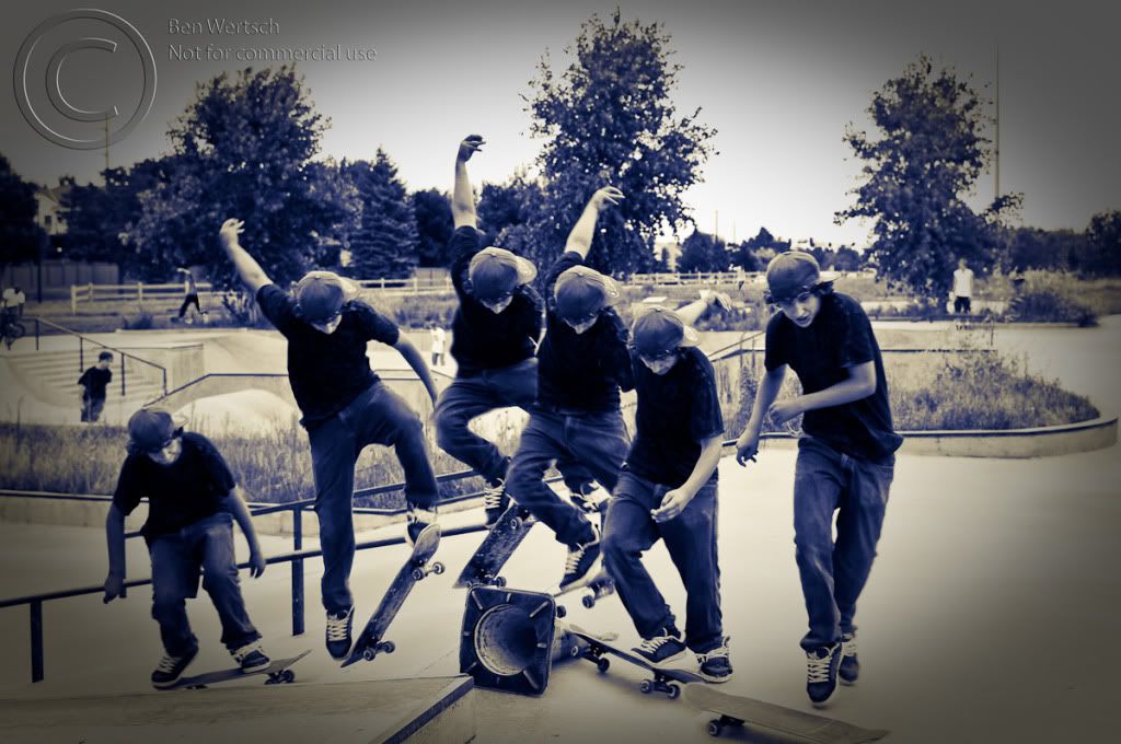
He failed to complete the trick, but it was time for both of us to leave and this was the best I had to work with. I'll be heading back out again to try this in the future, but I was curious if anyone could give me some feedback and comments on the image below so that I can improve in the future. Thank you!


ISO 400, 2.8 1/320th second
8FPS using MB-D10 and AA batteries (six images used in this shot)


_3031689-Edit-Edit-1.jpg

Comments

  • phillybikeboyphillybikeboy Registered Users Posts: 92 Big grins
    edited August 5, 2009
    He failed to complete the trick, but it was time for both of us to leave and this was the best I had to work with. I'll be heading back out again to try this in the future, but I was curious if anyone could give me some feedback and comments on the image below so that I can improve in the future. Thank you!

    Maybe it comes from too many skate magazines for too many years, but for multiple images of a trick, I want to see a sequence of separate shots. While that's a really good composite, the technique gets in the way of telling the story. I want to see how a trick works, or in this case, why it didn't, but through the jumble of arms and legs and everything it all gets lost.

    I suspect someone less interested in skating will have a different opinion based on the overall aesthetics of the shot, but for me, despite the solid technical execution the shot really doesn't work.
  • InsuredDisasterInsuredDisaster Registered Users Posts: 1,132 Major grins
    edited August 5, 2009
    Maybe it comes from too many skate magazines for too many years, but for multiple images of a trick, I want to see a sequence of separate shots. While that's a really good composite, the technique gets in the way of telling the story. I want to see how a trick works, or in this case, why it didn't, but through the jumble of arms and legs and everything it all gets lost.

    I suspect someone less interested in skating will have a different opinion based on the overall aesthetics of the shot, but for me, despite the solid technical execution the shot really doesn't work.

    For me, I actually like the composite better, as it shows everything in just one shot. I'm not a big fan of 9 or 10 frames plastered on a page. But that's just me of course.

    But, just curious, how would I get you to like it better? I deleted several images in the sequence to give a better spacing. If I was to have fewer images so there was more distance between each shot, do you think it might be less a jumble of images? I don't think this trick is the best, as he bunches up too much during the jump, but perhaps a faster moving trick?


    Or, what if I was to reduce the opacity of most of the shots, and instead keep one of peak action? Again, this one's not the greatests of shots or tricks to work with, but it might help lessen the jumple effect, and instead just show the moves leading up to, and following peak action, but the emphasis would be on peak action.

    Maybe a combination of shots?


    I might not be able to get you to like it:cry , but I'm just curiuos if some of my other ideas would be more to your liking.


    Thanks for your comments, I do appreciate them.thumb.gif

    I'm including the shot below. It is one working off my opacity idea. I find many flaws in this image (the boy's hand is cut off, I'd have liked a different color shirt, overeposure. . . blah blah) but I reduced the opacity of the lead up images. I personally felt that the trick wasn't quite as exciting as the jumps I prefer to shoot, so for me, him looking at the camera after successfully completing his shot was peak action. It was this one that I left at 100% opacity, while I reduced the other layers a bit. I might even consider reducing them a bit more.

    What do you think of this one?

    _3031658-Edit.jpg
  • phillybikeboyphillybikeboy Registered Users Posts: 92 Big grins
    edited August 5, 2009
    But, just curious, how would I get you to like it better?
    Really, I'm just not a fan of the whole concept. If it's going to be a single frame, I'd rather see one good shot of peak action. If it's going to be multiple images, I prefer a sequence. That's just my personal taste, and I suspect many feel differently.
    wrote:
    If I was to have fewer images so there was more distance between each shot, do you think it might be less a jumble of images?
    Keeping with the theme, try losing the 4th image of the guy. That's were the shot gets all cluttered and unintelligible. It also gives a the motion more flow and symmetry.
    wrote:
    Or, what if I was to reduce the opacity of most of the shots, and instead keep one of peak action? Again, this one's not the greatests of shots or tricks to work with, but it might help lessen the jumple effect, and instead just show the moves leading up to, and following peak action, but the emphasis would be on peak action.
    That begs the question, what are you trying to achieve with the image? What are you trying to show? If you're trying to show the evolution of the trick, it seems adding transparency, and making the image of the skater less pronounced, is counterproductive. Are you trying to show the skater, or the effect?

    Let me take a moment to say it is a cool effect, and you execute it really well. That said, you're probably right....
    wrote:
    I might not be able to get you to like it:cry , but I'm just curiuos if some of my other ideas would be more to your liking.

    What I like really doesn't matter all that much. One thing I learned through the years of shooting, editing, and visual effects, is that some of my favorite shots and effects, some of the things I worked the hardest on and like the most, just didn't achieve what I needed to communicate, and needed to be let go. Often the most important question isn't if it's great, or if you like it, but "does it work?"
    wrote:
    Thanks for your comments, I do appreciate them.thumb.gif
    What do you think of this one?

    _3031658-Edit.jpg
    Were I the kid's parent, I'd love it. But I'm not....the trick is kind of basic, and you know how I feel about the effect.

    Keep shooting! Keep `shopping! There are few things I enjoy more than having to eat my own words!
  • InsuredDisasterInsuredDisaster Registered Users Posts: 1,132 Major grins
    edited August 5, 2009
    No need to eat your words. I appreciate your time, commentary and suggestions.

    I've got some other ideas, not composites, but other ideas for skateboarding. I hope to post them up in the comming weeks, successful or not.mwink.gif Very exciting stuff.
  • ScraffScraff Registered Users Posts: 124 Major grins
    edited August 6, 2009
    No need to eat your words. I appreciate your time, commentary and suggestions.

    I've got some other ideas, not composites, but other ideas for skateboarding. I hope to post them up in the comming weeks, successful or not.mwink.gif Very exciting stuff.

    I like it...I think it make for an intresting print. I have been taking a bunch of my son and his friends on their scooters and have wanted to try this processing. Can you give me some info on how you did it?
    Thanks...Scott
  • InsuredDisasterInsuredDisaster Registered Users Posts: 1,132 Major grins
    edited August 6, 2009
    Scraff wrote:
    I like it...I think it make for an intresting print. I have been taking a bunch of my son and his friends on their scooters and have wanted to try this processing. Can you give me some info on how you did it?
    Thanks...Scott

    Glad you like it.


    Basically, it goes like this.

    Use a tripod, or else it will be a lot harder in photoshop later. I'll explain why in a minute. Set your camera to take as many shots as quickly as possible. Using AA batteries, or a special bracketing trick, I could shoot at up to 8FPS with my camera. But as you can see, 5-6 shots each second would be fast enough.

    I have Lightroom 2 and a trial version of CS4. I just slected the ones I wanted, and clicked "load as photoshop layers" in LR2. This is apparently a new feature of CS4. You can manually open each photo up, then drag each photo on top of the other, so you'll have 1 photo with 5 or more layers. Whether you use CS4 or do it manually, I set my layers so the 1st shot was on the bottom. With CS4, you'll have to change the order later, but its still faster than dragging manually.

    Next, I turned off visiblity of all but the bottom two layers. The bottom one gets no treatment. But the next one up, I erase pretty much everything. The reason I say to use a tripod, is that by doing this, the background never changes. You may not have to erase that closely to the subject in layer 2. Only where the subject in layer one touchs layer two subject. If you didn't have a tripod, you might see a line or shift where the backgrounds meet. So less complicated masking. In fact, if the subject moves far enough between frames, you may be able to do each layer in a few seconds.

    So once layer two has been erased enough, then turn on layer three, slect it, and erase pretty much everything. Again, the farther the subject moves, the less you have to erase. Do that with the remaining layers.

    The one area I found needed some more attention was shadows. In some shots, erasing the top layer involved erasing into the shadow of the board. In some shots, I might have just erased the shadow completely; in others, I feathered the brush as much as possible and blended the shadow a bit with the lower layer. Its whatever looks best to you.


    Hope this helps and is not too long winded.
  • ScraffScraff Registered Users Posts: 124 Major grins
    edited August 6, 2009
    Glad you like it.


    Basically, it goes like this.

    Use a tripod, or else it will be a lot harder in photoshop later. I'll explain why in a minute. Set your camera to take as many shots as quickly as possible. Using AA batteries, or a special bracketing trick, I could shoot at up to 8FPS with my camera. But as you can see, 5-6 shots each second would be fast enough.

    I have Lightroom 2 and a trial version of CS4. I just slected the ones I wanted, and clicked "load as photoshop layers" in LR2. This is apparently a new feature of CS4. You can manually open each photo up, then drag each photo on top of the other, so you'll have 1 photo with 5 or more layers. Whether you use CS4 or do it manually, I set my layers so the 1st shot was on the bottom. With CS4, you'll have to change the order later, but its still faster than dragging manually.

    Next, I turned off visiblity of all but the bottom two layers. The bottom one gets no treatment. But the next one up, I erase pretty much everything. The reason I say to use a tripod, is that by doing this, the background never changes. You may not have to erase that closely to the subject in layer 2. Only where the subject in layer one touchs layer two subject. If you didn't have a tripod, you might see a line or shift where the backgrounds meet. So less complicated masking. In fact, if the subject moves far enough between frames, you may be able to do each layer in a few seconds.

    So once layer two has been erased enough, then turn on layer three, slect it, and erase pretty much everything. Again, the farther the subject moves, the less you have to erase. Do that with the remaining layers.

    The one area I found needed some more attention was shadows. In some shots, erasing the top layer involved erasing into the shadow of the board. In some shots, I might have just erased the shadow completely; in others, I feathered the brush as much as possible and blended the shadow a bit with the lower layer. Its whatever looks best to you.


    Hope this helps and is not too long winded.

    Thank you for the write up...I am going to play with some of my shots and see what I come up with. I will let you know when I post them and see what you think!
    Scott
  • InsuredDisasterInsuredDisaster Registered Users Posts: 1,132 Major grins
    edited August 6, 2009
    Scraff wrote:
    Thank you for the write up...I am going to play with some of my shots and see what I come up with. I will let you know when I post them and see what you think!
    Scott

    I'd love to see them! Have fun.
Sign In or Register to comment.