Face in the Dark
Hey, I've been away from here for a while.. but I have been busy taking photographs. Here are a few photos I took with my Fiancée as the model.
I used a Nikon D60 and off camera SB600 and a snoot made out of a frozen pastry cardboard box...
The fringing at the top of the mask is because of the cloak hood my fiancée was wearing... I can't figure how to get rid of it... The only editing I did was change the curves and normal RAW editing.
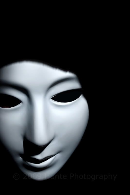
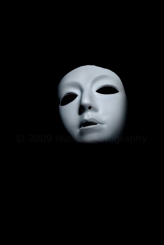
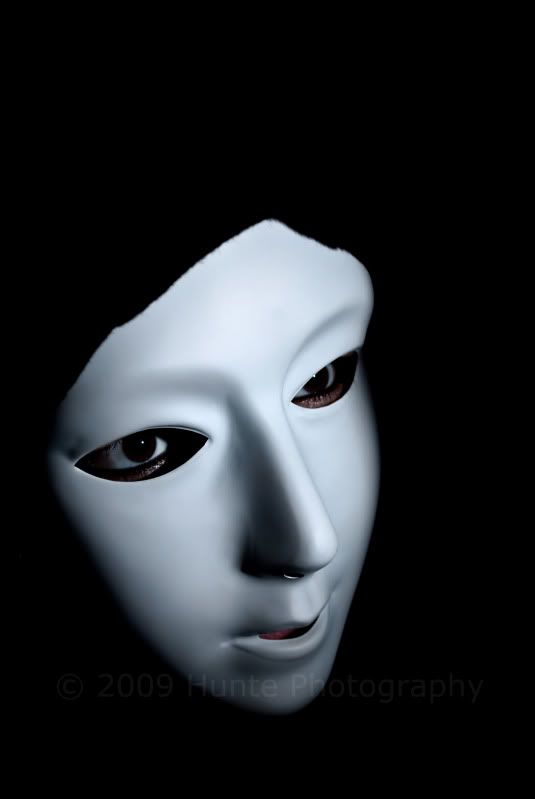
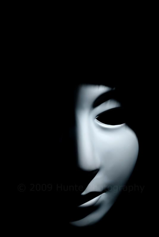
I used a Nikon D60 and off camera SB600 and a snoot made out of a frozen pastry cardboard box...
The fringing at the top of the mask is because of the cloak hood my fiancée was wearing... I can't figure how to get rid of it... The only editing I did was change the curves and normal RAW editing.


Website: http://www.huntephotography.com
Blog: http://www.huntephotography.wordpress.com
Twitter: http://www.twitter.com/huntephotos
Blog: http://www.huntephotography.wordpress.com
Twitter: http://www.twitter.com/huntephotos
0
Comments
I think the #3rd shot is the pick of the bunch.
Would have liked to have seen the whole mask in the first shot.
You did well, nice going making a Snoot for your Flash too
.... Skippy
.
Skippy (Australia) - Moderator of "HOLY MACRO" and "OTHER COOL SHOTS"
ALBUM http://ozzieskip.smugmug.com/
:skippy Everyone has the right to be stupid, but some people just abuse the privilege :dgrin
My Smugmug Site
I tried hard to get the mask in the centre with that lighting, but I never knew how hard it is to compose and shoot in a very dark room. haha.
I love my Snoot... the best thing I ever spent $3 on and then ate (contents that is)...
I'm going to do another shoot but this time using a different mask... stay tuned!
Blog: http://www.huntephotography.wordpress.com
Twitter: http://www.twitter.com/huntephotos
I was going with 3 over 4, but with the consensus going with 4
it very easy to see why they would be.
Nice work.
I actually preferred #4 myself, but I guess people see it different to me... although I can see why they would like #3.
Martin
Blog: http://www.huntephotography.wordpress.com
Twitter: http://www.twitter.com/huntephotos
As for the fringing on the top of the mask. Works good I think. Gives it some texture, but then again some could/would see it as a distraction from the smooth lines.
www.Dogdotsphotography.com
Thanks Dogdots!
For the next shoot I'm going to experiment a bit more and see if I can correct that fringing.
Blog: http://www.huntephotography.wordpress.com
Twitter: http://www.twitter.com/huntephotos
Man.... I messed up my post when I wrote it out... Nuts.
to say 4 over 3 not 3 over 4.
Blog: http://www.huntephotography.wordpress.com
Twitter: http://www.twitter.com/huntephotos