Ch. 42 - Purified (x3)

purifiedpurified Registered Users Posts: 173 Major grins
edited July 7, 2005 in The Dgrin Challenges
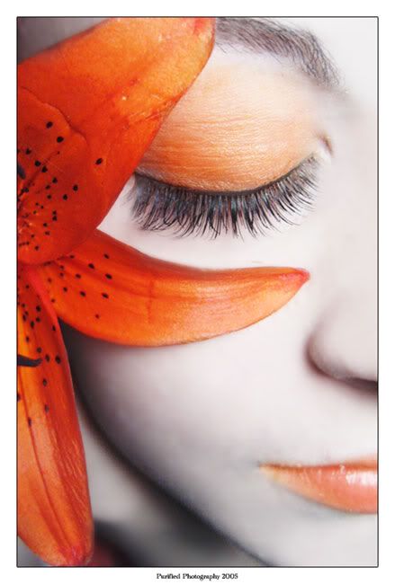
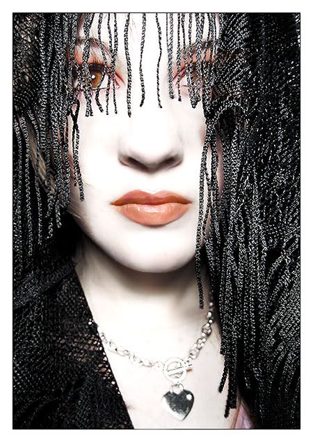
I haven't entered into a contest in quite a while, so I think I will this time. :): I didn't check what the next challenge was until yesterday and I was happy to know that I took these just within the limits. :) So... of all the hundreds of shots I've taken in the past few days, I've like these three the best. There's a still life, and two emotive portraits and...

...I don't know which one I should use for the challenge!
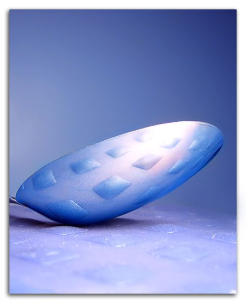
spoon.jpg


flowerdown.jpg


358247f8.jpg


Any thoughts? Favorites? Improvements?

Thanks!
Purified Photography
Updated June 5 2007


-Kelly

Comments

  • SandySandy Registered Users Posts: 762 Major grins
    edited July 2, 2005
    Nice work, both model shots are great. clap.gif
  • gusgus Registered Users Posts: 16,209 Major grins
    edited July 2, 2005
    No idea...they are all exceptional thumb.gif

    You have quite a future !

    If i must choose then i call #2 for the colour & DOF but 1 really looks great also.

    Gus
  • rahmonsterrahmonster Registered Users Posts: 1,376 Major grins
    edited July 2, 2005
    #2 Is fantastic I LOVE it!clap.gif They are all good but that is my favourite!
    www.tmitchell.smugmug.com

    Art washes away from the soul the dust of everyday life...Picasso
  • wxwaxwxwax Registered Users Posts: 15,471 Major grins
    edited July 2, 2005
    Purified, I agree with Gus, you have real talent. I like all of 'em. Wish I could help you, but I can't.
    Sid.
    Catapultam habeo. Nisi pecuniam omnem mihi dabis, ad caput tuum saxum immane mittam
    http://www.mcneel.com/users/jb/foghorn/ill_shut_up.au
  • behr655behr655 Registered Users Posts: 552 Major grins
    edited July 2, 2005
    Beautiful shots. I read your bio on smugmug. You've only been shooting for 4 months? Or is that when you went digital? Look out photography world.


    Bear
  • DoctorItDoctorIt Administrators Posts: 11,951 moderator
    edited July 2, 2005
    Yo P - glad to see some of your shots again nod.gif

    You really have a sharp eye for composition. I like all three, but I'm a sucker for abstract and still life, so my vote is on the spoon. I'd love to see in in the challenge. The colors are so cool (like literally, cold, cool) and the patterns really grab my attention.
    thumb.gif
    Erik
    moderator of: The Flea Market [ guidelines ]


  • deadhippodeadhippo Registered Users Posts: 3 Beginner grinner
    edited July 2, 2005
    actually
    i really like the third photo
    the detail on the lips was amazing and the eyes were penetrating
    the picture had a sense of mystery

    i feel the orange picture is like a cosmetic advert
    i dont mean that in a bad way
  • DoctorItDoctorIt Administrators Posts: 11,951 moderator
    edited July 2, 2005
    deadhippo - i just moved your above comments here from the actual challenge thread thumb.gif
    Erik
    moderator of: The Flea Market [ guidelines ]


  • DavidTODavidTO Registered Users, Retired Mod Posts: 19,160 Major grins
    edited July 2, 2005
    Purified,

    It's truly amazing to me what you get done with your little A95. It shows how much more important talent is over equipment. All 3 are excellent. I like the first two best. I love your portraits and how you are able to reinvent yourself in so many ways. But that spoon is so dang cool.
    Moderator Emeritus
    Dgrin FAQ | Me | Workshops
  • erich6erich6 Registered Users Posts: 1,638 Major grins
    edited July 2, 2005
    I like all three as well but I like #2 the best. Awesome style and composition. thumb.gif

    Erich
  • wingerwinger Registered Users Posts: 694 Major grins
    edited July 2, 2005
    Curious how do you set up your portraits? Is that a model you know and do you have studio lights or are those all just with the flash on the camera?
  • Jerry CurtisJerry Curtis Registered Users Posts: 170 Major grins
    edited July 2, 2005
    Fabulous shots! My fave is this one:
    I love the close crop and the orange colors that tie the whole image together. Marvellous shot!

    And I agree with DavidTO - talent beats equipment any old day of the week!


    flowerdown.jpg
    -Jerry

    Whether you think that you can or that you can't, you are usually right.
    - Henry Ford

    www.pbase.com/icicle50
  • purifiedpurified Registered Users Posts: 173 Major grins
    edited July 2, 2005
    The model is me since I have no one else to use for my portraits. I used regular indoor lighting. For both of these I have a reading lamp with a 75 watt bulb directly shining a foot and a half away. I also used the blue tungsten setting on my camera that counteracts the color cast that you get from shooting in a regular indoor setting.
    Purified Photography
    Updated June 5 2007


    -Kelly
  • 4labs4labs Registered Users Posts: 2,089 Major grins
    edited July 2, 2005
    I agree with everyone else. What a talent! I like em all.
  • purifiedpurified Registered Users Posts: 173 Major grins
    edited July 2, 2005
    Thank you for all of your incredible feedback! I think I'll go with #2 for now since it's seem most liked and I was leaning toward that one as well. Though, I might change my mind... ;)
    Purified Photography
    Updated June 5 2007


    -Kelly
  • lynnmalynnma Registered Users, Retired Mod Posts: 5,208 Major grins
    edited July 2, 2005
    Purified these are beautiful shots every one!! I think I agree with number two..clap.gifclap.gifclap.gifclap.gifclap.gifclap.gif
  • DavidTODavidTO Registered Users, Retired Mod Posts: 19,160 Major grins
    edited July 2, 2005
    purified wrote:
    Thank you for all of your incredible feedback! I think I'll go with #2 for now since it's seem most liked and I was leaning toward that one as well. Though, I might change my mind... ;)


    Good choice.
    Moderator Emeritus
    Dgrin FAQ | Me | Workshops
  • douglasdouglas Registered Users Posts: 696 Major grins
    edited July 5, 2005
    All 3 are great shots, you look like a natural at this. #2 is wonderful, awesome tones, lines and color matching.

    Best regards,
    douglas
    Best regards,
    douglas
  • wholenewlightwholenewlight Registered Users Posts: 1,529 Major grins
    edited July 5, 2005
    It looks like you've made your choice but I'll put in my vote for #2. Very, very cool shot.

    I always anxiously open your postings to view your work - you have such a creative eye.

    And specific accolades go to you for being your own model. Very nice! thumb.gif And here I am wishing and drooling over more hardware in the the B&H photo catalog, and you post admirable shots using a pretty simple setup. Keep posting and we'll keep enjoying.
    john w

    I knew, of course, that trees and plants had roots, stems, bark, branches and foliage that reached up toward the light. But I was coming to realize that the real magician was light itself.
    Edward Steichen


  • Michael AllenMichael Allen Registered Users Posts: 196 Major grins
    edited July 6, 2005
    All 3 are excellent, but to pick one I'd have to say no.2 also, very nice work.
    -Mike
  • InvectiveInvective Registered Users Posts: 113 Major grins
    edited July 6, 2005
    Really like #2 :D
    "The fool doth think he is wise, but the wise man knows himself to be a fool."
  • aero-nutaero-nut Registered Users Posts: 693 Major grins
    edited July 6, 2005
    Absolutely stunning shots! You really do have some great talent. If you keep coming up with shots like that, you will put the pros to shame....(Don't tell Andy I said that. :D )


    I agree with the group...#2 really captures the theme and color.
  • davevdavev Registered Users Posts: 3,118 Major grins
    edited July 7, 2005
    I think you should try a different pic for the challenge so the rest of us
    have a chance.:D
    Number 2 for sure, but as the others have said, they're all great.

    dave.
    dave.

    Basking in the shadows of yesterday's triumphs'.
Sign In or Register to comment.