Some post work.. C&C please
I know it's not the "whippin post" but let me know what you think of these. I shot these about an hour ago and did some 'quick' post on them, just looking for feedback to see if i'm on the track i think i'm on. (if that makes sense) :scratch
D50 - f2.8 @ 50mm - 1/1250s -0.7

original
D50 - f1.8 @ 50mm - 1/320s -0.7
original
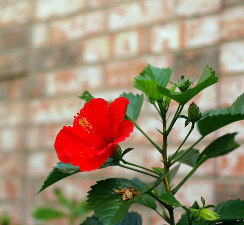
I just liked the color on this one (f2.5 - 1/320s)
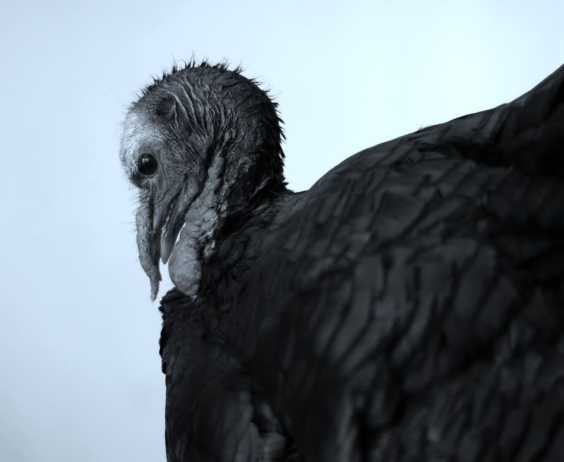
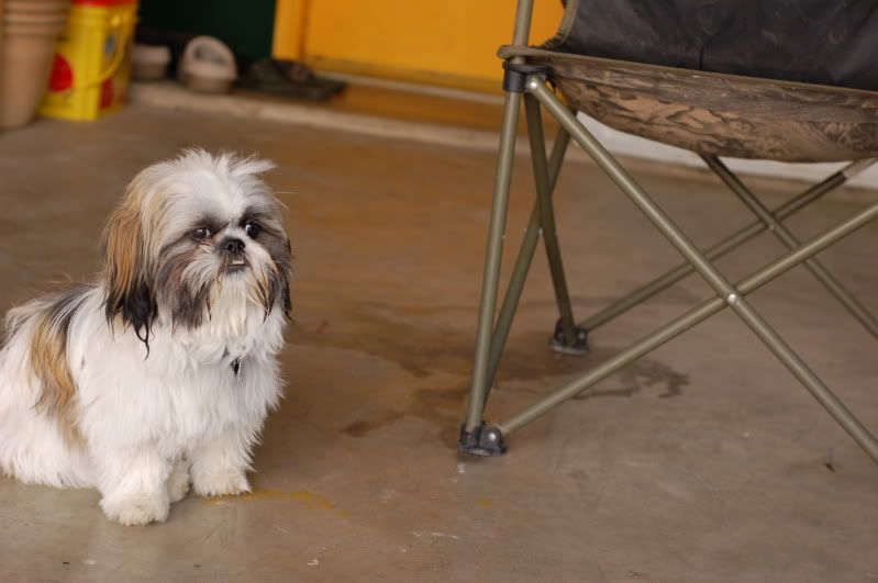
my buddies killer attack dog
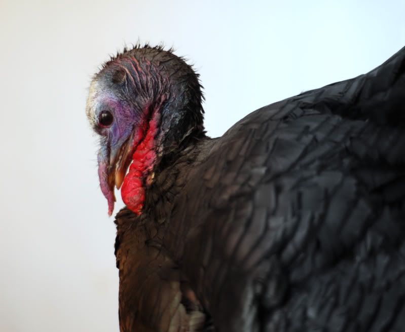
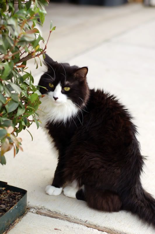
and his mouser.. fig
any and all feedback appreciated..
Devin.
D50 - f2.8 @ 50mm - 1/1250s -0.7
original
D50 - f1.8 @ 50mm - 1/320s -0.7
original
I just liked the color on this one (f2.5 - 1/320s)
my buddies killer attack dog
and his mouser.. fig
any and all feedback appreciated..
Devin.
Devin
0
Comments
Turkey...focus is too soft. You're going for really ugly here, so you have to get the ugly in focus. Did you drop-out the background? The edges of the body look like you did a selection and deleted the background. It's not natural. You might try leaving the background, but putting a heavy Gaussian blur on it.
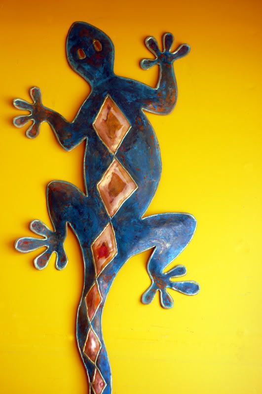
Lizard wall-hanging. Not well lit. The center is lit (unevenly), but the top and bottom are not.
Dog...Cute dog in a very unattractive setting. A dog that size can be moved away from that kind of background.
Cat...Focus is soft.
http://tonycooper.smugmug.com/
Thanks so much for the critque Tony.. have a great night
Who is wise? He who learns from everyone.
My SmugMug Site
My Photographic Adventures
Nikon D7000 | 10-20 | 50 | 55-200
www.Dogdotsphotography.com
here is a tighter crop (to much i think) and added an adjustment layer. I need to do something with the floor though.. not very attractive.
I'm going to walk across the street and do a re-shoot today.
Who is wise? He who learns from everyone.
My SmugMug Site
will do.. thanks andrew
I like the crop, but it probably could of more on top. If you reshoot it -- focus on the eyes.
As for the floor....It works good as it blends really well with the color of the dogs fur. My opinion tho
Good luck on the reshoot and I look forward to seeing what you get
www.Dogdotsphotography.com