Think, submit, shine. My Friend Elsa in SF (C&C) Please.

A recent shoot I did with my friend from Health Class I had not seen in two years.
#1 Think
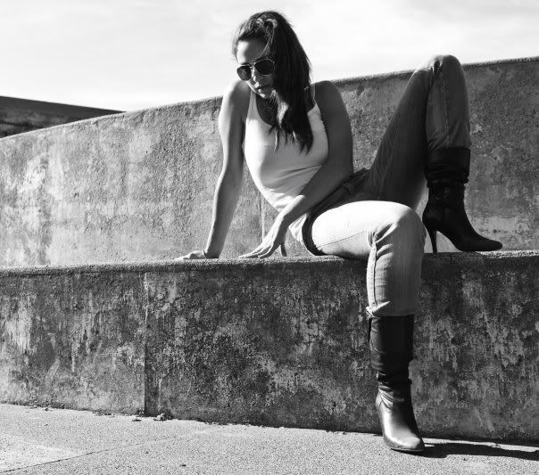
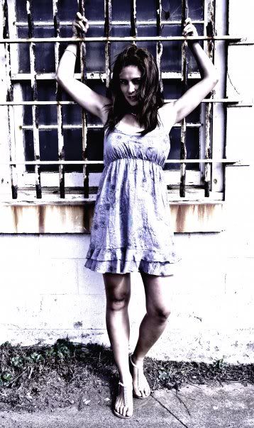
#2 Submit
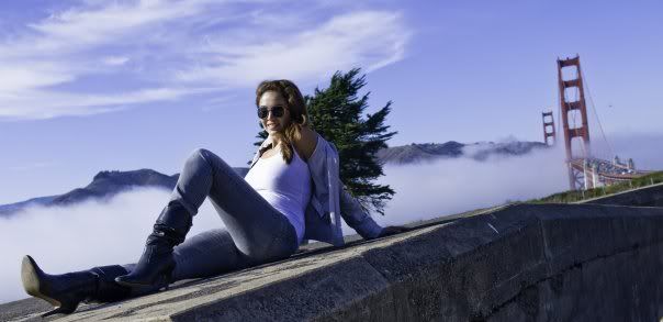
#3 Shine
Yeah the color is off on this. I am at work and stupid FB changed the color out put so sorry for the crap color quality.
#1 Think
#2 Submit
#3 Shine
Yeah the color is off on this. I am at work and stupid FB changed the color out put so sorry for the crap color quality.
0
Comments
The second one could have been potentially better considering harsh light, if she had been turned toward the bars and side shot with flash or reflector fill.
The last is not my cup of tea, simply because of the composition. It basically says: Snapshot.
cheers,
www.ivarborst.nl & smugmug