Pass or fail kid shot... Sparkling whites!

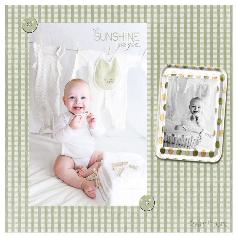
Okay, everybody I don't know if I pulled this off. I had this clear vision of what I wanted for this shot...Sparkling white background. Clean, adorable, delicate baby clothes hung neatly in the background with wooden clothes pins. Crisp white towels, stacked and folded, with wooden clothes pins scattered around. And of course a happy smiling baby! (a bonus that he decided to hold up the wooden clothes pin just perfectly for the camera).
This was taken at 1/200, ISO 800 and 3.5 f. I wasn't planning on using flash for this (window lighting), but at the last minute I popped on an old Nikon film SB22 speedlight onto my Canon dSLR *(which I know isn't metering the flash and perhaps not a good idea on my Canon). Anyway, I bounced the flash to the wall (with the windows). I wanted light and I GOT IT... Too much perhaps, but I did get the whites I wanted, LOL! Is this just WAY too bright? I really had a vision of pure white for this...but is it too much? Or is it fresh and clean? Luckily I shot in RAW so suggestions as to how I can modify this shot would be appreciated (I'm new to editing).
This is essentially "look" I wanted on this page.
Did I pull it off? Pass or Fail? Be honest. THANKS for the help...
__________________________
Kelly
My Photostream
http://www.flickr.com/photos/freezethemomentphotography/
http://www.kfsphotography.smugmug.com
Kelly
My Photostream
http://www.flickr.com/photos/freezethemomentphotography/
http://www.kfsphotography.smugmug.com
0
Comments
1
2
3
4
Kelly
My Photostream
http://www.flickr.com/photos/freezethemomentphotography/
http://www.kfsphotography.smugmug.com
Note in particular in #1 how CRISPLY clear you got the eyes - that's what you want!! You really nailed it. My only nit in #1 is either that he needed a change that you didn't spot,, OR his big toe is casting a shadow in a most unfortunate place.... probably worth cloning that one out
I don't think 3&4 work as well - I see white balance problems there, and am going to guess the mixed light sources are giving you some colour casts; they're also slightly soft (with less light, did your shutter speed drop so that you got some camera shake?)
You are making tremendous strides with every batch you share - keep up the good work!!!
Halite. I will read up on cloning and figure out how to clean up that backdrop sheet. You are absolutely correct. I didn't notice it until now but it is very distracting. Thanks for that great suggestion before I send this one off to print for his baby book!
Oh DM, a couple of these were w/o speedlight. The speedlight helped SO MUCH! I couldn't get the whites "white" without it!!! That is why I went sepia or b/w on the others. They were all handheld, but the speedlight worked wonders (both for focus/crispness and whites). I will need to get one that meters specifically for this camera. That was an old Nikon SLR film speedlight and it isn't metering with my dSLR Canon. I have a few items for my xmas list already!
Thanks again...At least I got this one keeper! I was just thrilled his eyes turned out so clear and I didn't overexpose the whites. It was a risk in shooting all whites.
Thank you again for commenting. The comments are what help keep me going forward!!!!
Kelly
My Photostream
http://www.flickr.com/photos/freezethemomentphotography/
http://www.kfsphotography.smugmug.com
Kelly
My Photostream
http://www.flickr.com/photos/freezethemomentphotography/
http://www.kfsphotography.smugmug.com
1 is a home run, good job! If the parents haven't seen the pictures, I wouldn't let them... just print 1 at like 12x18, matte it, frame it, and present it to them in person. They won't be able to not buy it. Name your price. If they roll up in a nice car, I would say $200.
An "accurate" reproduction of a scene and a good photograph are often two different things.
Kelly
My Photostream
http://www.flickr.com/photos/freezethemomentphotography/
http://www.kfsphotography.smugmug.com
Kelly
My Photostream
http://www.flickr.com/photos/freezethemomentphotography/
http://www.kfsphotography.smugmug.com
www.brogen.com
Member: PPA , PPANE, PPAM & NAPP