Baby shoot. Never easy. Any input for me?

Me again. Trying desperately to get better at this. Shot all of these in M which is a big deal for me---plunging right into the deep water.
I know these are not stellar as most of yours are, but any insight and help would be great. I'm honored to be able to post my pictures amongst your pieces.
These were mostly shot with either exclusive ambient indoor window light (large bay window) or with my old Nikon SLR speedlight (put on my Canon dSLR. It isn't metering correctly so I have to adjust for ISO). I bounced the speedlight either on the wall or ceiling.
THANK YOU! I wish someday that I will be able to take shots that will make people's heart skip a beat. I know this isn't in my immediate future, but if I keep at this perhaps it won't be too long")
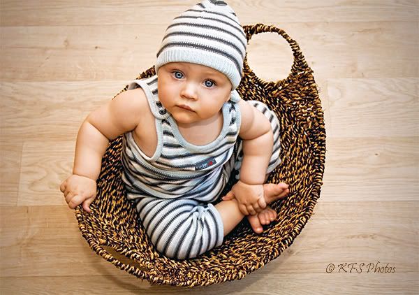
THANKS gang! I'm going to throw a bunch out for comment some are not really there yet...but anyway, for what its worth. I'm thinking my "keeper" is #3. I do love that shot to be honest.
Thanks for your help and support!
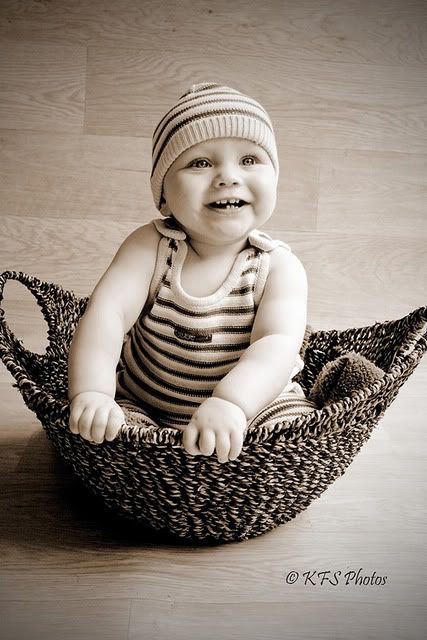
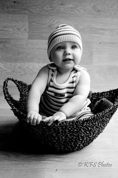
#1
#2

#3
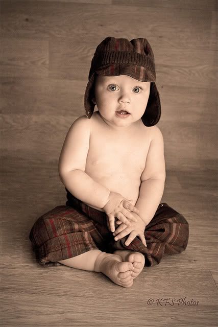
#4

#5
#6
#7

And for Clixphoto. Thanks for the square crop suggestion
I know these are not stellar as most of yours are, but any insight and help would be great. I'm honored to be able to post my pictures amongst your pieces.
These were mostly shot with either exclusive ambient indoor window light (large bay window) or with my old Nikon SLR speedlight (put on my Canon dSLR. It isn't metering correctly so I have to adjust for ISO). I bounced the speedlight either on the wall or ceiling.
THANK YOU! I wish someday that I will be able to take shots that will make people's heart skip a beat. I know this isn't in my immediate future, but if I keep at this perhaps it won't be too long
THANKS gang! I'm going to throw a bunch out for comment some are not really there yet...but anyway, for what its worth. I'm thinking my "keeper" is #3. I do love that shot to be honest.
Thanks for your help and support!
#1
#2
#3
#4
#5
#6
#7
And for Clixphoto. Thanks for the square crop suggestion
__________________________
Kelly
My Photostream
http://www.flickr.com/photos/freezethemomentphotography/
http://www.kfsphotography.smugmug.com
Kelly
My Photostream
http://www.flickr.com/photos/freezethemomentphotography/
http://www.kfsphotography.smugmug.com
0
Comments
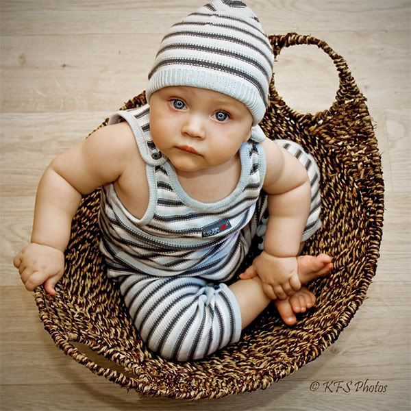
Cute basket!
Caroline
You know, I also like 4, but the vignette is a little too strong for me and I agree that it's a bit too yellow.
Caroline
Jeff
-Need help with Dgrin?; Wedding Photography Resources
-My Website - Blog - Tips for Senior Portraiture
NAPP Member | Canon Shooter
Weddings/Portraits and anything else that catches my eye.
www.daveswartz.com
Model Mayhem site http://www.modelmayhem.com/686552
Just a few nits... I would have like to have this shot a little more at her level. Get closer to the ground. Not sure if the shooting from above was so that you could use that nice floor as back drop. And i would have tried some in landscape, so the basket handles weren't cut off, and have her face in the top third...(rule of thirds stuff). Other than that, i really like the lighting!! Hard to miss with such a cute subject!! Great job!!
My Smug Gallery
Caroline, I took off the vignette in #4 (actually a distortion burn filter). You were right it was way too heavy on that shot. I had some shadows behind him I wanted to cover, but I agree that lessening the burn looks better!
Melissa, I definately had some serious yellow action going on there in # 4 *and still do but it is less-so now. Thanks for pointing that out! I will have to play with it more.
Jeff, you are too kind. I remember when I was learning to play the guitar and my brother kept telling me it sounded great. I knew it didn't, but it sure helped keep me moving forward!!! Thanks for the dose of encouragement.
Swartzy, as for the eye focus...Well, I guess I just tried to really capture those baby blues! I think that the low res image actually makes everthing look much sharper than it is in my RAW file. I have my resize set to "bicubic sharper" . Maybe I should go with "bicubic smoother". I made sure that I had strong focus on his eyes for this shoot. They were my focal point. I guess it worked, lol! The kid has some seriously big blue eyes though, that's for sure!
Oh and Caroline. I found that basket yesterday. I LOVE it! I will use it to keep all his little toys organized. It was only 11 Euros and would be a PERFECT newborn poser. Too bad I didn't have it back in January.
I just saw your post, Briggie. Thanks for the nits. I really need to keep in mind shooting lower. I made this mistake the other day too! Yes M was scary, but fun! The backdrop was a roll of linolieum and it was only 1 meter wide (4 m long) so I had to pretty much shoot in portrait to keep the b.g there, lol! How I dream of someday having a proper studio to play in! I need to re-read my rule of 3rd chapter. Thank you for that input
Okay all... You are truly wonderful to help and encourage me. THX again!
Kelly
Kelly
My Photostream
http://www.flickr.com/photos/freezethemomentphotography/
http://www.kfsphotography.smugmug.com
www.clix-photo.com