Options

DSS35 - Pyro's Second Try

pyroPrints.compyroPrints.com Registered Users Posts: 1,383 Major grins
edited October 16, 2009 in The Dgrin Challenges
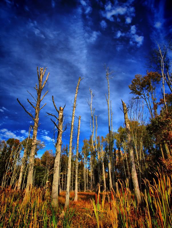
So here is the new crop. Any ideas? as you can see I've been HDRing it up a bit =c)

current
_PA087885_resize.jpg

1
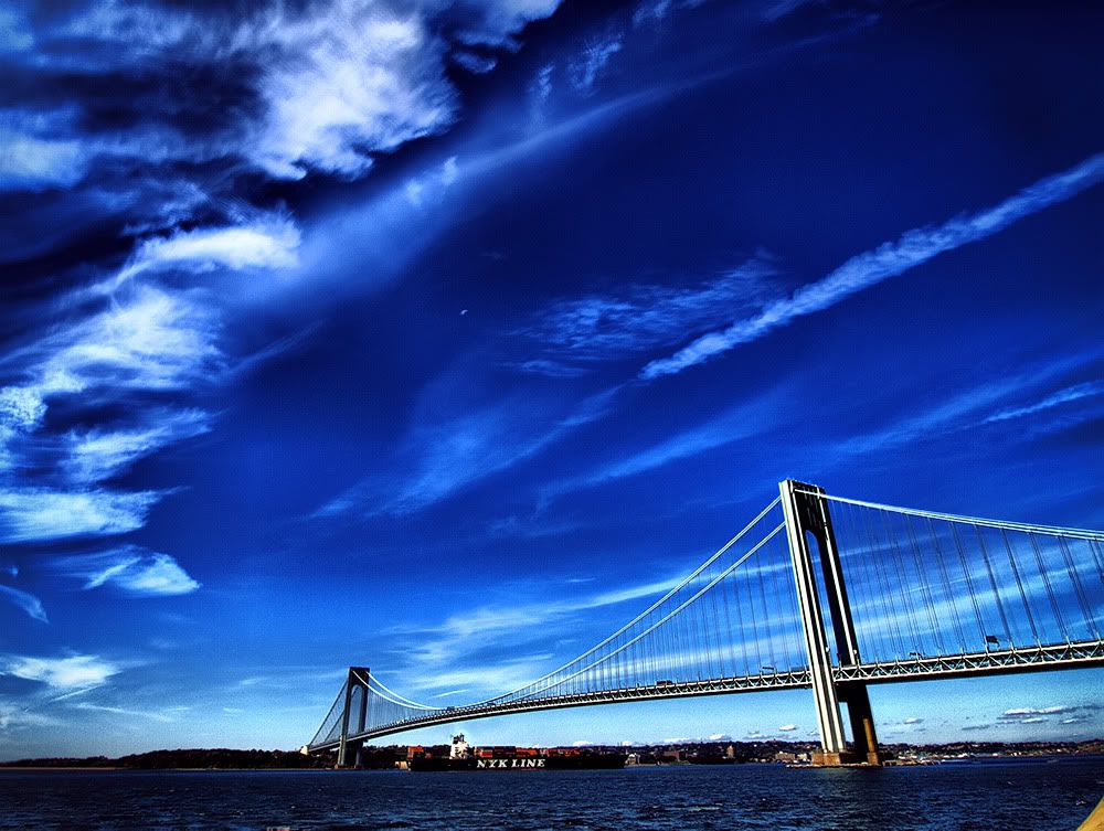
_bridgeAndMore_1.jpg

2
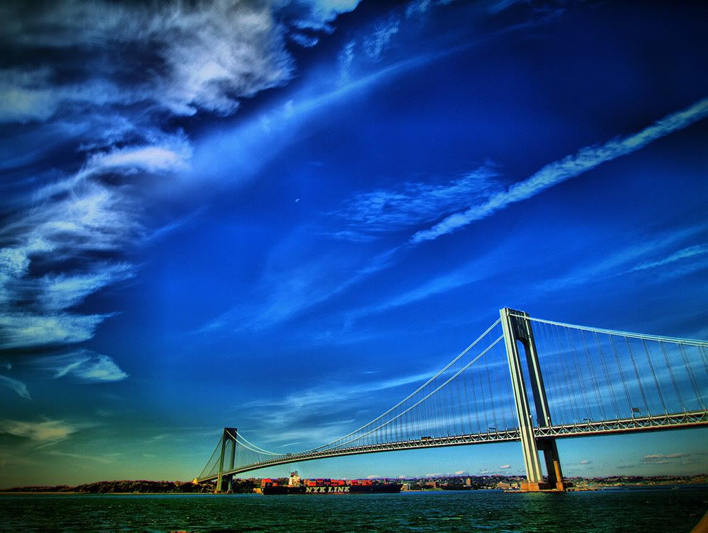
_bridgeAndMore_2.jpg

3
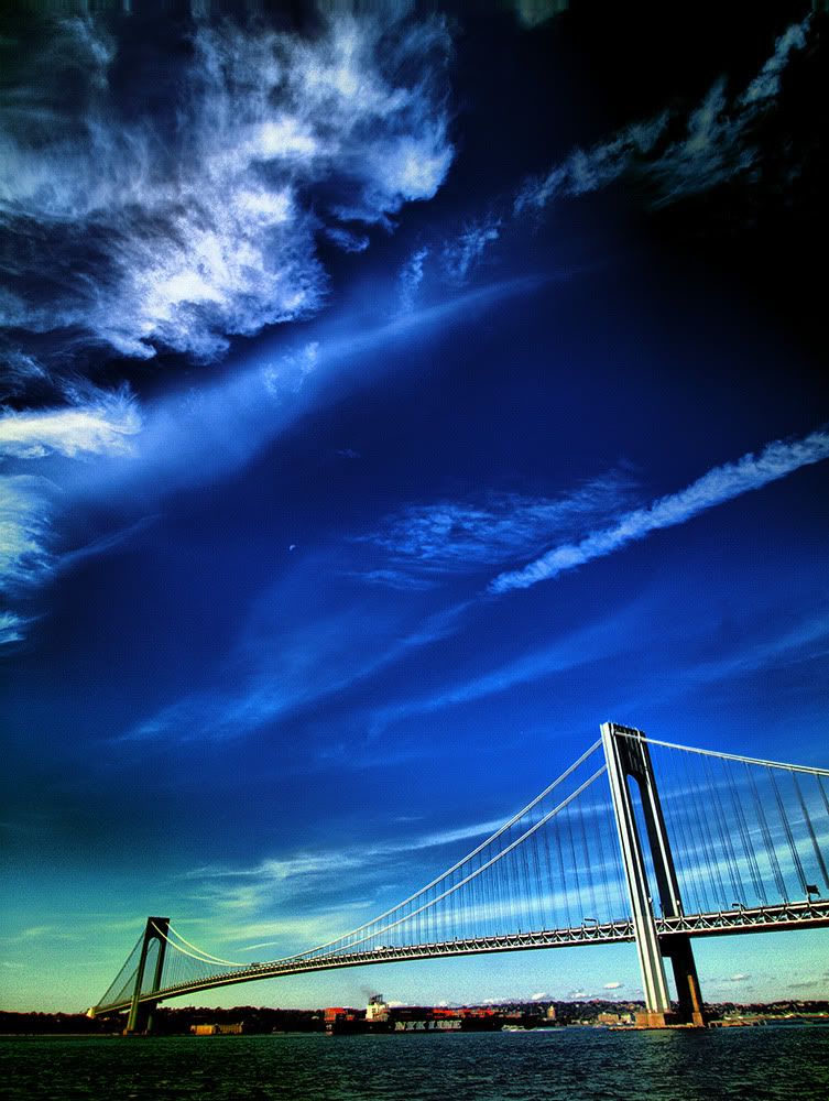
_bridgeAndMore_3.jpg

4 - not sure if this one is blue enough
_brighton.jpg

5
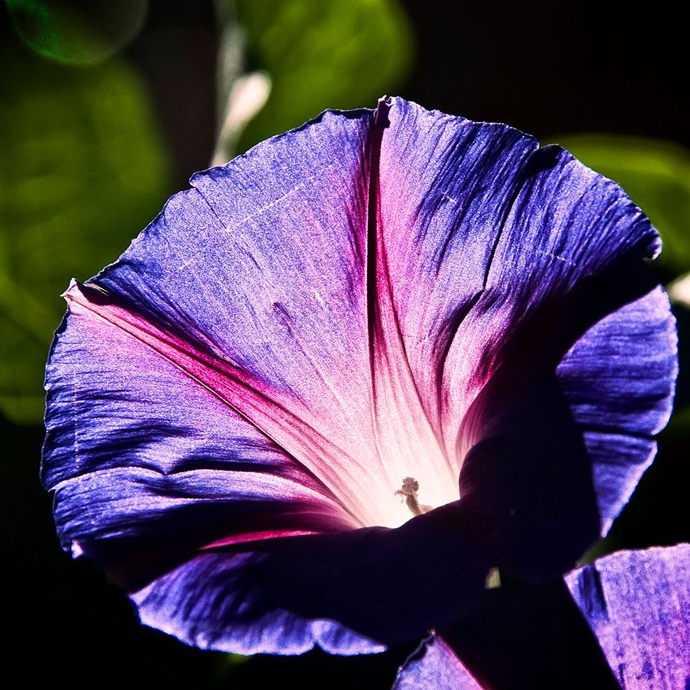
_luminesence.jpg

6
_walksOnTheBeach.jpg
pyroPrints.com (my little t-shirt shop)
pyroPrints.com/5819572 The Photo Section

Comments

  • Options
    MarkRMarkR Registered Users Posts: 2,099 Major grins
    edited October 13, 2009
    Thematically, #1 is spot-on.
  • Options
    The Curious CamelThe Curious Camel Registered Users Posts: 943 Major grins
    edited October 13, 2009
    I agree I like number one best.
    Two is beautiful but the perspective of the bridge seems to odd.
    It might be better if part of the bridge was cropped, not sure.

    In one I love the way it seems the trees are arms and hands pointing the viewer to the sky. Really beautiful.

    g
  • Options
    pyroPrints.compyroPrints.com Registered Users Posts: 1,383 Major grins
    edited October 13, 2009
    MarkR wrote:
    Thematically, #1 is spot-on.

    #1 or the original?
    pyroPrints.com (my little t-shirt shop)
    pyroPrints.com/5819572 The Photo Section
  • Options
    FlyingginaFlyinggina Registered Users Posts: 2,639 Major grins
    edited October 14, 2009
    I like #1 best for the challenge too.

    I went back to look at the original one of the trees, but without seeing the two pictures side by side, I can't really tell you which I like best or why.

    Could you post the original so we can compare?

    Virginia
    _______________________________________________
    "A photograph is a secret about a secret. The more it tells you, the less you know." Diane Arbus

    Email
  • Options
    MarkRMarkR Registered Users Posts: 2,099 Major grins
    edited October 14, 2009
    #1 or the original?

    Well, both actually, but I was referring to #1.
  • Options
    KinkajouKinkajou Registered Users Posts: 1,240 Major grins
    edited October 14, 2009
    I vote #2. #1 seems to be about the trees and the sky 50/50, and #2 is about the bridge and the sky - closer to a 30/70 ratio. If that makes any sense at all...
    Webpage

    Spread the love! Go comment on something!
  • Options
    adbsgicomadbsgicom Registered Users Posts: 3,615 Major grins
    edited October 14, 2009
    Current is still the best of the bunch IMO.
    The bridge in #1 has a wierd warp do it (giving sort of that Tacoma Narrows Bridge effect). I don't like the color cast to the bridge in #2/#3. The rest are not as thematically strong.
    - Andrew

    Who is wise? He who learns from everyone.
    My SmugMug Site
  • Options
    sherstonesherstone Registered Users, Retired Mod Posts: 2,356 Major grins
    edited October 14, 2009
    I think your current #1 is the strongest.
  • Options
    pyroPrints.compyroPrints.com Registered Users Posts: 1,383 Major grins
    edited October 16, 2009
    Thanks much guys =c) I think I'll stick to the Trees for final.
    pyroPrints.com (my little t-shirt shop)
    pyroPrints.com/5819572 The Photo Section
Sign In or Register to comment.