Baby faces- close ups

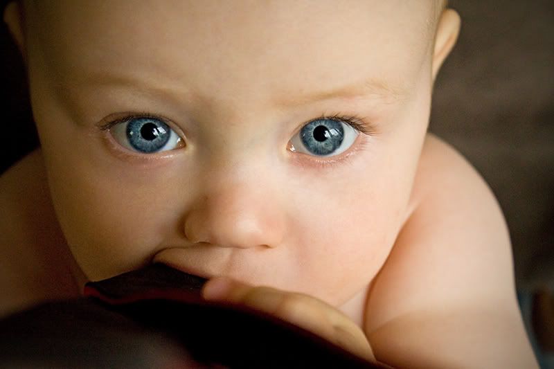
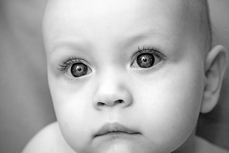
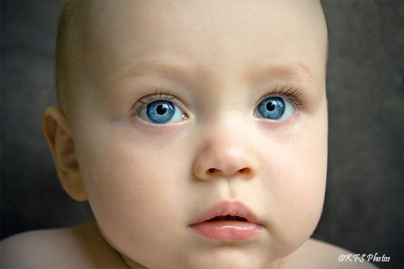
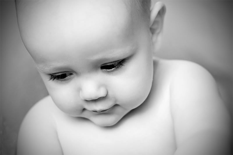
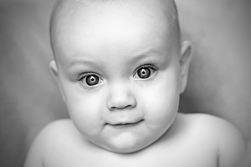
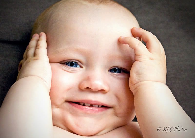
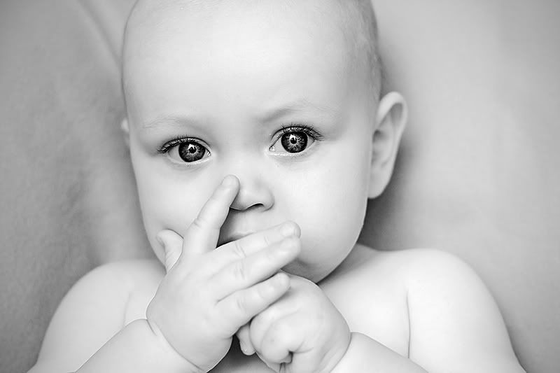
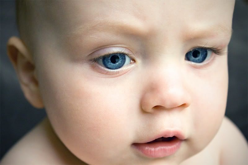
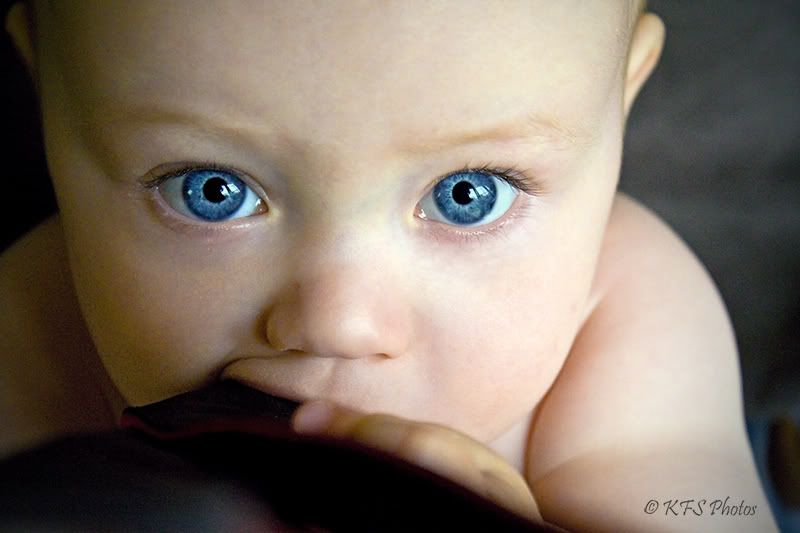
Any thoughts on these? I was trying to really get a sharp close up--especially of his eyes and eye lashes. This isn't easy with a moving 9 month old! Thanks for your comments on these  There is one that is a duplicate because I didn't know if the saturated version was "too much" on the eyes (the first and last picture are the same). The first is the more realistic color of his eyes, but when I upped the saturation it just blew me away so I kept it---btw in that one he was chewing on my camera strap which was hanging down and not around my neck, lol! I did some in color and some b/w (b/w was on a different day). These are all with natural window lighting. What are your favorites and why. What can I do to improve this kind of shot. Thanks so much for being my sounding board!
#1
#2
#3
#4
#5

#6
#7
#8
#9
#10
#1
#2
#3
#4
#5
#6
#7
#8
#9
#10
__________________________
Kelly
My Photostream
http://www.flickr.com/photos/freezethemomentphotography/
http://www.kfsphotography.smugmug.com
Kelly
My Photostream
http://www.flickr.com/photos/freezethemomentphotography/
http://www.kfsphotography.smugmug.com
0
Comments
Caroline
Kelly
My Photostream
http://www.flickr.com/photos/freezethemomentphotography/
http://www.kfsphotography.smugmug.com
I know the noise is pretty evident on those color ones, but I just loved his eye color in the series due to the sharp focus.
These were shot on 2 diff days.
The B/W were ALL taken with my 50 mm at 1/125 sec, F 2.8 and ISO 200.
The color shots were at 1600 ISO with my kit lens. They were around F 4.5, 1/80 sec...with DRURY window light. It was quite early in the a.m. (breakfast in the highchair). I had my kit lens on the cam and just grabbed the moment. My bag was upstairs with my 50 mm lens.......ANYWAY the 1600 shows a lot of noise. I ran it though a noise reduction filter but ultimately I prefered the noisy look,
Looks like the 50 mm lens takes the cake! It was interesteing to compare the 2 for a similar shoot.
THANKS for your input!:D
Kelly
My Photostream
http://www.flickr.com/photos/freezethemomentphotography/
http://www.kfsphotography.smugmug.com
Kelly
My Photostream
http://www.flickr.com/photos/freezethemomentphotography/
http://www.kfsphotography.smugmug.com
And I also agree about the cropping of chins. I think number 3 would be my favorite if it were taken about an inch lower...from a bit above of the eyebrows to below the chin. That would also nicely put his eyes in the upper third of the photo. The colors and light are so nice and soft.
I think I like #8 the best. I like the expression and the contrast of his eyes to the rest of the shot. I wonder how it would look cropped just a bit...I would try taking a bit off the left (so his arm leads down into the corner) and a bit off the top so his eyes move up a bit in the frame (maybe halfway between the top of the frame and the top of his ear).
Between 1 and 10, I prefer 1. The skin tones look nicer to me in 1.
The cool thing about smaller pupils (and therefore larger irises) are the amazing textures and flecks of color and depth that can be captured.
I like #2 for the detail in his eyes, but like #3, wish it were taken about an inch lower.
Perhaps changing your focus point to an upper third one (above the center), would help in framing shots like this?
You found some lovely light so I hope you keep shooting there!
Comments and constructive critique always welcome!
Elaine Heasley Photography
Elaine, you offer some wonderful advice and perspective. Thank you for taking the time to analyze the shots for me. I will definately use this lighting again...and take with it a new perspective on framing. I think I can get some very good takes next time with everyone's advice. I will also try to crop that shot as you suggested.
Thanks again!
Kelly
My Photostream
http://www.flickr.com/photos/freezethemomentphotography/
http://www.kfsphotography.smugmug.com
Who is wise? He who learns from everyone.
My SmugMug Site
Kelly
My Photostream
http://www.flickr.com/photos/freezethemomentphotography/
http://www.kfsphotography.smugmug.com
I personally have no problem with the noise, but I rarely do. Noise shows a lot less in print anyway.
#2 (even though I would have liked more chin
Those blue eyes are amazing
www.ivarborst.nl & smugmug
Really adorable set
Diva, Yes I think I was straddling the fence with this choice of framing...I should have gone more extreme if I was going to cut anything off,
Thanks for that suggestion.
Kelly
My Photostream
http://www.flickr.com/photos/freezethemomentphotography/
http://www.kfsphotography.smugmug.com