Just looking for some C&C
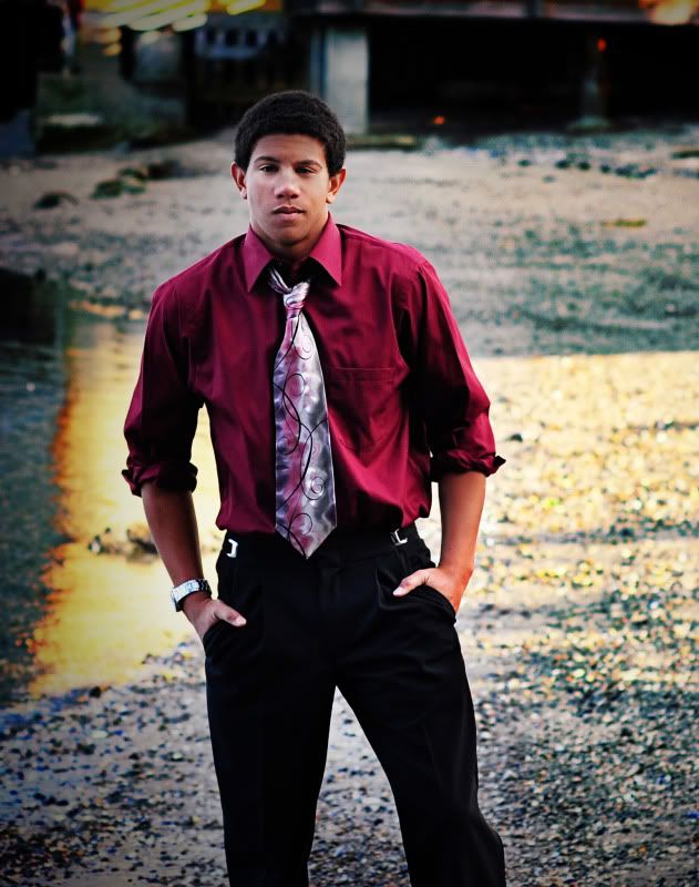
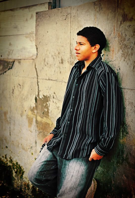
So I still haven't been able to get a whole lot of portrait practice until yesterday. This is a senior here close by and the photog I intern for said he wanted me to come along and snap some shots and get some practice. He said I can do whatever I want with them. So I did a little PP and I was curious what you all think.
My Facebook
0
Comments
The subject matter, clothing and backgrounds are excellent. Great job on this series. It just needs that little bit of fill and cropping to make the shots go from good to excellent.
Thanks for posting these
My Photo Blog -->http://dthorpphoto.blogspot.com/
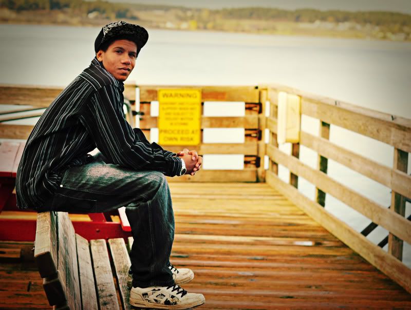
love the band of light hitting the water.
2. nice, casual, i like the light and color.
maby experiment with different directions of his head.
3. i think the colors are good, but i dont really "feel" it.
nice shots
I appreciate the comments! Ive never really been good with crops. I know the whole rule of thirds, but I will play with the crops a little more! As for fill I try to go as much ambient as I can. This guy just was a little dark and maybe it was the combination of dark skin and being in the shade that made it even darker. Thank you for your comments! Its always nice to see that I am heading in a good direction instead of nothing but negative comments!
Thanks for the comments! I thought the first 2 were my favorites and the 3rd was a great shot to me. As for the other directions of the head in the second there were two of us shooting and I didnt want him to turn when the other photog was shooting. I totally feel ya on that shot though with the head direction! Thanks again for your comments!
I like no 2, you don't always have to look at the camera. You could fold his arms and have him look at the camera and shoot down the wall with a really tight crop for an additional pose. I would go back and photograph that wall. It would make a great texture overlay I believe.
No 3 doesn't work for me from that angle. It would be much more dramatic with the same pose and front on. He has the face for a strong character pose.
www.cameraone.biz
I appreciate the kind words! I agree with you about the eyes. I am not good using an external flash for fill so I tend to stay away from what Im not good at. I try to use i-TTL, but I usually get bad results. Im thinking about getting a shoot through umbrella and stand and see how that helps. Ive seen a few people on here with great results doing that. I agree with you on #2 as well! I was thinking about shooting down the wall, but he didn't seem to care too much about the shots. I think he was the " lets get this over" type. I like your idea for #3. I will keep that one in mind and see if I can pull if off later. All in all I think you hit some very good points and appreciate your response! To me this is a start and I have a lot to learn, but without the help of you people on here I wont be able to learn as much! Thanks!
www.ivarborst.nl & smugmug
Im glad you like #3. To me it seems different, but I agree its missing something. All of the images were processed using a little bit of TRA stuff so the color in #2 was caused by the cross processing. I would love to show you more, but I only took a few and these were my favorites. Ill look through them again and see if there are some more that I can post! To everyone I really appreciate the feedback!